
Preamble
One of the things that has become clear during the pandemic is the widespread public misunderstanding of statistics. Nowhere is this clearer than in the attempts to compare the UK performance in the pandemic with that of other countries. Many on social media attempted comparisons with countries of very different social structure (such as those in East Asia), or with very different levels of connectivity (such as New Zealand and Australia) – effectively trying to compare apples with oranges. Comparisons were also made using daily statistics for case numbers and deaths on specific days, completely ignoring day to day statistical variability, the place of the country in the pandemic cycle and indeed the variability in population size. Very often comparisons of this kind were made on Twitter etc. for overtly political reasons and to attack or support the government and were very selective both in their content and timing – government critics were at their most vociferous when infection rates were increasing and strangely quiet when they were decreasing, and the opposite was true for government supporters. All these comments served to do was to illustrate the ignorance and prejudice of the commentator.
In this post, I want to address the same question – how did the UK cope with the pandemic in comparison to similar countries – but to do so in a slightly more rigorous way. It will become clear I am no epidemiologist, but hopefully the argument will be based on a rather more firmly based methodology than in the past.to do so, I will use one statistical measure only – that of deaths due to Covid-19, which seems to me the statistic that is most likely to be recorded accurately. I will not use case numbers as the variations in testing regime between countries means that any such comparisons are unreliable from the beginning. Further, I will only make comparisons with a subset of countries in Western Europe, essentially extending as far east as Poland and Hungary, but not including countries in the Scandinavian or Balkan peninsulas, 18 such countries in all. These are all broadly similar in terms of culture and society. An argument can be made that the comparison should be restricted further to just that small number of countries with populations similar to the UK – France, Germany, Italy, Spain and Poland – and indeed we will use this subset to some degree in what follows.
Nature of the analysis
The weekly death rates from March 2020 to June 2021 for the UK are shown in figure 1 below from the WHO web site. The curves for all the other countries considered are broadly similar, but the precise shapes and timings of the curves depend crucially upon the lockdown measures that were imposed by different countries, upon the spread of the new variants through the countries (in particular the so-called Kent or alpha variant) and the effectiveness and rapidity of the vaccination programmes.
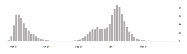
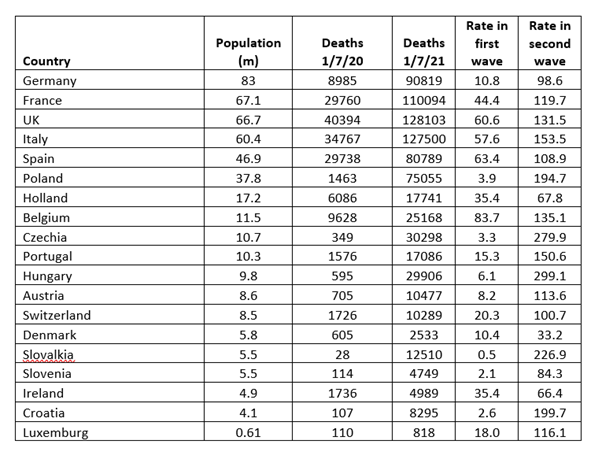
In the analysis we use WHO data for deaths and data from Wikipedia for country populations. The cumulative death figures at 30th June 2020 and 30th June 2021 are used and are shown in Table 1. The first wave of the pandemic was over by the first date, and the second wave well on the way to being over by the second, at least in terms of deaths. The death rates up to June 30th 2020 and between July 1st 2020 and June 30th 2021 have been calculated from the data and are expressed in what has become the conventional statistic of deaths per 100,000 population.
(At the time of writing – June 30th 2021- the delta variant continues to increase case rates in the UK, in effect a third wave, but deaths remain at a very low level. It is likely that this wave will spread across Europe in the next few months, but hopefully because of the vaccination efforts, serious illnesses and deaths in those countries too will remain at a low level.)
The first wave
The distinction between the first and second waves of the pandemic is important. For the first wave up to 30th June 2020, it can be seen from Table 1 that some countries were affected significantly whilst others hardly at all. The death rate per 100,000 in the UK of 60.6 was amongst the highest in the countries studied. The reasons for this variation are complex, and can be expected to include the degree of initial seeding of the countries from areas where Covid-19 was already endemic, the age profile of the population etc. The February half term skiing trips by many on the UK seem to have been a significant source of the spread, together with international travel from affected areas. There also seems to have been a pronounced west / east gradient, with the easternmost countries in the sample suffering very few deaths in this phase. Germany seems to have straddled this boundary. To unravel these effects would take a much more sophisticated analysis than I can carry out, and it must be left to those better able to do it, . This is not to say that what happened in this wave is unimportant, and the UK death rates were very high. Indeed, it is likely that the UK government will ultimately have to answer serious questions on their level of preparedness, PPE supplies, and in particular the decisions that were made to send untested elderly hospital patients back into care homes. The government estimate for the excess deaths in care homes up to mid-June 2020 was 19,394. If this figure is excluded from the totals the UK death rate in the first wave falls to 31.5 – close to the average of the death rates in the other countries. That being said, the level of the analysis I am able to undertake does not enable me to draw any further conclusions concerning the relative performance of the different nations in the first wave of the pandemic.
The second wave
In the UK the rise in September and October 2020 was brought under control through a fairly severe lockdown from November 5th 2020 to 2nd December 2020 although by the end of the lockdown it had not fallen to pre-lockdown values. There was much criticism if the government at the lateness of the imposition of the lockdown. The rate began to rise again in early December, due to the emergence of the Kent or alpha variant, peaking in mid-January before being brought down by another lockdown which started on January 6th and was relaxed in stages from March 8th. Again, there was a widespread feeling that the government were late these restrictions and should not have allowed social mixing over Christmas. Vaccinations begin in late December 2020, and this also played a significant role in the lockdown. In the other countries under consideration, the peak in early 2021 due to the Kent variant usually began a month or two later, and the vaccination programmes were also a month or two behind those in the UK, so in general the curves were shifted along the time axis by a month or so. But by the end of June 2021 death rates were very low in all countries.
The international comparison shown in Table 1 indicates that in the second wave, the deaths per hundred thousand of all 18 countries varied widely between 33 in Denmark and 299 in Hungary. The population weighted average was 133. The average of the seven most populous countries was 129. The value for the UK was 132 – very close to the average for both the complete data set of all countries and for the restricted number of countries. Many of the death rates are similar with half the countries having rates between 75 and 150. The data offers little encouragement for those who would either praise or denigrate the performance of the UK – it was boringly average. No doubt it’s mistakes in not locking down quickly enough have been compensated by the rapid vaccination roll out, but the same sort of trade offs can be found in all countries. Perhaps the most important questions to ask are how Denmark, Ireland and Holland achieved the lowest death rates of less than half the average. There are almost certainly important lessons to be learnt from these countries.
