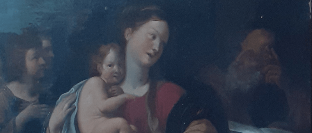
The painting of the Holy Family shown below has hung in the Vicar’s Vestry at All Saints church in Oakham for many years, and has, until recently, never been properly identified. Recent expert advice suggests it is a late 18th / early 19th century copy of a composition by Francesco Albani of between 1608 and 1610. It is believed that it was produced by a workshop in Italy, or perhaps the Netherlands, to satisfy the demands of those on the “Grand Tour” for devotional works. Whilst thus not of any great value, it thus does have an interesting back story.
After a composition by Francesco Albani, paint on metal, late 17th / early 18th century
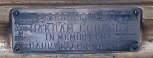
It’s detailed provenance is not known, but a difficult to read caption on the painting frame (below) has the inscription
“Presented to Oakham Church in memory of Harry Ellingworth”.
The Ellingworth family were prosperous shopkeepers in Oakham in the late 19th and early 20th century, and a number of them were named Harry. The most significant of these seems to have been a Harry Ellingworth who was a Town Crier in Oakham in 1881.
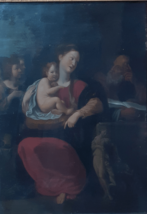
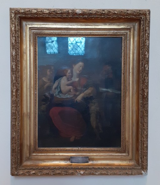
Painting in frame (with window reflections)
Dedication label
Interestingly a number of similar copies of the painting can be traced – either painted in Albani’s workshop or elsewhere (see below). The details vary, but the basic composition is the same. The market for such paintings was clearly buoyant.
Print of the original by Francesco Albani housed in the Museum of Fine Arts in Boston. 1608-1610
Dulwich Art Gallery Holy Family by Studio of Francesco Albani 1610-60
The painting shows a somewhat weary and pensive looking Madonna in a red dress with a dark blue shawl, The Christ child sits on a golden cushion on her lap, partly surrounded by a blue sheet. Joseph looks on from the right, with an open book in front of him, that seems to be placed on a stone chest or altar or perhaps a tomb. It may be that the directions in which the Madonna and her husband are pointing is of some iconographic significance – Joseph, in his contemplation of scripture pointing upwards to God, and Mary, with the Christ child on her lap, pointing down to earth, the direction, if that is an appropriate word, of the incarnation. Two angelic figures look on from the left. There is a figure carved on the stone chest, that, from the original, appears to be some sort of Bachannalia, with wine being poured out for small dancing child like figures. Again there may be some iconographic significance here with a representation of Christ’s blood being poured out at the Eucharist. The mixture of biblical and classical themese seems to have been common at the period of the original composition.
For family reasons, I often make the journey from Oakham to the Chesterton area of Cambridge, travelling by train from Oakham station to Cambridge North, changing at Ely, and then either walking or taking one or more buses to reach my destination. The last leg is actually quite time consuming, and adds considerably to the overall travel time. Now in July 2025, I learnt of the existence of a new bus service from Huntingdon to Fenstanton and then along the Cambridge Busway, through Chesterton to Cambridge, passing very close to my destination (the Whippet Coaches T1). This seemed to me to offer an interesting, and potentially quicker journey, travelling to Peterborough by Cross Country trains, then to Huntingdon on Thameslink, and then onto the bus to my final destination. What follows is a report on the journey there and back via this route, highlighting both its good and bad points.
The journey
I trevelled to Cambridge very early on a Saturday morning, catching the 5.47 East Midlands Trains service from Oakham to Peterborough, and then, after a 9 minute connection, the 6.24 Thameslink service to Huntingdon. The connection was straightforward, although there was some conflict between the online information and what actually happened on the ground with regard to the platforming of the Thameslink train at Peterborough. I arrived at Huntingdon on time at 6.38.
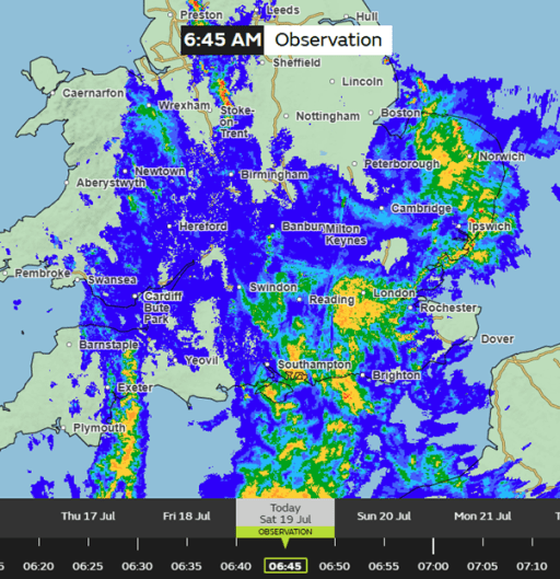
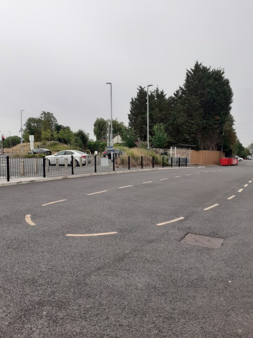
Now the weather that day was “interesting” to say the least, as can be judged from the weather radar screen shot below (Figure 1). The T1 was due to leave the station at 7.19, so I was anxious to find somewhere dry to wait. On leaving the Huntingdon station buildings, I found a convenient bus turning circle, with a respectable shelter (Figure 2). The only problem was that this was obviously not in use, and I was directed to a bus stop on the side of the ring road outside the station, which had no facilities other than a bus lay by and a stop sign (Figure 3). Why this change had occurred I have no idea – presumably something to do with operational convenience – but it had nothing to do with the comfort and convenience of passengers. Not good.
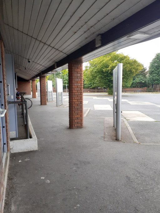
I was not anxious to wait to get soaked in such a situation, so I followed the signs to Huntingdon Bus Station, about a 5 to 10 minute walk away (including crossing the ring road) where the T1 was due to call after the railway station. This was a perfectly acceptable facility, with covered seating and adequate information – the only problem was that it wasn’t at the railway station (Figure 4).
Figure 1. Weather RadarFigure 2. The bus turning circle at HuntingdonFigure 3. The bus stop and layby at Huntnigdon stationFigure 4. Huntingdon Bus Station
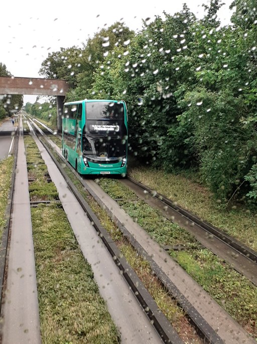
The bus arrived precisely on time. The driver was cheerful and efficient and everything ran smoothly. the bus ran non-stop to Fenstanton, then travelled quite slowly over some minor roads (with cars very dubiously parked) to the Busway at Swavesey. From there the trip was fast and smooth along the busway. The weather by this time was horrible as can be seen from figures 5 and 6. Loadings were light throughout, perhaps because it was a wet Saturday morning. It left the Busway at Milton Road in the north of Cambridge, and stopped at a number of stops along that road (unlike the standard Busway buses that run limited-stop into the city centre). I arrived at the stop I wanted a little after 8.00. The journey time was about 2 hours and 20 minutes, even with the 40 minute sojourn in Huntingdon. That was about the same time that the journey would have taken by train to Cambridge North. It was however rather cheaper, partly thanks to my Bus Pass!
Figure 5. The BuswayFigure 6. The Busway again
The return journey was uneventful, except for the weather. Around about Fenstanton, the persistent rain became a deluge which persisted until after the bus arrived at Huntingdon. The drop off in the layby outside Huntingdon station and the walk into the station building was unpleasant to say the least. I got on the bus at around 12.30 and arrived back at Oakham at 14.20 – half an hour quicker than the outward journey thanks to good connections in Huntingdon and Peterborough.
Reflections
So what was my overall view of the journey. The T1 bus service itself was very pleasant and convenient and Whippet Coaches are to be congratulated. The journye times and stopping places suited me very well. The service has the potential to be more than just a local service and could have a more inter-urban role, if the connections into the rail network were better. The hourly service inevitably means some extended connection times at Huntingdon and / or Peterborough and a more frequent service would be nice, although whether this would be financially viable is perhaps doubtful.
The unpleasant part of the journey was the lack of proper bus connection facilities at Huntingdon station. It is difficult to see how this could have been made worse, and is a classic example of the neglect of the most basic principle of integrated transport. Whoever is responsible (Cambridgeshire County Council perhaps?) should hang their heads in shame.
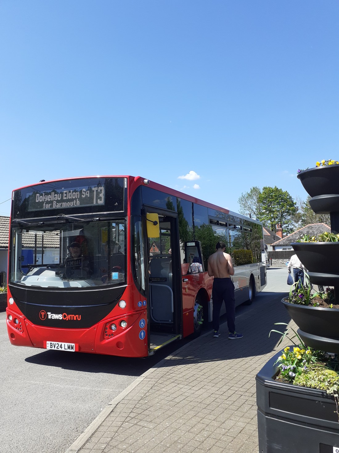
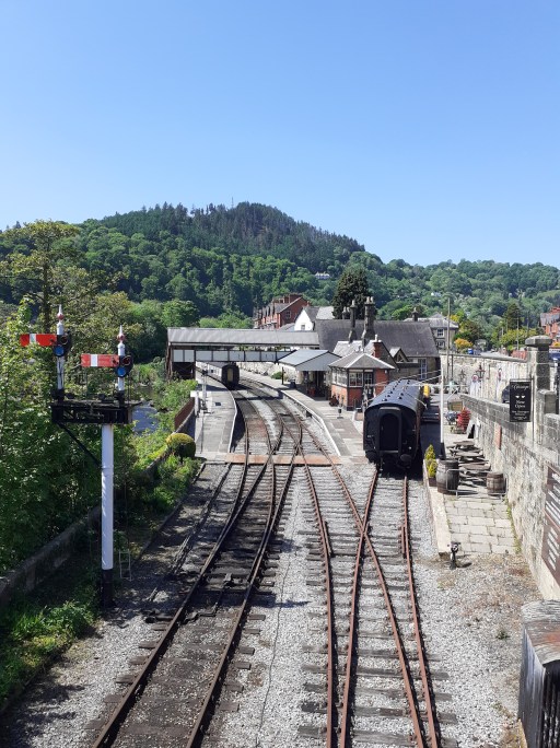
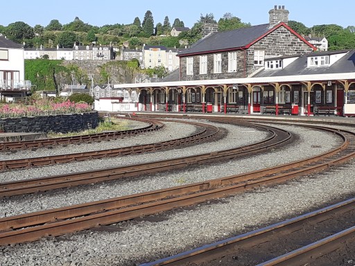
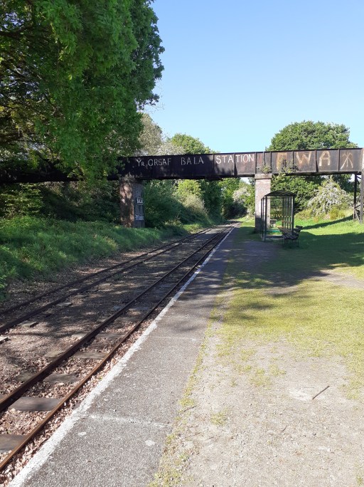
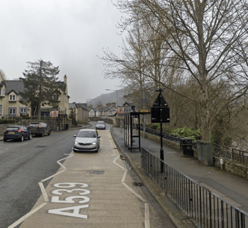
In mid-May 2025, I made a journey that I have had in mind for a number of years – a circular trip around North Wales mainly by inter-urban bus. I had a number of reasons for wanting to make this trip. Firstly it involves travel through some of the loveliest countryside anywhere in Britain. Secondly, it allowed me to indulge my obsession with looking at heritage railway stations, three of which are shown below – I will leave it to the reader to identify them. And thirdly, and for the purpose of this post most importantly, it allowed me to travel on the Traws Cymru bus network. I have watched this network develop from afar over the years, and have often thought I would like to look at it more closely.
In what follows I firstly describe the route that I took and comment on some general aspects. I then consider the vehicles that I travelled on, and then the infrastructure – bus stops and interchanges. Finally I make a number of comments on the good and bad points of the trip.
The route
The first step of my journey was to travel from my home in Oakham in Rutland to Ruabon on the Welsh border by train. This involved changes ta Birmingham New St and Shrewsbury. There were no problems either on the way there or the way out, with all journeys running close to time. At the start of the journey there was the perennial feeling of relief when it became clear my Cross Country train was really running and had not been cancelled, that turned into a feeling of surprise when it actually arrived at Oakham on time. But, as I say, the journey worked well and I arrived at Ruabon around noon as planned.
The Traws Cymru inter-urban bus network in North Wales is shown in the figure above. My first bus was not however part of the Trwas Cymru network, but rather the Arriva 5 from Wrexham to Llangollen that I boarded at Ruabon. I took this rather than wait an hour and a half for the first Traws Cymru T3 bus, and it gave me time for a brief look around Llangollen and a look at the railway station. On boarding this bus I asked for a concessionary 1bws ticket (£4.70 for all day travel on buses in North Wales for English bus pass holders – excellent value). The driver looked a bit mystified but eventually gave me the correct ticket. The bus was quite full – over 50% loaded – but fairly comfortable and made up some of the time after a 10 minute late departure from Ruabon. From then on my journeys were all (bar one) on the Traws Cymru network as follows (approximate loading given in brackets).
Llandudno 13.39 to Corwen 14.04 – T3 (60%)
Corwen 14.15 to Betws-y-Coed 15.03 – T10 (5%)
Betws-y-Coed 15.05 to Caernarfon 16.23 – S1 (30 to 50%)
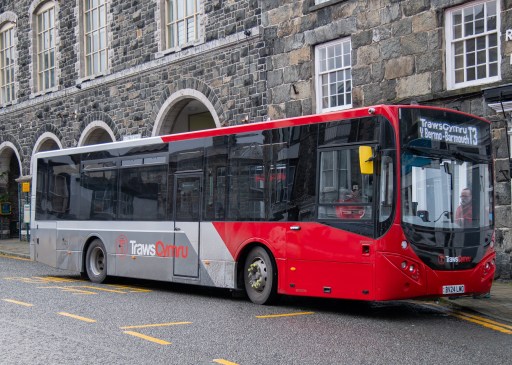
Caernarfon 17.05 to Porthmadog 18.05 – T2 (100%+)
And the following day.
Porthmadog 8.05 to Dolgellau 9.02 – T2 (30%)
Dolgellau 9.03 to Bala 9.33 – T3 (5%)
Bala 11.33 to Ruabon 12.39 – T3 (25%)
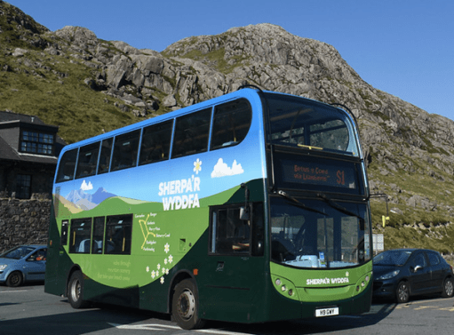
All the journeys kept time very well, and none was more than 3 or 4 minutes late at the point where I disembarked. Throughout the trip, the drivers were helpful and friendly, which makes a hige difference to the passenger experience. The journey not on the Traws Cymru network was the Sherpa S1. I chose to change onto this, rather than continue on the T10 to Bangor and catch the T2 to Caernarfon and Porthmadog there, simply because the ride up to Pen-y-Pass at the foot of Snowdon must be one of the most spectacular and exhilarating in the country.
The vehicles
I am by no means a bus expert, but from what I could gather from various websites, I travelled on the following vehicles.
5 – ADL Enviro400 City, operated by Arriva
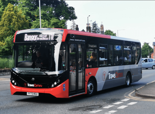
Traws Cymru T2 and T3 – Volvo B8RLE MCV Evora operated by Lloyds Coaches.
Traws Cymru T10 – ADL Enviro200 MMC operated by K and P coaches.
Sherpa S1 – ADL Enviro400 operated by Gwynfor coaches.
Photographs of all but the first of these are shown below
From my point of view as a passenger, the Traws Cymru and Sherpa vehicles were all basically buses – comfortable enough, with nice seats, but not of express coach standards. All vehicles had working USB charging points (something that many rail franchises don’t seem to be able to provide), and two of the Traws Cymru vehicles had WiFi, although this tended to drop out in the more rural areas. Most had screens that could potentially be passenger information screens, although they were not in use. As someone who isn’t terribly well acquainted with the area, the use of such screens to tell me which stop was coming next would have been really useful, and would have meant that I did not have to rely upon Google maps. In general though, I found the buses a pleasant and efficient way to travel, although I doubt I would have found them terribly comfortable for journeys of much more than an hour.
Bus stops and interchanges
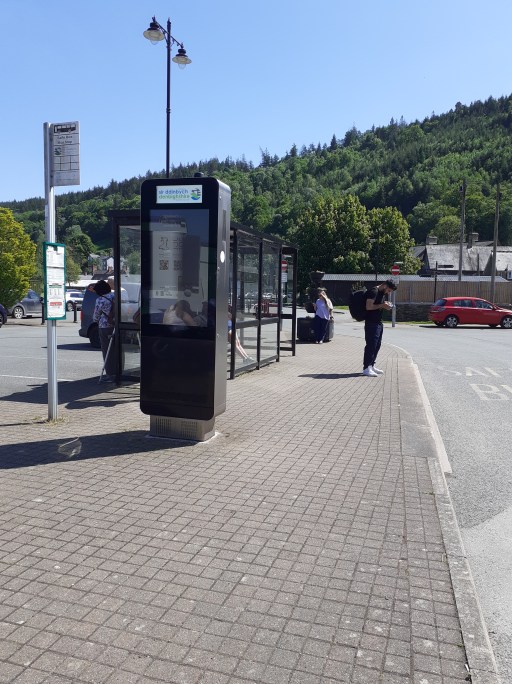
Bus stops and interchanges are an integral part of any public transport journey, but in my experience receive far less attention and allocation of resources than they should. These feelings were reinforced on the journey described in this post
Ruabon station bus stop
At Ruabon the Traws Cymru stop was just outside the station building. It contained basic information about timetables, but no real time information. The shelter was functional but nothing more. I actually only used this stop on my return journey – the Arriva 5 left from a stop at the end of the Station Drive. Here the same information (about northbound buses to Wrexham only) was being displayed in the shelters on either side of the road, which was confusing to say the least. If one didn’t have a basic grasp of the geography of the area, it would be easy to have got on the wrong bus.
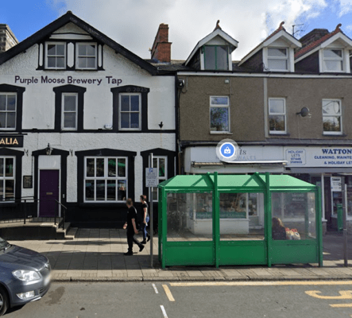
At Llangollen I got off and on the bus at the Bridge Hotel stop. This can be seen to be a roadside stop of the most basic sort. Fortunately it wasn’t raining. There was a timetable displayed, but no real time running information.
Corwen was very different. Here there are proper interchange facilities with good, real time information, a solid shelter and space to wonder in the bus stop area. I think I could make out a toilet block too, but didn’t investigate it. This is a nice facility. It would probably benefit from not being branded as “Corwen Car Park” – although it is indeed in the centre of a car park. It is much better than such a name would suggest. My only worry would be that the shelter would not be large enough for all those changing vehicles on a wet day. But this is how it should be done.
Corwen bus stop, waiting area and information panel
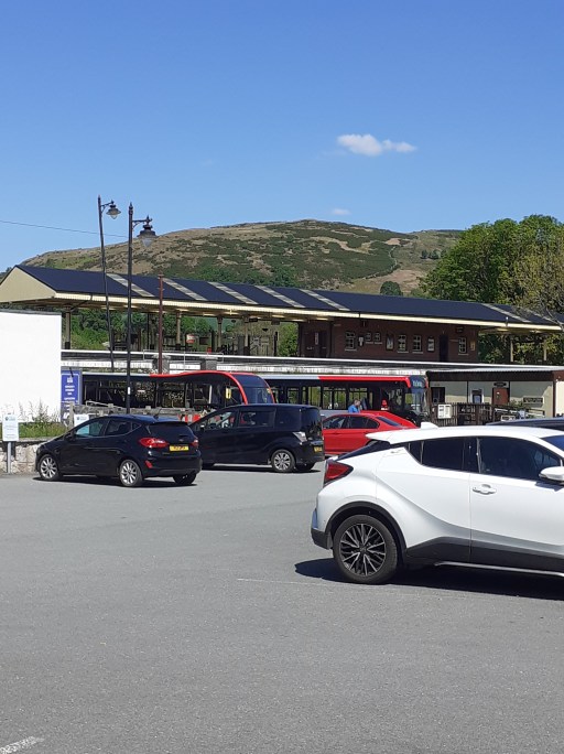
Betws-y-Coed is a strange place. It seems to be drowning in an ever expanding sea of car parks that have obliterated whatever it was that attracted folk there in the first place. The interchange is close to the station, and whilst there is shelter and some timetable information, I found the interchange, with four buses parking in an area that simply wasn’t large enough, very confusing and unsettling. Indeed I boarded the wrong bus at my first attempt. I think that there is scope for producing something like Corwen here, but it will cost I guess. Sadly the adjacent railway line, with its not-quite three hour interval service simply isn’t part of the interchange game here, which is based on a regular two hourly frequency.
Caernarfon bus station is simply a row of three of four bus stop and bays along a narrow street. However there is good passenger information and the provision of shelters is adequate. No problems here from my perspective.
I began my second day at the bus stop outside the Australia in Porthmadog. It is simply a roadside stop. Passenger information and creature comforts are minimal. Porthmadog deserves better.
With my trip almost over, it reached its low point – Eldon Square in Dolgellau. This was perhaps the most chaotic bus interchange I have ever experienced with four buses double parked in wholly inadequate, highly trafficked space. There may have been public information systems, but such was the chaos I couldn’t find anything. The place is simply not fit for purpose. It is clear from a web search that its inadequacy is well appreciated and there have been long term discussions about how to overcome the issues. Maybe something will be sorted out in future, but of all my memories of the trip, Eldon Square is the one that remains with me. I will do my utmost to avoid ever having to use it again.
My final change of buses was at Bala – simply alighting at the stop in the centre and getting on the next bus in two hours time. again, it was a simple roadside bus stop. with only a paper timetable provided, amongst a sea of notices pasted to the stop itself. Very oddly, one of these was advertising a vacancy for a clergyman in East Sussex!
Some closing thoughts
On balance I was quite impressed by the Traws Cymru network. The regularity and timekeeping were impressive (although I suspect the latter might suffer when the traffic is busier in the high season) and the tickets were excellent value. The buses were comfortable, at least for journeys up to an hour or a little longer. It would be good if more use could be made of the on board information screens, particularly for passengers who don’t know the area well. The bus stops and interchanges were not so impressive however, with only just tolerable information provision (and hardly any in real time) and shelter provision in most places. I suspect if the weather had been wet, I would have been less impressed by the experience. The contrast between my experience at the well thought out interchange at Corwen and the chaos of Eldon Square in Dolgellau was quite stark. Something really does need to be done about the latter.
A recent news item indicates that an express North / South Wales coach service is under consideration, over the route of the current T2 to Aberystwyth and the T1 from there to Carmarthen, which would only have a relatively small number of stops in the larger towns. From my perspective this is to be welcomed, but I would urge anyone involved in implementing such a scheme not to forget the passenger infrastructure where the coach calls. If a premium service is to be provided by high quality coaches, then this must be matched by higher quality passenger facilities at its calling points, with good quality shelter and information systems – and ideally toilets and access to refreshments. Good interchange with the rail network should also be provided, with something better than a bus stop in the station carpark, Without such provision I fear any such experiment will fail.
Readers of two earlier blogs will know that I have been a collector (or perhaps better described as a hoarder) of train and bus timetables for many decades. In the two posts, I used this collection to look at public transport developments in Oakham and the development of the cross city rail line in Birmingham, both over the last 50 or 60 years. In this post, I do something similar, and look at how the rail journeys through the Gwynedd town of Porthmadog have changed from the 1960s to the present day. Specifically I look at how services on the Cambrian Coast railway have changed over that period. I visited the area many times from the 1980s onwards, and particular from the mid 1990s through to the mid 2000s for family holidays. These holidays were often focussed on travelling on the Ffestiniog Railway and were thoroughly enjoyed by all. I do not however consider the services on the FR in this blog, except in passing.
In what follows, I basically consider the southbound services through Porthmadog in terms of frequency, connectivity, journey times and reliability, with my considerations based on timetables I have in my collection or are easily accessible over the web. The services heading east to Pwllheli exhibit much the same trends. But first we need to set out the basic facts about the Cambrian Coat line itself.
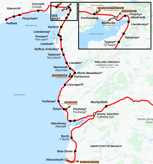
Cambrian Coast line
The Cambrian Coast line is shown on the map if Figure 1 (from Wikipedia). It extends from Pwllheli in the north to Dovey Junction in the south, where it meets with the Aberystwyth to Shrewsbury line. In between it passes through a number of small towns (Criccieth, Porthmadog, Harlech, Barmouth and Tywyn) and a larger number of villages. It is a single track route with a number of passing places – at Porthmadog, Harlech, Barmouth and Tywyn.
In the pre-Beeching area, there were two other connections with the national rail network – at Afon Wen between Pwllheli and Criccieth where the line was met by the Caernarfon and Bangor line; and at Morfa Mawddach, south of Barmouth, where there was a junction with the line to Dolgellau, Llangollen and Wrexham. At Porthmadog the line was crossed by the narrow gauge Ffestiniog and Welsh Highland Railways.
From the 1960s onwards the main service on the line has been between Pwllheli and Machynlleth, the latter being the first main station on the Aberystwyth to Shrewsbury line after Dovey Junction. Some of these services continued to Shrewsbury and beyond, often having attached to a service from Aberystwyth. These services have been provided by a number of operators – British Rail up to privatisation in 1996, then Regional Railways Central, which morphed into Central Trains from 1996 to 2001, then within the Wales and Border franchise operated by Arriva Trains Wales up to 2018. The franchise was then awarded to Keolis Amey Wales by Transport. Following the financial collapse of the franchise in 2021, services have been provided directly by Transport for Wales, through Transport for Wales Rail.
The traffic on the line is mostly passenger – some local traffic for work / school / leisure purposes, but mainly tourists and holidaymaker traffic that, inevitably, is much higher in the summer than in the winter. The major destinations are Barmouth, Porthmadog and Pwllheli, and up to the 1980s, there was a sizeable flow to Butlins near Pwllheli.
Post-Beeching the traction on the line was mainly coaches hauled by diesel locomotives – class 25s and then class 31s. But by the 1980s, the dominant forms of traction were DMUs of various types. Services are now provided by two coach Class 158s.
More details of the line can be found at its Wikipedia page, although this is somewhat unbalanced in subject matter and not terribly consistent in format and style.
Frequency Analysis
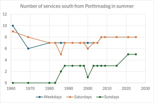
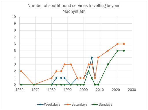
Figure 2 shows the number of trains on the line from 1960 to the present day, for weekdays, Saturdays and Sundays. These are southbound trains through Porthmadog during the summer period (there often being a slight reduction in the winter). In the early 1960s (pre-Beeching) there were nine or ten services on the line. including through trains to Wrexham (and beyond) from the junction at Morfa Mawddach. Many of the services terminated at Barmouth. There were also trains from Pwllehil to Bangor via Afon Wen that did not pass through Porthmadog. After the Beeching cuts however, the service number settled down somewhat to seven or eight per day on weekdays and Saturdays. Sunday services were introduced in the 1980s and the number of these have steadily increased to around five per day.
Figure 2. Southbound services
Figure 3 shows the interval between services on weekdays only – the graphs for Saturdays and Sundays tell the same story. Broadly, up to 2007, the services were irregular, with intervals between services from one hour to three hours are more. Around that time, a regular interval timetable was imposed, with trains at broadly two hourly intervals. This will be reflected in much of the discussion that follows.
Figure 3. Intervals between southbound services
Connectivity Analysis
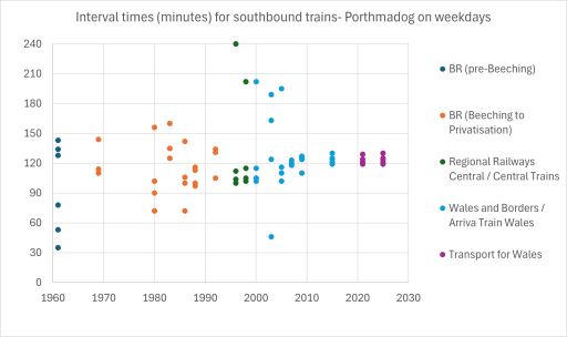
Figure 4 shows the number of through trains that ran south from Porthmadog and went beyond Machynlleth, again for weekdays, Saturdays and Sundays. From the 1960s to the 1980s these were very occasional, with most through trains running on Saturday for the holiday market. These included the Cambrian Coast Express to Euston. From the 1990s onwards the number of through services increased, mainly through the Cambrian Coast DMU coupling to the service from Aberystwyth and running to Birmingham New Street. In the late 1990s and early 2000s the turnaround time at New Street was very tight, which led to unreliability and late running, the effect of which was magnified by the single track nature of the line westwards from Shrewsbury, with delays caused by the need to wait for passing trains. This was to some extent alleviated from 2008 when most services ran through to Birmingham International. Most services on the line are now through services, although, oddly, the current timetable doesn’t acknowledge this and suggests a change at Machynlleth is necessary. There seems no obvious reason for such reticence, unless the operators are simply keeping their options open to terminate the Cambrian Coast services at Machynlleth.
Figure 4. Southbound services beyond Machynlleth
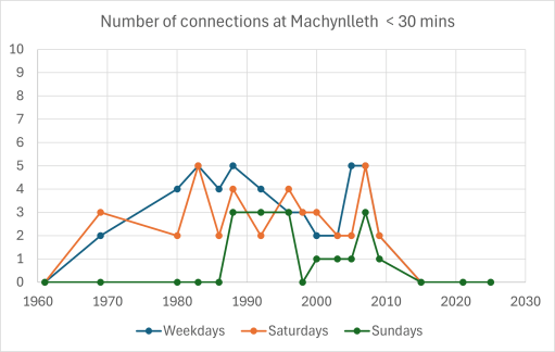
Figure 5 shows the number of connecting services from the Cambrian Coast line onto the Aberystwyth – Shrewsbury – Birmingham services, with a connection time of less than 30 mins. These peak in the 1980s and 1990s and then fall off as through trains become the norm.
Figure 5. Connections at Machynlleth
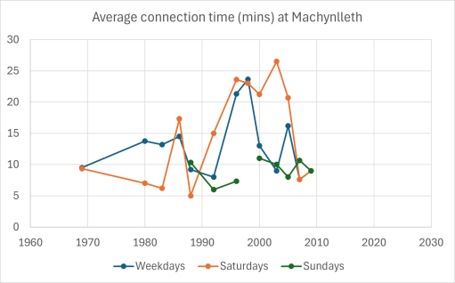
Figure 6 show the average connection times at either Machynlleth or Dovey Junction. In the 1990s and early 2000s the average connection time was over 20 minutes, with some connections (if they can be called that) having times of 40 minutes or more. Machynlleth is a very pleasant station on a dry summers day, and it is a pleasure to wait there. However, it is in mid-Wales and such days are few and far between. In general waiting there for 30 or 40 minutes for a connecting train was usually rather unpleasant. Some services required a change at Dovey Junction, a station with road access, minimal facilities and in the middle of a bog. Again on a dry summer’s day it has a certain bleak charm. But one suspects scheduling connections there was simply an act of sadism by the franchise timetabling teams.
Figure 6. Connections times at Machynlleth
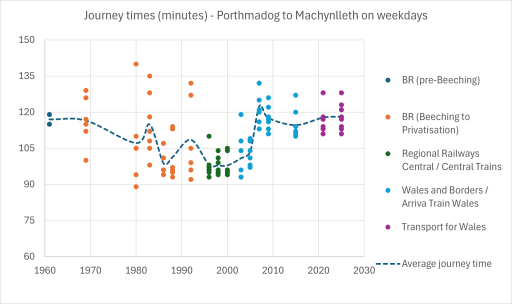
Journey Time Analysis
Figure 7 shows the journey times between Porthmadog and Machynlleth on weekdays – again the Saturday and Sunday times are similar. From the 1960s to the mid 1990s these decrease from around two hours on average to around one hour forty minutes on average, with a wide spread. In 2007, coinciding with the introduction of a regular interval service, there is a sharp increase in average journey times to around one hour and 55 minutes – roughly the same as in the 1960s.
Figure 7. Journey times
Reliability Analysis
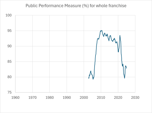
The rail industry measure reliability through the use of a Public Performance Measure (PPM). Essentially it produced a figure between 0 and 100% that is a measure of lateness / cancellation etc. All franchises are given targets for the measure that they have to meet. A value of 90 to 95% is regarded as adequate or good whilst one of 80% is regarded as poor. The historical figures for the whole of the Wales and Borders franchise are given in Figure 8. (The figures for individual routes are not easily available – at least I can’t find them on the web.) The graph shows a significant increase in PPM between 2006 and 2007, which coincides with the frequency and journey time savings on the Cambrian Coast. Now the Wikipedia page indicates that the Cambrian line was by far the worst performing line in the franchise, so it is not unreasonable to conclude that the changes made there in 2007 had a significant effect on the overall franchise PPM.
Figure 8. Public Performance Measure
Discussion
The major point to arise from the analysis presented above, is that in 2007 there was a positive decision to adopt a regular interval timetable, which enabled an increase in through journeys beyond Machynlleth through coupling with the Aberystwyth trains and resulted in a significant increase in reliability. However, this also resulted in a significant increase in journey times. The question arises as to whether a regular timetable and better connections and reliability was worth the extended journey times. I am inclined to think it was, but others may well disagree.
But could journey times be improved? I think perhaps they could be. simply having a longer layover at Pwllheli, with trains arriving there earlier and leaving later, should keep similar times for all the trains in the passing places. However I say this without having done any sort of timing analysis, which would require detailed route information and train performance characteristics. But perhaps a few minutes could be taken off the journey without loss of reliability.
Similarly, could journey frequency be improved to an hourly service? Leaving aside the issues of whether passenger numbers warrant this, or of stock availability, the answer is probably yes, if the two currently unused passing places at Barmouth and Porthmadog are brought into use. However this would effectively mean that the line was running at capacity – which would almost certainly lead to loss of reliability. A better way to improve service frequency would be, in my view, a closer integration with the Traws Cymru T2 bus service from Aberystwyth to Bangor via Machynlleth and Porthmadog. Indeed that service already offers a 1 hour 28 minute journey time between Machynlleth and Porthmadog – considerably better than the rail journey time, although it does take a much shorter route through Dolgellau.
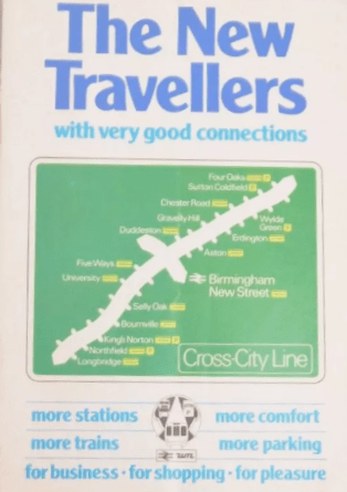
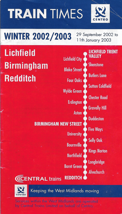
I have been a collector of old bus and railway timetables for many years, with no particular end in view, other than to put them in boxes for some unspecified future use. However, the assembled timetables seem to be too good a resource not to make use of in some way, and I used some of them to compile a recent post on the development of public transport in Oakham in Rutland. This went down surprisingly well with readers, which shows there are some very odd folk out there. But the reception has encouraged me to press ahead with a series of posts that will use my stash of timetables to look at the development of public transport services in particular places or on particular routes. This particular post will consider the development of the Cross City railway line that runs from Lichfield in the north, through Birmingham, to Redditch and Bromsgrove in the south. There is an excellent Wikipedia article that describes the history of the line, and there is little point in reproducing that, and in this post I will concentrate on the development of the timetable on the line from the early 1960s (when it didn’t exist as one route) through to the present. It will be seen that it is in some sense a story of ambition that has never been quite fulfilled because of operational issues.
In what follows we will track this timetable development through the use of timetable extracts – usually for the weekday morning post peak period, but sometimes for other parts of the day where the (lack of) availability of information makes that necessary. This shows the broad outline of the timetable, but cannot of course capture the full detail.
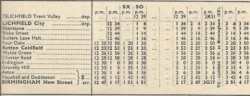
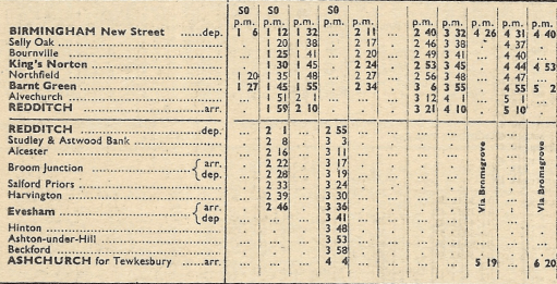
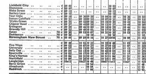
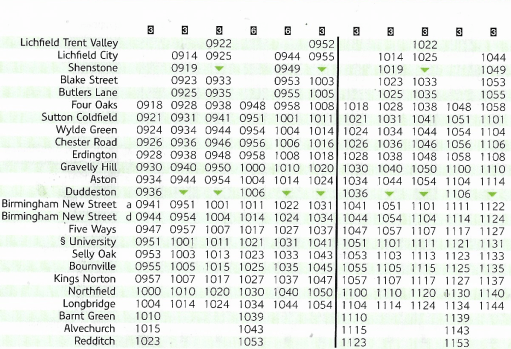
September 1962 to June 1963
North
South
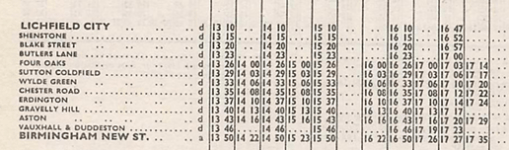
We first of all consider the situation in the early 1960s. Extracts from the timetables for the routes that were ultimately to form part of the Cross City line are shown above, for the early afternoon weekday period (taken from the London Midland Region timetable for September 1962). It can be seen that there is broadly a half hourly service from Lichfield city to Birmingham New Street. Connections are provided to Lichfield Trent Valley (where the current Cross city line crosses the West Coast Main Line) by a Burton on Trent – Lichfield – Walsall service, with occasional through services from Trent Valley to Birmingham. Some trains started and terminated at Four Oaks, but there was no regular pattern. South of New Street, the service to Redditch was somewhat sporadic, with some trains extending to Evesham and Ashchurch for Tewksbury. Note that trains did not at that stage call at Five Ways (which was closed) or University (which didn’t exist).
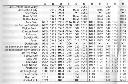
September 1964 to June 1965
North
South
By 1964, the first wave of the Beeching cuts had taken place and the timetables above (again from the London Midland Region timetable) such trains as there were to Redditch from New Street terminated there. North of New Street, the service to Lichfield varied between a thirty minute and an hourly frequency, with hourly trains starting at Four Oaks. Again, there were connections to Lichfield Trent Valley from Lichfield City on the Walsall to Burton service.
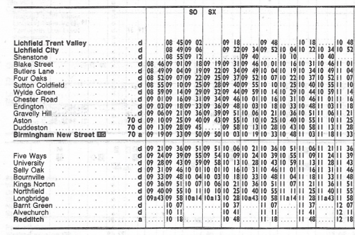
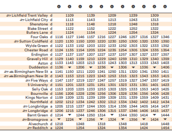
May 1969 to May 1970
North
South
The May 1969 timetable (from the London Midland Region timetable downloaded from Timetable World) shows a more regular service on the north end of the route, with an hourly service from Lichfield City and a thirty minute service from Four Oaks to New Street. South of New Street the trains to Redditch were again somewhat sporadic, with one, two or three hour intervals between them.
May 1978
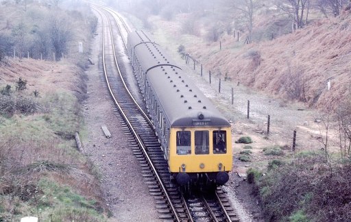
The Cross City line opened in something like its current form in 1978. The graphic above (a screenshot from a rather fuzzy ebay photo) shows that it was marketed as a service between Longbridge and Four Oaks, with a fifteen minute interval service between the stations. There were in fact hourly trains to Lichfield City that were not referred to in the timetable shown, and sporadic trains to Redditch in the south. The route was operated at this stage by Class 116 DMUs. Five Ways station had been re-opened and a new station built at University.
Class 116 DMU
May 1980 to May 1981
The May 1980 service (shown above from the national BR timetable) is similar to the 1978 service. Here the extract shows no services to Redditch although there were again some sporadic, mainly peak hour services down the Redditch branch.
May 1983 to May 1984
By May 1983 the situation to the south had become more satisfactory with hourly trains to Redditch, with Lichfield City also having hourly trains, and four an hour from Four Oaks to Longbridge.
May 1984 to May 1985
One year further on, in May 1984, the situation is again similar, but with one of the Four Oaks trains per hour extended to and from Blake street.
July to September 1991
By 1991 there were significant changes. Two trains per hour ran south from Lichfield Trent Valley (which had been reopened in 1988), four trains per hour from Lichfield City with some peak services running from Blake Street.. To the south there were four trains per hour to Longbridge, two of which were extended to Redditch.
September to November 1992
The BR national timetable showed that the situation in September 1992 was very similar to the previous year, but was only timetable to extend to the end of November 1992, when a different timetable came into operation (see below).
December 1992 to May 1993
The December to May 1993 timetable is very odd, with the services being split at New Street, with four trains per hour from Lichfield Trent Valley to Birmingham, and four to Longbridge, with two extended to Redditch. There is no rationale given for this but may well have been something to do with the electrification works that were going on at the time.
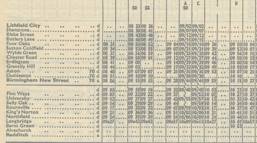
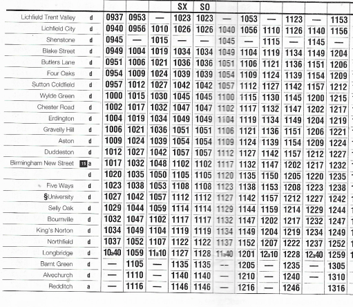
June to September 1997
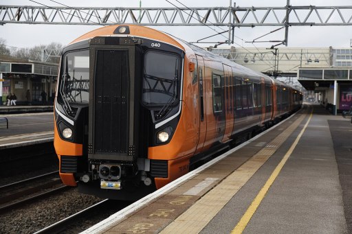
My more intimate involvement with the Cross city line began in 1997/8 when I began working at the University of Birmingham, whilst living in Lichfield, and travelling on the line daily. I thus began collecting the Cross City pocket timetables at this point. It will be seen below that the art work / size / format changed continually over the years that were to follow. The route had been electrified in 1993 and was thereafter, until 2024 operated by Class 323 EMUs, up until 2020 in mainly three car formation, with some six car trains at peak times. The situation was similar to the early 1990s with four train per hour frequency between Lichfield City and Longbridge , with two trains per hour extended to both Redditch and Lichfield Trent Valley.
Class 323 EMU
June to September 2002
In the summer of 2002 we have a very similar looking timetable and frequency, albeit with some slight changes of times. But in general we can see the timetable pattern has remained stable over at least five years.
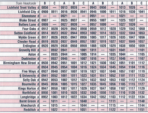
September 2002 to January 2003
In September 2002, there was something of a revolution. The number of trains was increased to six per hour, with four beginning their journeys at Lichfield Trent Valley, and two at Lichfield City and four ending their journeys at Longbridge and two at Redditch. The stopping pattern was complex with not all trains stopping at all stations. To try to make life easier for passengers, trains were to carry a headcode (that can be seen on the above timetable) indicating their destination and the stopping pattern. To put it bluntly, the service was an absolute disaster. A very frequent service with variable stops needs to be highly reliable – and that has never been the case for the Cross City line, largely due to congestion at New Street. My memory is of confused and angry passengers, very late running and many cancelled trains. Although the ambition was laudable, the pattern was never going to work. My memory is that it was replace by an emergency timetable within only a few weeks of its implementation, but I can’t be certain about that. At any rate, a new timetable was issued from January 2003.
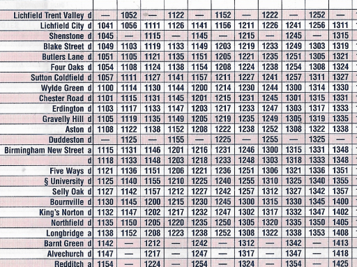
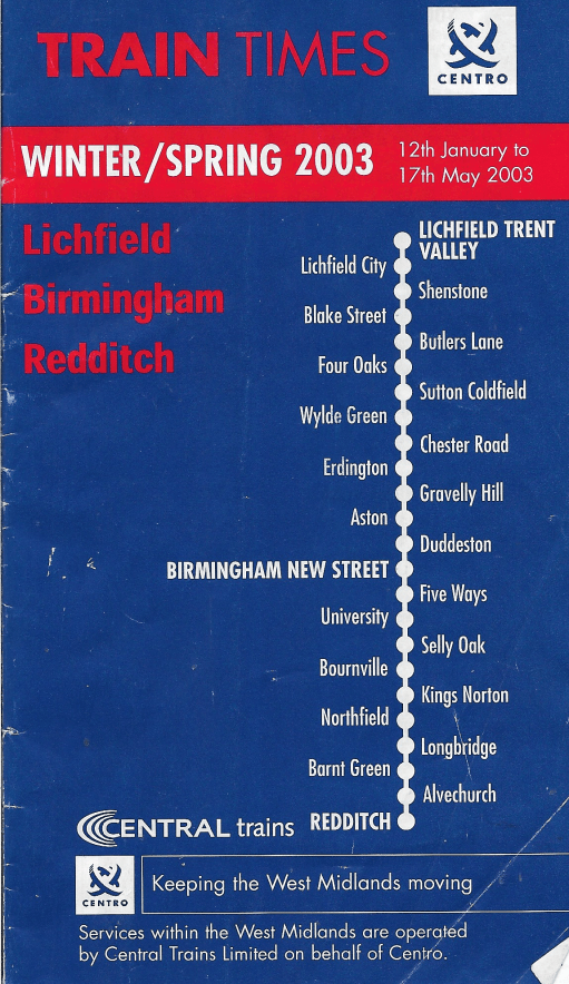
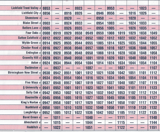
January to May 2003
The new timetable again had six trains an hour, two beginning at Trent Valley, two at Lichfield City and two at Four Oaks, with four an hour terminating at Longbridge and two at Redditch. With only minor exceptions (Shenstone and Duddeston), all trains stopped at all stations. From a personal perspective, this led to an unbalanced departure schedule at Lichfield City, with twenty and ten minute intervals, but this pattern was to persist, in essentially the same form until 2018.
May to December 2009
The 2009 timetable is very similar to that from 2003, with very minor changes of timing.
May 2015
Similarly the 2015 timetable was of the same form, but Redditch was now served by three trains per hour following the opening of a passing loop at Alvechurch that increased the capacity of the branch.
May to December 2019
The main change in 2019 was the extension of two of the three services that terminated at Longbridge to Bromsgrove, following electrification of the line through Barnt Green, with some other slight timing modifications. Then in 2020 COVID happened.
May to December 2022
During the COVID lockdown, the services on the cross city line were scaled back to four per hour, with two starting at Lichfield Trent Valley and two at Four Oaks, with two terminating at Bromsgrove and two at Redditch and this pattern was to persist. These four trains used four of the six paths from the earlier six train timetable resulting in unbalanced intervals between trains along the line. Stations north of Four Oaks suffered particularly, with the service being reduced to half hourly, the lowest level of service since the mid-1980s. To make up for this all services were six coaches however.
December 2024 to May 2025
In the present 2024 winter timetable, this situation persists, for good or ill. The quality of the rolling stock has however increased with the use of Class 730 EMUs.
Class 730 EMU
Journey times and leaf fall timetables
Finally, before I close, I will brielfy discuss journey times and leaf fall timetables, which are quite closely connected. I take the journey time between Lichfield City and Birmingham New Street as a comparative value through the years. In the 1960s, when the service was operated by Class 116 DMUs, the journey time was around 45 minutes, but by the close of the decade it had reduced somewhat to between 40 and 42 minutes. . After electrification with the introduction of Class 323 EMUs , this time fell to between 35 and 37 minutes. Current times with the Class 730 are still around 37 minutes.
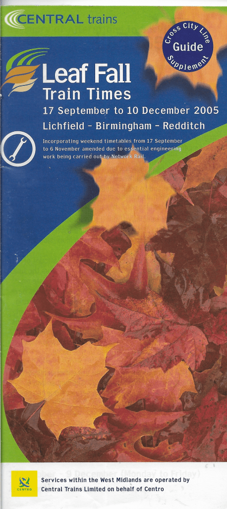
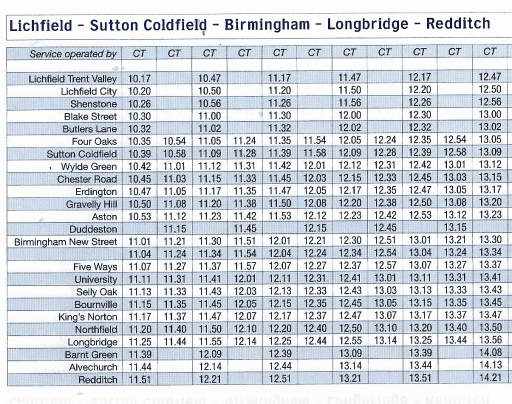
From the early 2000s a “leaf fall timetable” has operated on the Cross City line between October and December, when track conditions can become difficult. A typical example for 2005 is shown below. At the time the normal timetable consisted of six trains an hour, with two starting at Lichfield Trent Valley, two at Lichfield City and two at Four Oaks, with four terminating at Longbridge and two at Redditch. The revised timetable shows four trains an hour, with two starting at Lichfield Trent Valley and two at Four Oaks, with two terminating at Longbridge and two at Redditch. Journey times from Lichfield City to Birmingham New Street were 45 minutes. There was thus both a significant reduction in service frequency and a significant increase in journey time in the interests of maintaining reliability.
Closing remarks
As I said at the start of this blog, the history of services on the Cross City line show a commendable ambition on behalf of the operators, but with this ambition compromised by lack of operational reliability. The six train per hour service that operated from 2003 was notoriously unreliable, with this unreliability in the peak leading to significant overcrowding as two trains worth of passengers often tried to squeeze onto one, with most trains having only three coaches. Perhaps the current less frequent timetable, but with longer trains, is more satisfactory in that regard. The unbalanced timetable, with alternating ten and twenty minute gaps between trains is far from satisfactory however. If one is optimistic, one might say that this will allow six trains per hour to be reinstated in the future, but if this is not going to be the case, the timetable really does need recasting with a consistent fifteen minute interval.
This post simply shows some photographs that I have found amusing for one reason or another in the past, in the hope that others may also find them enjoyable. They have been collected over the last couple of decades, and I am afraid I don’t know the source of some of them, but if any reader can supply the missing information, I would gladly acknowledge the photographer, or remove the pictures if required.
Unknown source. From around 2015
Unknown source (from 2023/4)
From Prof Roger Goodall, Loughborough University
Unknown Source, 2020?
Unknown Source, 2023?
Unknown Source, 2023?
Jim Baker, Cromer 2024
Oakham, 2024
BBS Gloucestershire December 2024Unkown soutce 2023?
From Twitter 2014 “Thomas the Tank Engine: The crystal meth years.”
Over the decades I have sporadically and wholly unsystematically been a collector and hoarder of bus and train timetable booklets and leaflets, and despite a recent clear out, the collection still takes up significant shelf space. I have no real idea what to do with it, but it is interesting to look at and ponder. Recently I have become a user of the British Newspaper Archive, and I have just discovered that if you use the correct search terms then a whole load of bus and train timetables published in newspapers can be accessed and downloaded. The positive thing about this is that don’t further reduce my shelf space, although at the moment they are littering my hard drive rather badly. And whilst again, I have no real idea what to do with them, the early ones, from the nineteenth century, are, at least to me, really interesting. In this blog I will discuss just one set of such timetables, from the County Express newspaper that served the areas of Brierley Hill, Dudley and Stourbridge, from Saturday October 24th 1868. In particular I will focus on train services through Dudley station at that time, when there was a very extensive set of services and travel opportunities. Trains no longer serve Dudley of course, so this exercise is somewhat poignant. But first, I will consider Dudley station itself as it would have been in 1868.
Dudley Station
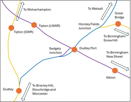
Dudley station is very well described on the Disused Stations web site. In 1868 the track layout had taken on a form that was to continue to exist, with period revisions, for much of the next century. It was in essence two stations. On the west side, there was the GWR station on the former Oxford, Worcester and Wolverhampton line that ran from Oxford, through Worcester, Kidderminster and Stourbridge and on to Wolverhampton. On the east there was the LNWR station that was the terminus of the former South Staffordshire Railway from Burton, Lichfield, Walsall and Dudley Port and also the terminus of the LNWR Stour Valley Line that ran to Dudley Port and joined the main LNWR Wolverhampton to Birmingham New Street Line. Each half of the station consisted of an island platform, with an overbridge connecting them with each other and with the main station entrance on the Tipton Road. There were extensive goods facilities for both the GWR and the LNWR to the north of the passenger station. The map in the figure below shows the station and the lines that pass through it in relation to the local network.
Dudley station and its locality
Services using the station
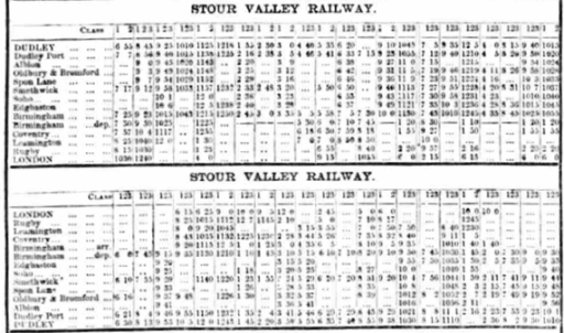
The County Express gives timetables for four distinct services that used the station in 1868.
Services on the GWR London Paddington to Wolverhampton route via Worcester.
Services on the GWR Great Malvern to London Paddington route via Birmingham Snow Hill.
LNWR services on the South Staffordshire line to Birmingham New Street and London Euston via Walsall.
LNWR services on the Stour Valley route to Birmingham New Street and London Euston via Dudley Port and Smethwick.
I will consider each of these in turn, and try to describe the nature of the services, their frequency and journey times. But first there are two caveats that need to be made. Firstly, as can be judged by the example at the top of this post, the timetables on the scanned pdf of the County Express are not always easy to read, and this might lead to some minor errors in any numbers I quote, although the big picture will not be affected. Secondly, and more importantly, the timetables read as if some of the local services become through trains to long-distance destinations. I suspect that this might, in places, be hiding journeys where a change of train is required. I will try to highlight my uncertainties in this regard as they arise.
GWR London Paddington to Wolverhampton via Worcester
There were eleven southbound services that called at Dudley on this route on weekdays, and five on Sundays. The corresponding numbers for northbound services were thirteen and seven. Those going south called at some combination of Netherton, Round Oak, Brierley Hill, Brettell Lane, Stourbridge, Hagley, Churchill, Kidderminster, Fearnall Heath, Worcester and stations to Oxford and London; and those going north called at Tipton, Princes End, Daisy Bank, Bilston, Priestfield and Wolverhampton. These stations were not always at their final or current locations – for example Netherton was moved northwards when the Dudley to Old Hill line was opened in 1878 to be north of junction, and Stourbridge was moved south and renamed Stourbridge Junction when the Town branch was opened in 1879.
There were five weekday trains in each direction that ran through to Paddington, with most of the rest running to Worcester. Journey times were approximately as follows.
Dudley to Wolverhampton – 20 to 25 minutes Dudley to Stourbridge – 30 to 40 minutes Dudley to Worcester – 1 to 1.5 hours Dudley to London Paddington – 4.5 to 6.5 hours
GWR Great Malvern to London Paddington via Birmingham Snow Hill
There were eleven trains from Dudley to Birmingham Snow Hill and beyond on this route on weekdays, and six on Sundays, with ten and six in the Great Malvern Direction. Those going to Malvern called at some combination of Stourbridge, Kidderminster and Worcester (and not the intermediate stations) and those going to Snow Hill and Paddington ran along the LNWR line through Dudley Port (not stopping) to Horseley Fields junction and then called at Great Bridge, Swan Village, West Bromwich, Handsworth, Soho, Hockley, Birmingham Snow Hill , Warwick, Leamington, Oxford and Paddington.
Five weekday services ran through to Paddington with 6 in the reverse direction, with the others terminating either at Snow Hill or Leamington. Some of the Malvern services terminated at one of the intermediate stations. Journey times were approximately as follows.
Dudley to Birmingham Snow Hill – 30 to 35 minutes Dudley to London Paddington – 4 to 6 hours Dudley to Stourbridge – 15 to 20 minutes Dudley to Worcester – 1 to 1.5 hours Dudley to Great Malvern – 1.5 to 2 hours
Thus, the times from London to Paddington were similar on both GWR routes. This route gave a much faster trip to Stourbridge, Kidderminster and Worcester as trains did not call at the intermediate stations. The Disused Stations site suggest that the particular utility of this route was that fast trains could be turned around at Dudley and thus ease potential congestion at Snow Hill.
LNWR Dudley to Birmingham New Street via Walsall
In the County Express this is referred to as the South Staffordshire Railway, (SSR) although by 1868 it was fully incorporated into the LNWR The SSR main route was from Derby to Birmingham New Street via Burton upon Trent, Lichfield and Walsall. The services outlined in the County Express were thus on the southern leg of the SSR and operated as stopping services from Dudley to Walsall and Walsall to Birmingham. The timetable implies that these were through services, although this would have required a quite rapid reversal at Walsall (perhaps a change of engines, or perhaps passengers were required to change). There were thirteen services form Dudley to Birmingham New Street on weekdays and four on Sundays, with thirteen and fivein the opposite direction. The trains called at Dudley Port, Great Bridge, Wednesbury, Walsall, Bescot Junction, Newton Road, Hampstead and Great Barr, , Perry Barr, Aston, Bloomsbury, Lawley Street and Birmingham New Street. Only about half the trains called at Lawley Street, Bloomsbury and the stations from Pery Barr to Walsall. The approximate journey times were as follows.
Dudley to Walsall – 25 to 30 minutes Dudley to Birmingham New Street – 1 to 1.5 hours
The journey from Dudley to Birmingham was thus a lengthy one and probably not attractive, and the service was clearly aimed at serving local traffic between Dudley, Walsall and Birmingham.
LNWR Dudley to Birmingham New Street and London Euston Square via Dudley Port and Smethwick
This LNWR route is described as the Stour Valley Railway by the County Express. It gained its name from the original intention to extend it over the Dudley ridge into the Stour catchment to the south. This aim was abandoned quite early, and though it retained its name, it remained stubbornly in the Tame catchment. There were fifteen services from Dudley to Birmingham and London on weekdays and seven on Sundays, with fifteen and six in the opposite direction. Trains called at Dudley Port (via the loop at Sedgeley Junction), Albion, Oldbury and Bromford, Spon Lane, Smethwick, Soho, Edgbaston and New Street, and then onto Coventry, Leamington (via the LNWR Kenilworth loop), Rugby and Birmingham. Six weekday up trains continued to London, with the others terminating at either Birmingham or Leamington. Approximate journey times were as follows.
Dudley to Birmingham New Street – 30 to 40 minutes Dudley to Leamington – 1.5 to 2 hours Dudley to London Euston – 3.5 to 4.5 hours
The times from Dudley to both Birmingham and London were thus both very competitive with others.
Other services
The County Express gives details of some other services that it no doubt felt were of interest to its readers.
LNWR London to Birmingham, via Coventry and Rugby i.e. not diverting to Leamington so offering a more rapid journey to London than the Stour Valley Railway, although a change at New Street would be required.
LNWR Birmingham to Wolverhampton and Liverpool, offering connections in both directions at Dudley Port.
The GWR Stourbridge Extension Railway – from Stourbridge to Birmingham Snow Hill. At this stage this was still an independent company that wasn’t completely taken into the GWR until 1870.
The GWR Severn Valley Railway from Hartlebury to Bewdley, Bridgenorth to Shrewsbury, although travel from Dudley would have required rather lengthy trips to Hartelbury and some rather slack connections and would not have been particularly attractive. In 1868 the Kidderminster to Bewdley line, which would offer a shorter route, had not yet been constructed.
The GWR line from Bewdley west to Tenbury and Wooferton, with connections to Hereford, which would have required a change from the Severn Valley railway at Bewdley. It is unlikely that many from the Dudley area made this rather rambling cross-country trip.
A typical day at Dudley station
The table below shows the arrivals and departures at Dudley station on a weekday in 1868. It can be seen to be very busy, even without including the very numerous freight workings, with ninety three services in total from 6.30 in the morning till 22.55 in the evening. Note I use the modern form for specifying time, which has the advantage of being able to be used to calculate journey times using EXCEL.
Company
From
Arrive
Depart
To
SVR
Birmingham NS
06:30
GWR
06:40
London Paddington
SVR
06:55
London Euston
SSR
07:35
Birmingham NS
GWR
08:10
Leamington
SVR
Birmingham NS
08:13
GWR
Wolverhampton
08:05
08:15
London Paddington
GWR
Birmingham SH
07:55
08:15
Great Malvern
SSR
Birmingham SH
08:24
GWR
Worcester
08:21
08:29
Wolverhampton
SVR
08:45
London Euston
GWR
Kidderminster
09:10
SSR
09:15
Birmingham NS
GWR
Kidderminster
09:10
09:20
London Paddington
SVR
09:25
Leamington
GWR
09:30
London Paddington
SSR
Birmingham NS
09:34
SSR
09:50
Birmingham NS
SVR
Birmingham NS
09:53
SVR
London Euston
10:03
SVR
10:10
Birmingham NS
GWR
Worcester
10:32
10:33
Wolverhampton
SSR
Birmingham NS
10:35
SSR
10:45
Birmingham NS
GWR
Honeybourne
10:55
10:57
Wolverhampton
GWR
Wolverhampton
10:55
11:00
GWR
Great Malvern
10:55
11:00
London Paddington
GWR
Leamington
10:46
11:00
Kidderminster
SVR
11:25
London Euston
SVR
London Euston
12:00
SVR
12:18
Birmingham NS
SSR
12:20
Birmingham NS
GWR
Wolverhampton
12:35
12:38
London Paddington
GWR
London Paddington
12:33
12:38
Great Malvern
SVR
London Euston
12:43
GWR
London Paddington
12:45
12:50
Wolverhampton
GWR
Great Malvern
12:45
12:55
Birmingham SH
GWR
London Paddington
13:33
SSR
Birmingham NS
13:35
SVR
London Euston
13:45
GWR
Wolverhampton
13:48
13:50
Worcester
SSR
13:50
Birmingham NS
SVR
13:53
Birmingham NS
GWR
London Paddington
14:14
14:17
Wolverhampton
SVR
London Euston
14:20
GWR
Great Malvern
14:14
14:23
London Paddington
SVR
14:30
Birmingham NS
SVR
15:00
Birmingham NS
GWR
Wolverhampton
15:02
15:04
Worcester
GWR
London Paddington
14:33
15:04
Great Malvern
GWR
London Paddington
15:20
15:24
Wolverhampton
GWR
Wolverhampton
15:20
15:24
Worcester
GWR
Great Malvern
15:20
15:28
Leamington
SSR
Birmingham NS
15:35
SVR
London Euston
15:50
GWR
Stourbridge
16:25
16:28
Wolverhampton
SSR
Birmingham NS
16:40
SVR
16:40
Leamington
GWR
London Paddington
16:35
16:44
Great Malvern
GWR
Wolverhampton
16:43
16:45
London Paddington
GWR
Stourbridge
16:23
16:45
Oxford
SSR
17:15
Birmingham NS
SVR
17:35
London Euston
GWR
Leamington
17:35
17:39
Stourbridge
GWR
Wolverhampton
17:35
17:40
London Paddington
SVR
Leamington
17:55
GWR
18:00
London Paddington
SVR
18:20
Leamington
SSR
18:30
Birmingham NS
SVR
London Euston
18:35
GWR
Worcester
18:40
18:43
Wolverhampton
GWR
Birmingham SH
18:40
18:45
Stourbridge
SSR
Birmingham NS
19:05
GWR
London Paddington
19:28
19:30
Wolverhampton
GWR
Wolverhampton
19:25
19:30
Evesham
GWR
London Paddington
19:24
19:30
Great Malvern
SSR
19:30
Birmingham NS
GWR
Great Malvern
18:38
19:40
Birmingham SH
SVR
Birmingham NS
19:40
SVR
London Euston
20:33
SSR
Birmingham NS
20:43
SSR
20:50
Birmingham NS
GWR
Wolverhampton
20:55
21:00
Kidderminster
GWR
Leamington
20:55
21:00
Kidderminster
SVR
21:10
Birmingham NS
SVR
London Euston
21:38
GWR
Stourbridge
21:55
21:57
Wolverhampton
GWR
Kidderminster
21:55
21:58
Birmingham SH
SSR
Birmingham NS
22:06
SVR
Leamington
22:30
GWR
London Paddington
22:33
22:36
Wolverhampton
SVR
22:45
London Euston
SSR
Birmingham NS
22:55
Weekday departures from Dudley in 1868
A reflection
The information set out above causes me to reflect on why such a vibrant railway scene was swept away in the 1950s and 1960s, and has left Dudley as one of the largest towns in England without a mainline railway service. The immediate reasons are to be found of course in the post war situation of the 1950s and 1960s – the decline of old industries, and the increasing dominance of road transport – but it seems to me that the seeds of this decline were planted in the early days of the railways in the region. Firstly, in the early days, the movement of freight, and in particular coal and iron products, was as important to the railway companies as passengers. This led to the locations of railway lines primarily in areas where there was significant industrial activity, rather than in areas of habitation. And when these industries eventually declined, there wasn’t the reasonably affluent population base to continue to support the railway network as a passenger only system. Secondly, inter-company competition resulted in competing lines – and in particular duplication of major stations in Wolverhampton and Birmingham. Again, in a period of post industrial decline, there was bound to be rationalisation, and this rationalisation needed to provide for the remaining freight, express trains and passenger trains. The result of this, the development of spatially constrained two track Stour Valley line as part of the West Coast route, inevitably meant that local services, would be squeezed out for capacity reasons. And thirdly with regard to Dudley itself, its geography made it vulnerable – sitting on top of a north-south ridge that was best approached by railways along the ridge rather than from either side, which resulted in it being bypassed by the major east / west through lines, and left isolated when the downturn came. The only main line to pass through the town was that of the OWWR / GWR, which in reality was a series of linked local services, with the long distance journey times to London being too great to be competitive, at least north of Worcester.
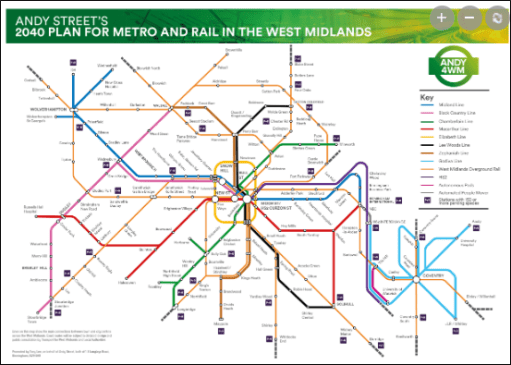
Could things have been different? Perhsps with a more centrally and strategically planned railway system that might have been the case, and a sustainable pos-industrial railway might have emerged in the Dudley area. But that is an unknown – and governments have not always shown themselves as being able to think strategically, at least where railways are concerned. But perhaps there is hope for something better – for example see Andy Street’s ambitious (and probably unrealistic) plan for metro expansion in the graphic below – although the ludicrous costs and construction times of tramways in the UK need to be massively reduced if they are to reach their full potential. But that, as they say, is another story.
On November 9th 2024 as part of the Black Country History Day to be held the Black Country Living Museum in Dudley, I will be presenting (with help from Emma Purshouse) some of the poetry of the Black Country poet Jim William Jones, to illustrate the industrial, social and built environment of the region in the second half of the 20th century. Jones was a sharp eyed observer of his beloved Black Country and his poems give a deep insight into the area and its people over that period. This is a rather different way of “doing” history, but hopefully one that will both entertain and inform. I write below to give some brief details of his life and work, since this information is not generally available elsewhere.
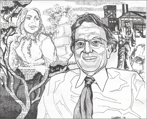
J W Jones by CLEBAK, From Black Country Society Calendar collection 1976
Jim William Jones was born in Coseley on February 15th, 1923, and spent his childhood and school years there. After leaving school he began work with the engineering firm Joseph Sankey and Sons as a junior clerk. He was conscripted into the army at the age of 18 in 1941, taking part in the Normandy landing in 1944 and also serving in India and Ceylon, reaching the rank of Warrant Officer. After the war he returned to Sankey’s and was trained in works management, before leaving industry to join local government in 1955 where he worked in education administration, marrying Jesse Ralphs at Wednesbury in that year. He was a qualified teacher of speech and drama and a member of amateur dramatic societies, hosting a radio programme on Beacon Radio and working with the Black Country folk music group Giggetty. He had a strong Christian faith and was a gifted speaker and Methodist local preacher. He became a very well-known Black Country poet, both for his dialect poetry (Black Country ballads) and for his poetry in more conventional English. Some of these can be found in three small publications by the Black Country Society – “From under the smoke” from 1972, “Factory and Fireside” from 1974, and “Jim and Kate” from 1986, all sadly long out of print. He contributed numerous poems to the first 25 years of the Society magazine, the Blackcountryman from 1967 to 1992. He died in 1993.
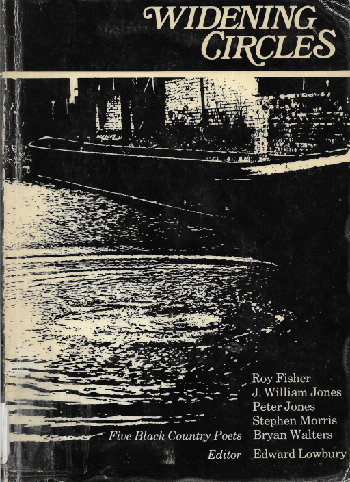
Some of Jim Jones poems were included in a 1976 anthology “Widening circles” edited by Edward Lowbury. Following Jones’ death, Lowbury wrote an appreciation for the Blackcountryman (26.4, 1993). He acknowledged the humour and the pathos in the dialect ballads, which at the time of publication of “Widening Circles” he felt to be more successful than the poems in standard English. By 1992 however he had somewhat modified his views and concluded that his standard English poems were perhaps “nearer to the heart of poetry than the more immediately entertaining dialect ballads”.
In a much later Blackcountryman article (45.3, 2012) Trevor Brookes again writes in appreciation of Jim Jones, and in particular his dialect poetry, emphasising that as well as humour, they contained much that showed a profound understanding of people and their lives. He regretted that these were not easily available, being scattered across many newspapers and other publications, and not accessible to modern readers.
Personally, I first became aware of Jim Jones work in the early 1970s, when my mother gave me a copy of “From under the smoke” as a Birthday present. This little volume became a prized possession and has travelled around the country with me over the last 50 years, regularly read and re-read.
To enable others to either reacquaint themselves with his work, or to enjoy it for the first time, some of Jones’ poems have ben published in a short series of Black Country Society blog posts from 2022 that can be found at the links below.
In addition, the Black Country Society has scanned “From under the smoke” and “Factory and Fireside” and these are available for members on the Society web site (password required). I have also produced a compilation of 33 of his poems that span the period from 1968 to 1992 – from “From under the Smoke”, “Factory and Fireside” and the Blackcountryman. This is again available to Society members on the web site. These three volumes will be available for purchase as pdfs from the Society online shop at some point in the near future.
Most, but not quite all, of the poems in the compilation are in standard English. Another volume could easily be produced containing a selection of his dialect poetry, but as Trevor Brookes noted, these are more scattered, and the collection of them would be a major task. Nonetheless it is perhaps something I will attempt in the future.
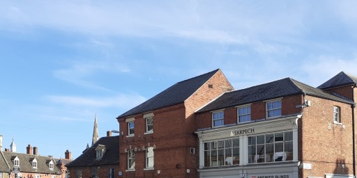
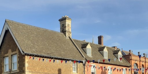
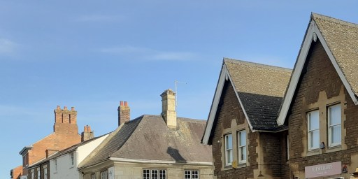
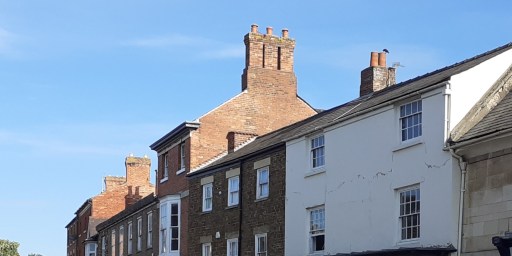
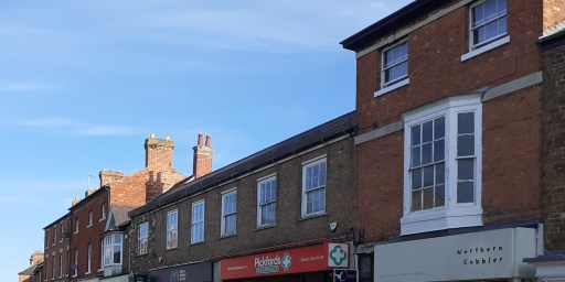
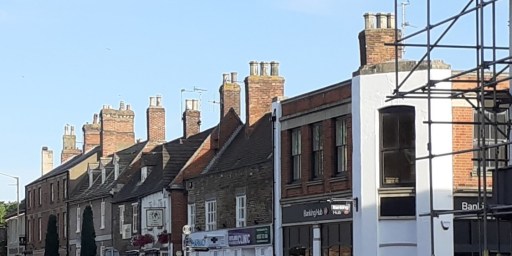
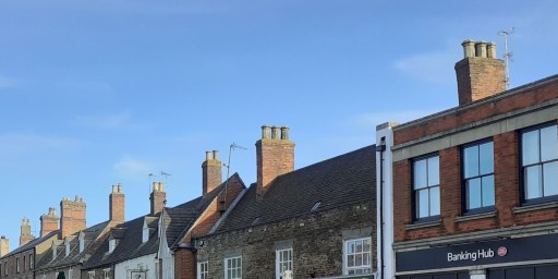
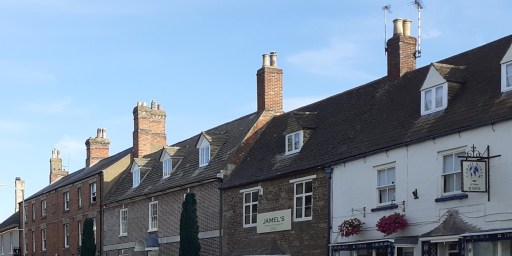
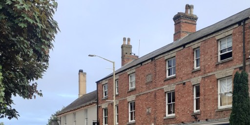
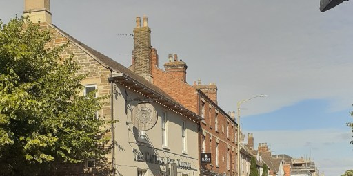
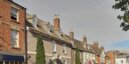
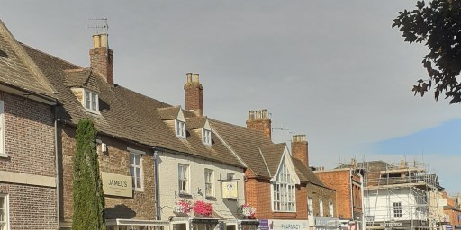
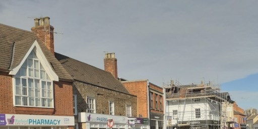
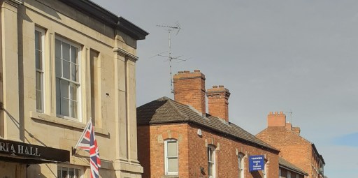
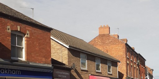
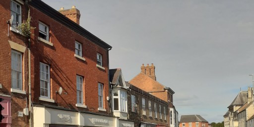
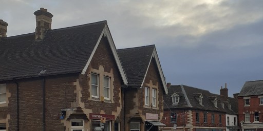
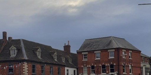
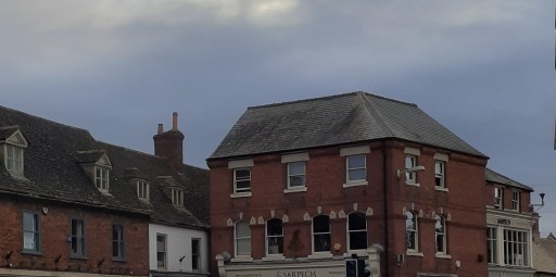
This post concerns roofs 1 – specifically those on the High Street of Oakham in Rutland. I find the upper floors of urban streets quite fascinating in their form and variety. When walking through towns however, one rarely looks upwards – indeed most of the time you would risk colliding with other pedestrians or walking into the road if you did. It is the shop fronts and their contents on the lower floors that command attention of course. But above them, the buildings themselves are sometimes stylish, sometimes idiosyncratic, sometimes merely odd – and usually worth a look. In what follows I show two galleries of photographs, both looking at the upper floors of buildings on the north side of Oakham High Street, taken from the pavement on the south side. The first gallery is a series of photographs from east to west (the junction with Burley Street and the Market area to the Wetherspoons pub), and the second from west to east. I am not really in a position to comment on the buildings in architectural terms, so the photos are simply presented for the reader’s interest and enjoyment.
1 I am fairly sure that when I was at school I was told that this was spelt “rooves”, but Google informs me that this is an archaic word, no longer used in practice. I fear I am thus labelled as archaic, which is probably true.
From east to west
From west to east
All the photos were taken by me, but I am happy for them to be used by others, with a proper acknowledgement.
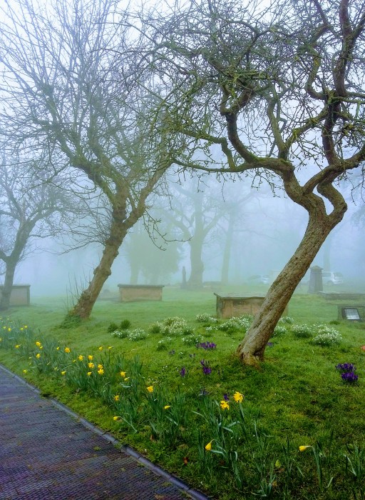
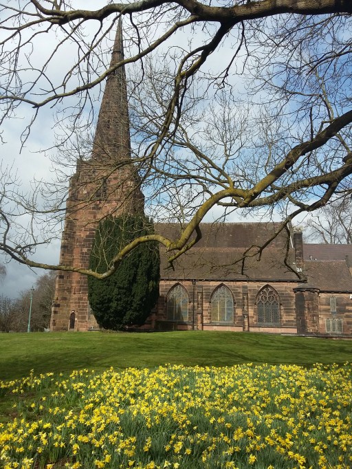
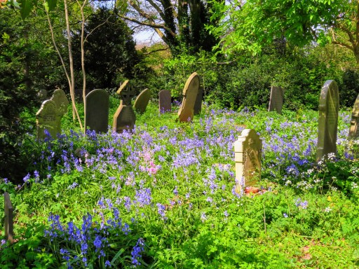
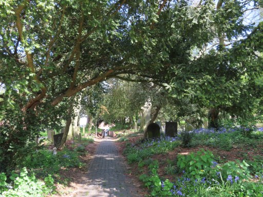
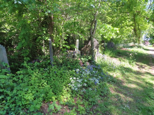
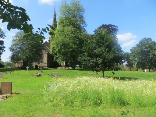
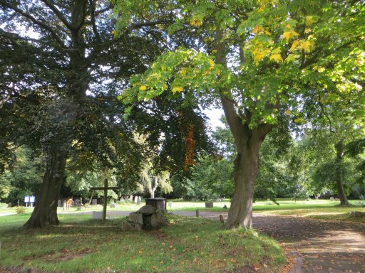
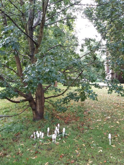
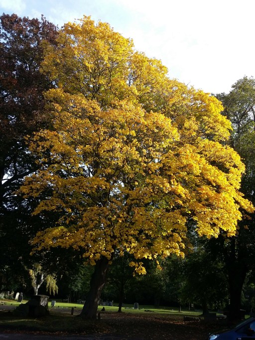
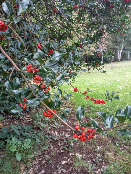
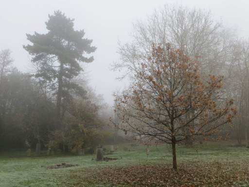
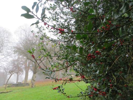
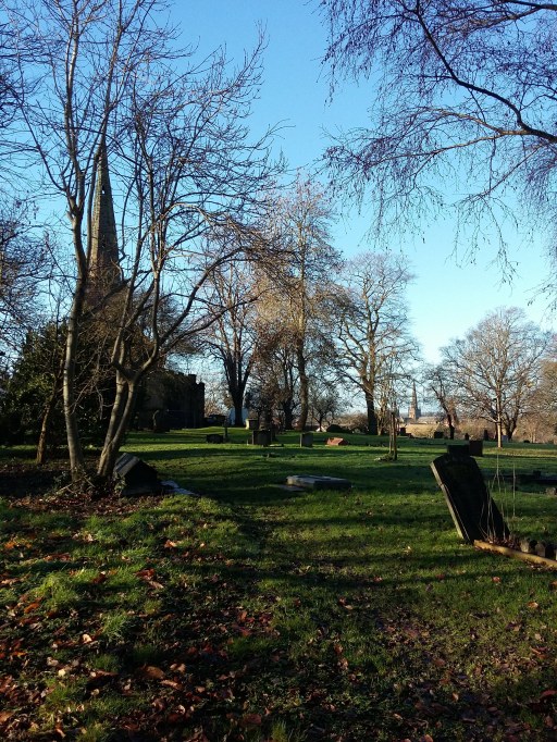
A picture blog featuring the photographs of Maureen Brand – evocative pictures of the churchyard of St Michael in Lichfield through the changing seasons.


