Ten of the best – a personal choice of Train Aerodynamics papers from 2021

Preamble

In January 2020 and January 2021, I posted quite lengthy blog posts that attempted to collate all the published papers in train aerodynamics over the previous year  – see here for the 2020 post and here and here for the two part 2021 post. . These were intended as supplements to the book “Train Aerodynamics – Fundamentals and Principles” published in 2019. These blog posts have been quite widely read. At the time of writing (mid-January 2022) the 2020 post has had 190 views and the two parts of the 2021 post 129 and 70 views. It had been my intention to do something similar for the papers published in 2021. However, I have changed my mind on this, and instead will take a different approach in this post. My reasons for this are twofold.

  • The number of papers in the field continues to proliferate and, quite frankly, many of them are of poor quality. This seems to be driven by the need, in some jurisdictions, for research students to publish papers in order to be awarded a PhD. This inevitably encourages a low standard of output. Also, I have noticed an increasingly disturbing trend, whereby when a paper is rejected by one of the higher quality journals, it is submitted in much the same form to other journals with less impact.  I have seen a number of such papers sent to me to review by different journals – and on two occasions in 2021 I have been sent the same paper by three journals. Obviously I have little influence on how researchers submit papers, other than through the normal reviewing process, but there seems to me no reason to give such papers the benefit of a mention in any comprehensive annual compilation.
  • The use of CFD techniques in train aerodynamics, which is proliferating at the same rate as the number of papers, is giving me increasing concern. CFD techniques ranging from RANS to LES are exceptionally useful tools in all fluid dynamics research and the same applies in the train aerodynamics field. But they are as much tools as any physical model tests and need to be used and interpreted very carefully. There are many investigators who do just that, including colleagues in my own institution. However, I fear that that is not always the case Specifically, the use of such techniques is in many circumstances becoming divorced from practical reality. There is a tendency to apply quite high level, but inflexible, CFD methods (such as IDDES) to look at quite trivial problems where much simpler methods could have given equivalent answers over a wider parameter range. And in the consideration of the results from these calculations, there is often little appreciation of the uncertainty that is attached both to the CFD results themselves (for example I have seen the percentage changes in predicted drag given to two decimal places) or in relation to full scale reality, where the uncertainties are multiplied by an order of magnitude or more.  Further the results of the CFD calculations are often massively over-analysed. For example, in studies of cross wind effects on trains, I have come across papers where the predicted wake systems are analysed in very great detail, with little realisation that any such systems cannot exist in reality due to the (unsimulated) large scale turbulence in the approach flow field – as of course is the case with many wind tunnel tests. The same can be said of the analysis of many other applications. Again, there is little I can do to influence these trends, but I see no reason to publicise such work any further in blog posts.

In the light of such developments, in this post I will not present a comprehensive compilation of all the train aerodynamics papers from 2021 but will rather choose a much smaller number (ten in total) which I believe are of particular significance and likely to influence the field in the future. These are spread across the range of train aerodynamic applications including train drag studies, trains in tunnels, crosswind effects and emerging issues. The choice of what to include is of course to some degree subjective and mirrors my own interests, but I hope that readers find it of interest.

Train drag studies

On the influence of Reynolds number and ground conditions on the scaling of the aerodynamic drag of trains. Tschepe et al (2021)

Very often the effect of Reynolds number on train drag measurements or calculations is broadly ignored provided that the Reynolds number is “high enough”. This is of course not adequate, as the skin friction component of drag must vary with Reynolds number throughout the parameter range – see for example my historically rather crude analysis of the problem from 1991. This paper, drawn from the doctoral work of Tschepe) presents the results of a thorough experimental and analytical investigation into this effect, using the results from water towing tank experiments. These experiments are quite novel and deserving of attention in their own right. The three-dimensional nature of the train boundary layer is clear, and the effect of ground roughness (ie sleepers and ballast) is shown to be of some importance (see also my blog post here). A simple analytical approach, based on flat plate theory, allows a correction method to be developed for extrapolating low Reynolds number results to full scale conditions.

A field study on the aerodynamics of freight trains Quazi ei al (2021)

This paper presents the results of full-scale measurements of the pressure drag of a freight container during a typical journey. As such it provides a basic benchmark for further studies. The technique is of interest in its own right, but the basic result, that, despite the container not having other containers immediately in front and behind it, the drag coefficient is much lower than that found in other full-scale, physical model and numerical calculations is of considerable interest. The authors suggest that this is because of the container position much further down the train than in other measurements, as well as other modelling issues. The results perhaps give pause for thought about the measurement of train drag from wind tunnel tests or CFD calculations.

Tunnel aerodynamics

Influence of air chambers on wavefront steepening in railway tunnels. Liu et al (2021)

The phenomenon of micro-pressure waves (sonic booms) emitted from tunnel portals has been much studied in recent years. These are caused by the steepening of the train nose pressure wave as it passes along the tunnel, resulting in a steep wave at the tunnel exit that is not wholly reflected with some energy being transmitted out of the tunnel in the audible frequency range. The standard method for the amelioration of such effects is through the use of tapering tunnel entry portals, that reduce the initial (and thus the final) steepness of the waves. Such portals can be quite long and extend some way out of the tunnel, and indeed can be quite expensive. This paper investigates an alternative to such portals – the distribution of air chambers along the length of the tunnel that in principle reduces the steepening of the pressure wave. Using a relatively straight forward gas dynamics analytical model, the authors show that suitably designed chambers can remove the dependence of the exit wave on the steepness of the inlet wave. Guidance is given for appropriate chamber volumes and the resistance of the connectors between the chambers and the tunnel. Overall, the method has much potential for future tunnel design.

Virtual homologation of high-speed trains in railway tunnels: A new iterative numerical approach for train-tunnel pressure signature. Brambilla et al (2021)

The standard methodology to investigate the passage of pressure waves along tunnels is to use full-scale measurements to measure the pressure wave system on train entry, and then to use data from those measurements to predict the pressure wave along the length of the tunnel using one dimensional gas dynamics methods. The latter can be run many thousands of times to investigate a range of operational conditions. Clearly the required full-scale tests are expensive and complex. Recently some full CFD calculations of the flow along tunnels have been published using sliding grids, which are again highly complex and computer resource requirements limits their use to just one or two conditions. This paper presents a combined methodology where CFD calculations using a standard fixed grid are carried out to measure the pressure characteristics at train inlet to the tunnel, and these are then used in one dimensional methods. The methodology has been validated against an extensive full scale data set. Its relative cheapness and flexibility means that it has the potential to become widely used within the industry.

Semi-empirical model of internal pressure for a high-speed train under the excitation of tunnel pressure waves. Chen et al (2021)

This paper looks in detail at the development of internal pressures within train cabins in tunnels. Using a combination of commercial CFD and finite element analysis, together with simple models of internal ventilation flow, the authors looked at pressure changes due to body deformation, pressure transmission through gaps in the train envelope and transmission through the air ducts of HVAC systems. Body deformation has little effect (unsurprisingly in my view) with the balance between gap and duct transmission varying depending on the degree of opening of the latter. Whilst the analysis is complex, the results should be of interest in describing a methodology that could ultimately be applied quite straightforwardly in design.

Pressure fluctuation and a micro-pressure wave in a high-speed railway tunnel with large branch shaft. Okubo et al (2021)

This paper describes an extensive experimental programme using a moving model facility that looked at the micro-pressure waves that occur as a result of the junction between the main tunnel and large branch tunnels with similar diameter (which would be used for passenger evacuation). The results are skillfully interpreted through the use of analytical models and show that in some instances the micro pressure wave emitted from the branch tunnel can be of greater magnitude than that omitted from the main tunnel. Both the physical and analytical modelling methodology have potential use for the design of complex branching tunnel systems.

Trains in crosswinds

Influence of the railway vehicle properties in the running safety against crosswinds. Heleno et al (2021)

I include this paper with some temerity, as I am named as an author – albeit the last one. However, my role was very minor, and mainly involved discussions on some technical details and proof reading the final draft (although they all contribute to my long term aim of getting to 200 journal publications before my demise!). This paper considers the effect of various railway vehicle properties on the overturning risk of a rail vehicle. It uses realistic vehicle dynamic and track roughness models and generates realistic time series of wind speed from wind statistical parameters. It is more rigorous in its modelling than the current method used in the CEN code, which uses a very simplified wind gust model. A thorough parametric analysis of the various vehicle parameters is carried out. In my view the major point to emerge is the lack of sensitivity of the calculated overturning wind speeds and safety risk to variations in the train suspension parameters. In principle this could lead to much simpler models for the CEN safety assessment than are used at present, where full dynamic modelling is required. This is personally satisfying as I have been arguing this very point for the last 10 to 15 years – see the discussion in this post from 2020.

Emerging issues

CWE study of wind flow around railways: Effects of embankment and track system on sand sedimentation. Horvat et al (2021)

I include this paper because it contributes to what I believe to be an important emerging issue as railways are developed in arid conditions – sand sedimentation over railway tracks. It is a straightforward CFD study of flow patterns over different railway track geometries that calculates wall shear stresses and used these to define potential regions of erosion and sedimentation. It lays the foundation for future work – possibly to integrate sediment modelling into the CFD calculations.

Investigation on flow field structure and aerodynamic load in vacuum tube transportation system. Zhong et al (2021)

This paper is a detailed CFD analysis of the flow around vacuum tube vehicles using IDDES techniques. Because of the enclosed nature of the vehicles and the well-defined geometry, this is a case where one would expect good accuracy from such calculations. Also of course the issues cannot be easily addressed by physical modelling techniques. Both subsonic and supersonic flows are considered, the nature of the flow field elucidated, and vehicle drag calculated. The results form a useful addition to the publicly available body of knowledge about the flows around such vehicles that can be used in further development of the concept. That being said, it is my firm view that, fascinating as the aerodynamics of the system might be, vacuum tube systems will not meet with wide adoption due to simple operational constraints – primarily the low capacity in comparison to conventional high speed rail systems.

General

Railway applications – Aerodynamics – Part 7: Fundamentals for test procedures for train-induced ballast projection. CEN (2021)

This is not a paper, but rather the latest offering from the CEN working group on Aerodynamics that looks at the issue of ballast flight beneath high-speed trains. It contains a wealth of information of the issues involved, economic aspects of the damage caused by ballast flight, current national practices and possible ways forward in terms of homologation. It is well put together and forms a very useful basis for further work in the field.

The English domestic cricket schedule

Preamble

Following the recent Ashes debacle, there has been much talk of why the England cricket team’s performance has been so poor. One of the reasons (but by no means the only one) seems to be the lack of emphasis given to the red ball game in the domestic structure.

Ben Stokes bowled at the MCG

In addition the fact that red ball cricket has been increasingly pushed to the margins of the season to accommodate more and more white ball cricket, and in particular the abomination called the Hundred (and here I let my prejudices show clearly), and thus not allowing the development of batting skills in dry, hot conditions – which are the normal conditions in most other cricket playing countries. Thus in this blog post I set out a possible programme for the domestic season that, whilst allowing the financially lucrative white ball cricket proper exposure, also allows for red ball cricket to be played in the high summer months. I think it would be workable, but, inevitably, others will disagree.

Principles

In setting out the proposal, I adopt the following principles.

  • The domestic season should have a clear, identifiable structure that allows for each of the three formats to take the limelight at appropriate times.
  • All formats should be contested by the existing county teams, rather than by multi-county franchises based on the larger grounds, thus allowing for equitable treatment of all counties based on performance, and thus acknowledging the importance of history and tradition.
  • That there should be space in the high summer months for both red ball and white ball cricket.
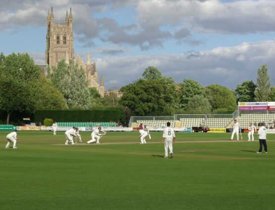
New Road Worcester

What I propose is for the men’s game – I am afraid I simply don’t know enough about the structures, resources and finances of the women’s game to be able to make coherent proposals. That being said, it would seem to me that something mirroring the proposals below might be quit feasible, albeit with a reduced number of teams and matches.

Fifty over format

  • Three groups of six county teams, perhaps geographically based, playing each other twice (10 games) with quarter finals, semi-finals and final.
  • First round of five group matches to be played in last two weeks in March in southern hemisphere countries, and perhaps marketed as a cricketing holiday to county members and the public.
  • Second round of five group matches to be played in last two weeks of April in England (which will thus give an interesting variety of conditions overall).
  • Quarter finals on the Friday before May Bank Holiday. Semi-finals a week afterwards.
  • Final on Late May Bank Holiday Saturday.

Two innings format

  • First division of eight county teams, each playing each other twice (14 games) with bottom two relegated to second division.
  • Second division of ten county teams, split into two groups of five, which may or may not be geographically based. Each team to play the others in the group twice and those in the other group once (13 games). Top team in each group promoted, with play off for the divisional championship.
  • Games to be played from Sunday to Wednesday from first week in May to second week in August (15 weeks) with some exceptions to accommodate the twenty over format (see below). This would allow games to be played in high summer conditions.

Twenty over format

  • To be played in two stages. County teams in first stage to be divided into three geographical groups of six, each playing each other twice (10 games), with games on Friday evening or Saturday afternoons between the start of May and end of July. Games would thus not be spread through the week which might not please broadcasters. There might need to be some slight modification of the schedule for two innings games to accommodate two games on one or two weekends. Top two in each group and two best third place teams to Premier league, and others to National League.
  • The ECB to give contracts to twenty or more overseas players with different skills, who would be allocated to the Premiership counties at the start of August, based on the county’s requirements.
  • The Premier league would run in the last two weeks in August and the first week in September, with each team playing the others once (7 games). It would be desirable for their to be no international games during this period to allow England players to compete. A “hundred” format could be used if felt desirable (although I can think of no reason why it should be so). Finals day on the second Saturday in September would consist of a play off between second and third place teams, and a final between the winners of that tie and the first placed team.
  • The National league would consist of ten counties, play six franchise teams composing those displaced from premiership squads, second eleven, university and academy players etc. over the same period. These would be divided into two groups of eight, and each play each other once (7 games). The franchise teams would be based at holiday destinations, or conurbations normally without top level cricket as a means of widening audiences. The top teams in each group would contests the final, on the same occasion as the Premiership finals day.

Final thoughts

I would suggest that the advantages to such a system would be as follows.

  • The format would thus give a structured approach to the season, with the three formats contented sequentially, with manageable overlap between the formats.
  • There would be three high points in the season – the fifty over final on the late May Bank holiday; the climax to the two innings game in early / mid-August; and the short form finals day in mid-September.
  • The international / domestic structure for the fifty over competition would both be attractive in its own right for at least the more affluent spectators, would give players experience of a range of conditions, and would also take some scheduling pressure off the domestic season
  • The structure would allow two innings games to be played in high summer conditions. The proposed second division structure would enhance the integrity of the competition with teams only being judge against teams that have played the same number of games against the same opponents.
  • It would also maximise audiences for the short form game on summer evenings and during the last two or three weeks of the school holiday period.

As a final point, such a schedule would also allow space in late September for a regional championship between, say, teams drawn from northern south eastern and south western counties with three four day matches over a two week period. This would give the players some experience of cricket between county and international level. But this is not an integral part of the proposal.

James Jordan Serjeantson – Rector of St. Michael’s church in Lichfield, 1868 to 1886

From the early 18th century until 1867, the clergy at St. Michael’s were “perpetual curates” – appointed by the incumbent of St. Mary’s. These were paid a cash stipend, but had no income from tithes and glebe lands, and were often of lower social standing than Rectors. At the start of December 1867, the then perpetual curate, Thomas Gnossall Parr, who has been in post as a Perpetual Curate since 1831, was made the first Rector of the parish. He was not to enjoy that title for any length of time and fell ill and died shortly afterwards on December 23rd1867.

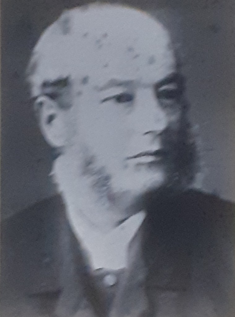
He was succeeded in June 1868 by the first to actually be appointed to the post of Rector – James Jordan Serjeantson (pictured). Serjeantson was born in Liverpool in 1835, the son of a Liverpool merchant and an Irish mother and attended Liverpool Grammar and Rugby Schools. In 1854 he matriculated at Trinity College in Cambridge and was awarded his BA in 1858 and his MA in 1861. He was a rowing blue and part of the University crew that lost the boat race in 1857 by 11 lengths. There have only been six larger losing margins in the 190-year history of the race, so I doubt it was an experience he relished. He was ordained deacon in 1859 and priest a year later, both at Lichfield Cathedral. He served a curacy at Stoke from 1859 to 1868 before coming to St. Michael’s. He left Stoke in June 1868 to high praise from his incumbent and the Archdeacon, with gifts (including a hall clock) from parishioners and Sunday School children.  He married Elizabeth Buckley, a clergyman’s daughter in August that year and they were to have seven children. 

It is clear from the records we have that he was an assiduous, hard-working parson, much admired and respected by his parishioners. In June 1877, he notes in the service register that “this is the 1000th sermon I have preached in this church”. In June 1983, he was to write again “this is the 2000th sermon I have preached in this church”.  This is an average of around 130 per year! Some indication of his activities can be judged from the activities of Holy Week in 1882 shown below. In total there were 16 sermons or addresses that week, all preached by Serjeantson. His sermons were very practical and he made no claim to eloquence, but were much appreciated by his congregation. It would seem he was quite blunt in his manner, not afraid to call a spade a spade, but was nonetheless admired for his straightforwardness.

He presided at the pastoral offices – 1123 baptisms, 1189 marriages and 215 funerals in total over the years of his incumbency and also presented 20 to 30 young people each year for confirmation. One of the more memorable funerals was that of William Corfield and his wife Theresa, his elderly mother and four young children who all died from suffocation in a house fire on Breadmarket Street, next to Dr Johnson’s birthplace in January 1873. The press reported that James Serjeantson’s voice trembled with emotion as he read the words of the funeral service around the grave before the coffins were lowered one by one.

Theologically, he seems to have been very much against the ceremonial associated with the Anglo-Catholic Oxford movement and is recorded as a signatory of a letter of 1875 to the bishops that argued against legalizing the use of eucharistic vestments and the eastward position for celebrating the eucharist. Some aspects of current worship at St. Michael’s would have certainly made him uncomfortable! The service register indicates he was a strong supporter of the Melanasian Mission, formed by Bishop Selwyn, the former Bishop of New Zealand, and indeed one of his curates, Rev John Still (1869-1871), left Lichfield to become a missionary in the South Pacific, at a time just following the martyrdom of Bishop John Patteson in the Solomon Islands.

Serjeantson had gifts other than his preaching and pastoral abilities. Within twelve months of arriving in the parish he was awarded the prize for the best variegated geraniums at the annual flower show (which almost certainly didn’t go down well with some of the more established exhibitors!) and he was also the founder and a valued member of the bell ringing team. His name can still be found on a number of memorial boards in the belfry, that commemorate the ringing of specific peals – for example he was part of the team that rang a complete peal of Grandsire Minor in 1876. He was a very knowledgeable naturalist, who initiated a scheme for replacing dead trees in the churchyard; an amateur astronomer (possessing his own telescope), and as a historian he was well acquainted with the church records. In short he was something of a polymath. He also served as a Workhouse Guardian and took an in various educational initiatives within the city.

In 1881 he and his wife, their two sons, Cecil (10) and Ronald (7), and three daughters, Mildred (5), Edith (3) and Monica (1) lived at the Rectory on Mount Pleasant, with a housekeeper, cook and two servants. Two other children died as babies – Edward in 1870 and Joyce in 1884.

He died on New Year’s day 1886 and was buried four days later, with the funeral being taken by the Vicar of Stoke on Trent and the Vicar of St Mary’s, with the Bishop of Lichfield presiding at the graveside. His passing was very extensively covered in the local press, with full obituaries and even the full text of memorial sermons! His final illness seems to have been short – he was still presiding at funerals two weeks before he died. Elizabeth was to outlive him by 33 years. Their graves, and the graves of their infant children, are, at the time of writing, currently inaccessible in the very overgrown area at the east of the old churchyard. I have not succeeded in identifying them, although I have received many bramble scratches in the trying. 

But James Serjeantson does have other memorials. A fountain on Greenhill that was erected in his memory in 1886 contains the inscription

Erected by parishioners and friends in grateful and loving memory of the Rev J J Serjeantson MA, Rector of St. Michael’s, Lichfield.

In addition, a plaque in the chancel at St. Michael’s reads

To the glory of God and in loving memory of James Jordan Serjeantson M.A. for 17 years rector of this parish who by the sympathy and energy with which he fulfilled his ministry on Christ endeared himself to his parishioners and by the brightness of his manner and his cheerful readiness with which he brought out the stores of his varied learning won for himself the esteem and love of all classes.   He fell asleep January 1st 1886 aged 50 years.

Both memorials speak eloquently of the high esteem in which he was held in the church and the city and the love that his parishioners felt for him. He perhaps deserves more recognition as the first to be appointed Rector of the parish.

Chris Baker

St. Michael’s church, Lichfield – from the parish magazines 1889-1892

I have recently come across a bound copy of the church magazines from 1889 to 1892. In this article I will share some items of interest that I found there – some that will describe situations that will be very familiar to the current congregation and some that are rather strange in modern terms.

The vicar for those years was the Rev. Cyril Hubbard, an old Etonian who the census tells us lived at the Rectory in Mount Pleasant with his wife, two children and four servants (!), and had been Rector since 1886. He seems to have been the driving force behind the magazine and wrote an article each month – a mix of devotional and news material. He was particularly concerned to increase the number of communicants, but also to repair and restore the tower and the chancel which were in a poor state of repair – more of this below. As ever, there were financial issues, and not infrequent requests for subscriptions to projects and for increased weekly offerings.  In the November 1892 magazine he both announced that he was leaving the parish and also named his successor who had been appointed by the Bishop of Lichfield – Rev Otho Steele from Hanley. He was to leave early in 1893, and Rev Steel took up the post very soon afterwards. It doesn’t happen like that these days!

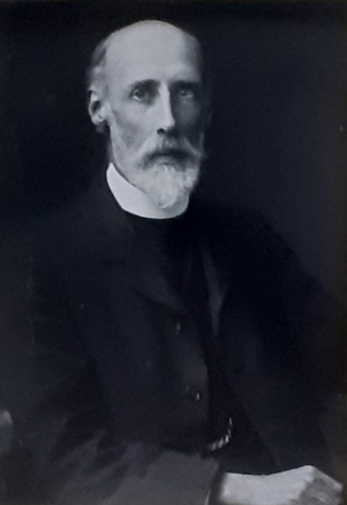
Rev. Cyril Hubbard

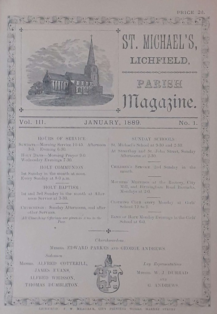
The magazine was a simple four- page affair – essentially a folded A4 sheet. There is an indication that these magazines were the first that were wholly church produced – a more generic ”Banner of Faith” magazine having been used beforehand. The front page was standard and gave details of the services and other activities. On a Sunday there were four or five services – a weekly Holy Communion at 8.00am (some things never change); Mattins at 10.45; a monthly Holy Communion at 12.00; an afternoon service at 3.00, that on various Sundays of the month included a Children’s service, baptisms, or churchings; and Evensong at 6.30.

There were also services on Wednesday evenings at 7.30 in church, and on Tuesday evenings at 7.30 in St. John’s St., and in Streethay. It is not clear where the latter were held – presumably in hired rooms?  Sunday Schools were held in the School at 9.30 and 2.30, and also in St John’s St. and occasionally Streethay at 2.30. There were a number of regular Monday meetings – a Clothing Club at the School from 12.00 to 1.00, three Mothers meetings at the Rectory, City Mill, and Birmingham Road Barracks at 2.00, and a Band of Hope Meeting (a young person’s temperance society) at 6.00 in the School. On Saints’ days there was a service of Mattins at 9.00. The Rev Hubbard and his congregation were not idle!

In addition to all the above there were occasional lectures, bible studies, concerts and so on. Of particular interest were the Smoking Concerts for men, where the entrance fee was 2d, for which they received 1d worth of tobacco and the rest being spent on the hired room and heating. Newspapers and board games were provided, and those who came entertained each other with song and rhymes (in a fog of tobacco smoke one assumes). The annual Vestry meeting took pace just after Easter, for the election of Churchwardens and presentation of their accounts; and the election of sidesmen for the parish and for the surrounding hamlets – Streethay, Fulfen, Tamhorn, Freeford, Statfold and Fisherwick. Sidesmen had a more representative role in that period than their current role as being welcomers into church. The churchwardens accounts for 1890 show a total income of £204 with £70 from St. Michael’s Trust, £52 from the offertory and £45 from burial and other fees; and an expenditure of £165 with £37 being spent on the organist and choir, £51 on the Sexton’s wages; £25 on the heating and cleaning; and £18 on “making a new carriage road to the church door”. There were special collections for charities such as “Waifs and Strays”, CMS, the clothing club et.c of £32 in total.

At the start of the period covered by the magazines, both the tower and the chancel were in a poor state of repair and it had become inadvisable to ring the bells except when strictly necessary. The tower had suffered from severe settlement problems, and by late 1889 there was a wide crack in the south wall that ran the entire height of the tower and part of the spire, and the western buttresses were also in a poor state. There were also problems with the north wall, and parapets. An appeal was launched to meet the £250 required for the work, which was successfully completed by September 1891.

The chancel had been extensively modified in the 1840s, when the roof was lowered, the walls plastered, a vaulted roof added, and all the windows (including the large east window) replaced by narrow lancet windows- in an effort to restore it to some (fictional) early English style. By 1889 it was in a very poor state of repair and work clearly needed doing. Rev. Hubbard largely financed this from his own resources.  The plaster was removed, a new oak ceiling added, and the east window restored to its past (and current) form. At that point there was not enough money to install stained glass, which was eventually incorporated a decade later. To the right of the altar a credence niche was created in the wall for the communion vessels. It was decorated with tiles found in a vault to the north of the altar that was entered by stairs beneath it – these tiles can still be seen.  The choir were moved into the chancel, a move which gave the Rev. Hubbard some anxiety as to whether they were too remote from the congregation to properly lead the singing, and he pleaded for the congregation to join in the singing psalms and hymns. The clergy reading desk was also moved into the chancel, which gave similar concerns, although it seems that the (unamplified of course) voice of Rev. Hubbard could still be heard.

The new Girl’s school was opened with a great fanfare in July 1889 – effectively the completion of the school in the form that many older residents of the parish will have known it. The new building was the part of the school next to Church Street and connected with the 1858 building with the tower to the south of it. At the opening, children’s games were played and after a short service of dedication the building was handed over by the Hon Alfred Percy Allsop, who had served on the school management committee for a number of years and had paid for the new building. The enthusiasm was somewhat damped within a few days by the sudden departure of the much-respected schoolmaster, Mr Lasseter, following the death of his wife and his own ill health. A former pupil teacher was drafted in to keep the school running while a new master was appointed. The school accounts for 1889 show an income of £479 with a government grant of £217, school pence (from families) of £130 and voluntary contributions of £53; and an expenditure of £493, with £404 spent on teachers’ salaries. There were 107 boys on the register, 92 girls and 60 infants (who were presumably also boys and girls).

At that time most of the burials in the churchyard were in the now overgrown area next to what we call the new churchyard, and these are recorded month by month in the magazine, in much the same way as now. A couple of articles also give details of the avenue that runs up to the church from the north gate. Mr Henry C Malden, in describing his research in the parish registers, informs us that the avenue was set with elm trees on February 26th 1750 – on a “windy Tuesday”. In 1890, many of these were in poor condition and had, according to Mr Walden, felt the effects of many windy Tuesdays and seen their best days, and it was decided to replace every other one by quick growing lime trees. Of crab apples there is not a mention. Mr Malden ends his article with the words.

“Sooner or later, my readers, like them, will have seen their best days, and have their names added to the long list of those whose last home is in the old churchyard on the hill.”

And that seems a good place for me to stop as well!

Pollutants, pathogens and public transport – ventilation, dispersion and dose

Preamble

The ventilation of buses and trains has come to be of some significance to the travelling public in recent years for a number of reasons. On the one hand, such vehicles can travel through highly polluted environments, such as urban highways or railway tunnels, with high levels of the oxides of nitrogen, carbon monoxide, hydrocarbons and particulate matter that can be drawn into the passenger compartments with potentially both short- and long-term health effects on passengers. On the other, the covid-19 pandemic has raised very significant concerns about the aerosol spread of pathogens within the enclosed spaces of trains and buses. There is a basic dichotomy here – to minimise the intake of external pollutants into vehicles, the intake of external air needs to be kept low, whilst to keep pathogen risk low, then high levels of air exchange between the outside environment and the internal space are desirable. This post addresses this issue by developing a common analytical framework for pollutant and pathogen dispersion in public transport vehicles, and then utilises this framework to investigate specific scenarios, with a range of different ventilation strategies.

The full methodology is given in the pdf that can be accessed via the button opposite. This contains all the technical details and a full bibliography. Here we give an outline of the methodology and the results that have been obtained.

Analysis

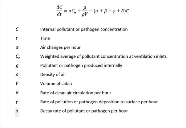
The basic method of analysis is to use the principle conservation of mass of pollutant or pathogen into and out of the cabin space. In words this can be written as follows.

Rate of change of mass of species inside the vehicle = inlet mass flow rate of species + mass generation rate of species within the vehicle – outlet mass flow rate of species– mass flow rate of species removed through cleaning, deposition on surfaces or decay.

This results in the equation shown in Box 1 below, which relates the concentration in the cabin to the external concentrations, the characteristics of the ventilation system and the characteristics of the pollutant or pathogen. The basic assumption that is made is of full mixing of the pollutant or pathogen in the cabin. The pdf gives full details of the derivation of this equation, and of analytical solutions for certain simple cases. It is sufficient to note here however that this is a very simple first order differential equation that can be easily solved for any time variation of external concentrations of pollutant generation by simple time stepping methods. For gaseous pollutants, the rate of deposition and the decay rate are both zero which leads to a degree of simplification.

Box 1. The concentration equation

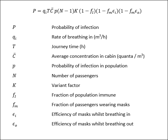
The pdf also goes on to consider the pollutant or pathogen dose that passengers would be subjected to – essentially the integration of concentration of time history – and then uses this in a simple model of pathogen infection. This results in the infection equation shown in Box 2. Essentially it can be seen that the infection risk is proportional to the average concentration in the cabin and to journey length.

Box 2. Infection equation

The main issue with this infection model is that it assumes complete mixing of the pathogen throughout the cabin space and does not take account of the elevated concentrations around an infected individual. A possible way to deal with this is set out in the pdf. Further work is required in this area.

Ventilation types

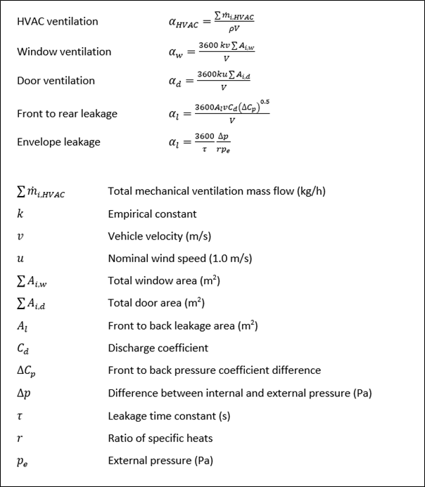
The concentration and infection equations in Boxes 1 and 2 do not differentiate between the nature of the ventilation system on public transport vehicles. Essentially there are five types of ventilation.

  • Mechanical ventilation by HVAC systems
  • Ventilation through open windows
  • Ventilation through open doors
  • Ventilation by a through flow from leakage at the front and back of the vehicle (for buses only)
  • Ventilation due to internal and external pressure difference across the envelope.

Simple formulae for the air exchange rates per hour have been derived and are shown in Box 3 below. By substituting typical parameter values the air exchange rates are of the order of 5 to 10 air changes per hour for the first four ventilation types, but only 0.1 for the last. Thus ventilation due to envelope leakage will not be considered further here, although it is of importance when considering pressure transients experienced by passengers in trains.

Box 3. Ventilation types

Scenario modelling

In what follows, we present the results of a simple scenario analysis that investigates the application of the above analysis for different types of vehicle with a range different ventilation systems, running through different transport environments. We consider the following vehicle and ventilation types.

  • An air-conditioned diesel train, with controllable HVAC systems.
  • A window and door ventilated diesel train.
  • A bus ventilated by windows, doors, and externally pressure generated leakage.

Two journey environments are considered.

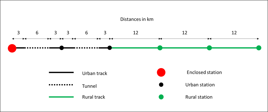
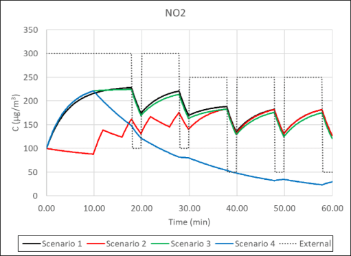
  • For the trains, a one-hour commuter journey as shown in figure 1, beginning in an inner-city enclosed station, running through an urban area with two stations and two tunnels, and then through a rural area with three stations (figure 1).
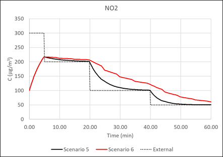
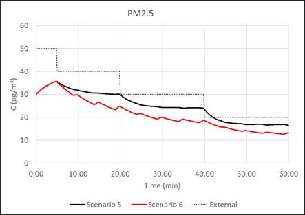
  • For buses, a one-hour commuter journey, with regular stops, through city centre, suburban and rural environments (figure 2).

Results are presented for the following scenarios.

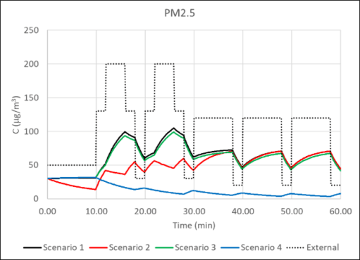
  • Scenario 1. Air-conditioned train on the rail route, with HVACs operating at full capacity throughout.
  • Scenario 2. As scenario 1, but with the HVACs turned to low flow rates in tunnels and enclosed stations, where there are high levels of pollutants.
  • Scenario 3. Window ventilated train on rail route with windows open throughout and doors opened at stations.
  • Scenario 4. As scenario 3, but with windows closed.
  • Scenario 5. Window, door and leakage ventilated bus on bus route with windows open throughout and doors opened at bus stops.
  • Scenario 6. As scenario 5, but with windows closed.

Details of the different environments and scenarios are given in tables 1 and 2.  Realistic, if somewhat arbitrary levels of environmental and exhaust pollutants are specified for the different environments – high concentrations in cities and enclosed railway and bus stations and lower concentrations in rural areas. The air exchange rates from different mechanisms are also specified, with the values calculated from the equations in Box 3. Note that, in any development of this methodology, more detailed models of the exhaust emissions could be used that relate concentrations at the HVAC systems and window openings to concentrations at the stack, which would allow more complex speed profiles to be investigated, with acceleration and deceleration phases.

Figure 1. The rail route

Figure 2. The bus route

Table 1. The rail scenarios

Table 2. The bus scenarios

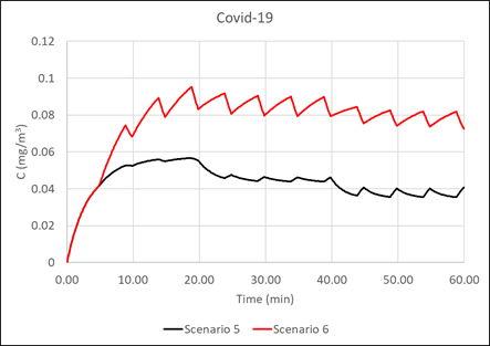
The results of the analysis are shown in figures 3 and 4 below for the train and bus scenarios respectively. Both figures show time histories of concentrations for NO2, PM2.5, CO2 and Covid-19, together with the external concentrations of the pollutants.

For Scenario 1, with constant air conditioning, all species tend to an equilibrium value that is the external value in the case of NO2 and PM2.5, slightly higher than the external value for CO2 due to the internal generation and a value fixed by the emission rate for Covid 19.

For Scenario 2, with low levels of ventilation in the enclosed station and in the tunnels, NO2 and PM2.5 values are lower than scenario 1 at the start of the journey where the lower ventilation rates are used, but CO2 and Covd-19 concentrations are considerably elevated. When the ventilation rates are increased in the second half of the journey all concentrations approach those of Scenario 1.

The concentration values for scenario 3, with open windows, match those of Scenario 1 quite closely as the specified ventilation rates are similar. However, for Scenario 4, with windows shut and only door ventilation at stations, such as might be the case in inclement weather, the situation is very different, with steadily falling levels of NO2 and PM2.5, but significantly higher values of CO2 and Covid-19. The latter clearly show the effect of door openings at stations.

Figure 3. The train scenario results

Now consider the bus scenarios in figure 4. For both Scenario 5 with open windows and doors, and Scenario 6 with closed windows and open doors, the NO2 and PM2.5 values tend towards the ambient concentrations and thus fall throughout the journey as the air becomes cleaner in rural areas. The internally generated CO2 and Covid-19 concentrations for CO2 and Covid-19 are however very much higher for Scenario 6 than for Scenario 5.

Figure 5. The bus scenarios

The average values of concentration for all the scenarios is given in Table 3. The dose and, for Covid-19, the infection probability, are proportional to these concentrations. For NO2 and PM10 the average concentrations reflect the average external concentrations, and, with the exception of Scenario 4, where there is low air exchange with the external environment for part of the journey. The average concentrations for CO2 and Covid-19 for the less ventilated Scenarios 4 and 6 are significantly higher than the other. For Covid-19, the effect of closing windows on window ventilated trains and buses raises the concentrations, and thus the infection probabilities, by 60% and 76% respectively.

Table 3. Average concentrations

Closing comments

The major strength of the methodology described above is its ability, in a simple and straightforward way, to model pollutant and pathogen concentrations for complete journeys, and to investigate the efficacy of various operational and design changes on these concentrations. It could thus be used, for example, to develop HVAC operational strategies for a range of different journey types. That being said, there is much more that needs to be done – for example linking the methodology with calculations of exhaust dispersion around vehicles, with models of particulate resuspension or with models of wind speed and direction variability. It has also been pointed out above that the main limitation of the infection model is the assumption of complete mixing. The full paper sets out a possible way forward that might overcome this. Nonetheless the model has the potential to be of some utility to public transport operators in their consideration of pollutant and pathogen concentrations and dispersion within their vehicles.

The angels keep their ancient places (V)

Introduction

In late September 2021, I organised a celebratory event at St. Michael-on-Greenhill in Lichfield around Michaelmas – the church’s patronal festival – entitled “The angels keep their ancient places” – a title taken from the poem “In no strange land” by Francis Thompson, The main aim was to celebrate the restarting of face to face activities after lockdown, but also to let all who might listen know that the church was open for business once more. The programme for the week is given below, and that is followed by links to videos of a variety of events that took place during the week – the sermon at the opening service by Bishop Michael, the blessing of the John Louis Petit information board, and the five “angel themed” evening talks. Most events were held in a “hybrid” form – with a face-to-face congregation or audience, and others joining by Zoom – it was still at the time when many were nervous about being with a crowd of others. The whole Thompson’s poem “In no strange land” is given in full at the bottom of the page.

Further details can be found on the St Michael’s web site.

Programme for the week

Sunday September 26th
8.00 Holy Communion (Book of Common Prayer)
10.00 Patronal service; the Bishop of Lichfield, Michael Ipgrave, preaching
1.30 Blessing of Petit display board by Bishop Michael
14.30 Guided tour of the church building

Monday September 27th         
20.00 Talk by Dr. Joanne Allen – Angels in art – five things you didn’t know about angels

Tuesday September 28th1
10.00 School service for years 5 and 6
20.00 Talk by Dr. Trevor James – St. Michael. History and Theology

​Wednesday September 29th  
11.00 Holy Communion service for Michaelmas
20.00 Talk by Rev. Prof. Chris Baker – St Michael’s Angels – the 19th century clergy

Thursday September 30th       
20.00 Talk by Major Ted Green – The Angel of Mons (Spirituality and the Great War)

Friday October 1st                     
10.00 Guided Tour of the trees in the churchyard by Ray Allen
20.00 Talk by Rev. Dr Stephen Barton – Angels in Scripture

Saturday October 2nd              
10.00 The Angel Trail – an angel themed walk around the church and churchyard for families and children;
14.30 Guided tour of the churchyard by Trevor James,

Sunday October 3rd                    
8.00 Holy Communion (Book of Common Prayer);
10.00 Harvest Family Praise
18.00 Choral Evensong for Harvest

Recordings

Opening sermon at the Patronal service by the Bishop of Lichfield
Blessing the John Louis Petit display board
Dr Joanne Allan
Dr Trevor James
Rev Prof Chris Baker
Major Ted Green
Dr Stephen Barton

“In no strange land” by Francis Thompson

world invisible, we view thee,
O world intangible, we touch thee,
O world unknowable, we know thee,
Inapprehensible, we clutch thee!

Does the fish soar to find the ocean,
The eagle plunge to find the air—
That we ask of the stars in motion
If they have rumour of thee there?

Not where the wheeling systems darken,
And our benumbed conceiving soars!—
The drift of pinions, would we hearken,
Beats at our own clay-shuttered doors.

The angels keep their ancient places;—
Turn but a stone and start a wing!
’Tis ye, ’tis your estrangèd faces,
That miss the many-splendoured thing.

But (when so sad thou canst not sadder)
Cry;—and upon thy so sore loss
Shall shine the traffic of Jacob’s ladder
Pitched betwixt Heaven and Charing Cross.

Yea, in the night, my Soul, my daughter,
Cry,—clinging to Heaven by the hems;
And lo, Christ walking on the water,
Not of Genesareth, but Thames!

Covid-19 – how risky are church services?

As I write, in late July 2021, Covid-19 infection rates are increasing rapidly, at the same time as restrictions are being eased, and people from all walks of life are becoming increasingly nervous about being infected. This nervousness is, quite understandably, shared by church congregations, and some are questioning whether it is actually safe to come to church in the current circumstances. Is it therefore actually possibly to be a bit more precise about what the actual risk of attending church might be? The answer is a qualified, yes, it is possible, very approximately, to calculate the risk of infection at church services, and, in this article, I will describe the risks of attending church for different scenarios, based on the current situation at St. Michael’s church in Lichfield, where I serve as a minister.

The method I will use is that developed by Prof Jose-Luis Jimenez at the University of Colorado – Boulder in the USA. This is a simple spreadsheet-based model of Covid transmission and infection using the latest scientific knowledge and which can be used in a variety of situations – residential homes, shops, public transport and places of worship for example. It is more fully described here. It is based on aerosol transmission of the virus, which is now regarded as the main way in which the virus is transmitted, particularly if simple hygiene methods are followed, such as regular cleaning of services and washing of hands, to reduce the risk of picking up the virus by touch. Prof Jimenez would be the first to admit that the method is very approximate and comes with lots of uncertainties, not least because the understanding of the way in which infected people emit the virus is at the moment poorly understood. Nonetheless it does give a rough indication of risk.

The situation I have looked at is effectively the current practice in St. Michael’s in Lichfield – a large, fairly poorly ventilated area, with a congregation of about 60 and a choir of 6. Social distancing is assumed, together with everyone wearing masks and only the choir singing, for a one-hour service, with the current community infection rate of about one in a hundred people being infected with Covid at any one time. 80% of the congregation are assumed to be double vaccinated. Plugging this lot into the spreadsheet gives a risk of any one member of the congregation being infected with the virus at a particular service of 1 in 26,700. To give some perspective, the risk of being involved in a road vehicle accident in Britain in the week following the service is 1 in 22,000. Thus, attending a service at St. Michael’s with the current practice is very safe indeed, even allowing for the very approximate nature of the calculations – we are all likely to be in much more hazardous situations at other times in the week.

As restrictions ease, churches across the country are considering easing their own restrictions, and Jimenez’s spreadsheet gives a way of how this might change the risk. Again, for St Michael’s, having 100 people in the congregation in church as opposed to 60 (and reducing social distancing) increases the risk to 1 in 17,500. Doing away with masks as well increases the risk further to 1 in 6,100. This is a big jump, as masks both restrict the spread of the virus from those who are infected, and also give some protection to those who aren’t. Taking the next step and letting the congregation sing hymns increases the risk to 1 in 2500. This is because singing, or speaking loudly, increases the breathing rate and allows more virus to be both exhaled and inhaled. As an interim step, should we keep social distancing and mask wearing but allow congregational singing with masks on, the risk of infection comes out as 1 in 10,200.

How these results should be interpreted is of course a matter for the individual. I personally would find a risk of 1 in 5000 acceptable but would begin to get a bit twitchy if the risk were as high as 1 in 1000.  Importantly though it should be remembered that the risks are more or less proportional to the number of infected in the general population. So as the community infection rate drops, as one hopes it will, the risk decreases. For example, if the community infection rate was 1 in 500, the risk of being infected at a church service with no social distancing, no masks and with singing, falls to 1 in 12,500, which I, for one, would regard as very acceptable and quite safe.

The calculation of Covid-19 infection rates in churches

Preamble

In a recent post, I looked at the risk of Covid infection on GB trains, based on the spreadsheet calculation methodology of Professor Jimenez and his team at the University of Colorado – Boulder. This method is based solely on aerosol transmission, which is now regarded as being of much more significance than transmission by surface contamination, and the risk of the latter can be easily reduced by normal hygiene precautions. In this post, I apply the same methodology specifically to the case of churches and include a downloadable EXCEL spreadsheet that might be of use to others. There is a level of self-interest of course, as I am a minister at an Anglican church which will shortly be faced with decisions concerning the nature of worship as the Covid restrictions are removed.  Essentially the spreadsheet gives a numerical value for the risk of Covid infection with specified amelioration methods in place (social distancing, masks, no singing etc.) and allows a rational assessment of safety to be made.

At the outset, it needs to be made clear that there are very many assumptions in the methodology of Jimenez, with some of the parameters not well specified, and the base values of risk that the model gives must be regarded as indicative only and it is best used in a comparative sense. In what follows, I first describe the input and output parameters of the spreadsheet, and then look at how it might be used to compare risk levels for different situations.

Screenshot of spreadsheet

Download the spreadsheet from here

The spreadsheet

The spreadsheet is quite simple and straightforward, and requires no specific expertise to use. A screenshot is given above. The brown cells are input parameters, and the blue cells the output parameters The former are as follows.

  • Length, width and height of worship area. The model effectively assumes that the worship area is a three-dimensional box. This is clearly not usually the case, and some degree of judgement will be required in assigning the length, width and height. All dimensions are in metres.
  • Duration of worship is specified in hours.
  • The ventilation with outside air is specified in air changes per hour. For most old churches that have been well maintained, this will be small and a value of 1.0 can be assumed. For particularly drafty churches, this could be rather higher (at say 3.0). For air-conditioned worship areas a value of 10.0 is appropriate.
  • For the decay rate of the virus and the deposition to surfaces standard parameters are assumed. Normally the value for additional control measures will be zero unless there is filtering of recirculated air.
  • The number in the choir and congregation are self-explanatory. Ministers should be included in the latter. Because of lack of reliable data on breathing rates and virus emission rates in children, no breakdown by age is required. This is probably a conservative assumption.
  • The fractions of time that the choir sings and the fraction of time that the congregation sings are both values between 0 and 1.0. The choir fraction is when they are singing alone – it is assumed they will join with the congregation when the latter sing.
  • The fraction of population that is immune is taken to be the proportion of the population that have received a full course of vaccinations, multiplied by 0.9 to allow for virus escape. At the time of writing in the UK, this parameter has a value of around 0.5.
  • The parameter that allows for virus transmission enhancement due to variants has a base value of 1.0, a value of 1.5 for the alpha variant, and a value of 2.0 for the delta variant.
  • A choice of values for masks efficiency for both breathing in and out are given.
  • The fraction of the congregation with masks is a number between 0 and 1.0.
  • The probability of being infective is taken from regional ONS data. For example, if the ONS figure of those infected is 1 in 500, then the probability will be 1/500 = 0.002.
  • The hospitalization and death rates of those infected can also be taken from ONS data and have small values just above 0.0. At the time of writing the hospitalization rate is around 0.02 (2%) and the death rate is almost negligible and is taken as 0.001 (0.1%).

The next set of parameters in the spreadsheet are those that emerge from the calculation process and are not of direct interest to users. These lead on to the output parameters, which are as follows.

  • The probabilities of covid infection, hospitalisation and death of a person attending the service of worship.
  • These probabilities expressed as risk – for example a risk of 1 in 1000 of infection.
  • The number of covid cases, hospitalisations and deaths arising from attending the service.

Comparing risk

The absolute values of probability and risk must only be regarded as approximate. Indeed, Jimenez emphasises that there is a great deal of uncertainty around many of the assumed parameter and urges caution in the interpretation of the results. At best, the results will be accurate to within an order of magnitude. The main utility of the model would seem to be to assess changes in risk – for example, any particular congregation may be comfortable with a certain set of Covid amelioration methods (no singing, masks etc.) and the method can be used to see how this risk might change as these measures are relaxed.

As an example of this, let us consider a church (which is not dissimilar to the one where I am a minister), where the congregation is currently capped at 60, there is 100% marks wearing, and only the choir of 6 sings. For the current infection rate of 1 in 150, this gives a risk of infection of 1 in 18100 for a one-hour service. This level of risk would seem to be acceptable to the congregation. Indeed, for one person attending similar services each week for one year, the risk of covid infection is close to the UK risk of injury in a vehicle accident in a year.

Firstly, suppose that a capacity of 100 is allowed (i.e. social distancing regulations are abolished). This increases the risk of infection to 1 in 11800. Now suppose that in addition masks are no longer required. This leads to a risk of infection of 1 in 4100. Allowing congregational singing raises the risk further to 1 in 1600. As all these figures are dependent upon regional infection rate, they also allow for the congregation to decide at what infection level restrictions can be removed. Should the infection level fall to 1 in 1000, then the overall risk with no amelioration measures decreases from 1 in 1600 to 1 in 11300. Whilst these figures are themselves only approximate, they nonetheless give any congregation the information to make a rational choice of how to proceed as restrictions are eased.

Closing comment

In order to make the spreadsheet as easy to use as possible, I have deliberately kept it simple and have not included too many options. However, if anyone has any suggestions for improvements / useful additions, then please contact me on bakercj54@gmail.com.

Covid-19 death rates – an international comparison

Preamble

One of the things that has become clear during the pandemic is the widespread public misunderstanding of statistics. Nowhere is this clearer than in the attempts to compare the UK performance in the pandemic with that of other countries. Many on social media attempted comparisons with countries of very different social structure (such as those in East Asia), or with very different levels of connectivity (such as New Zealand and Australia) – effectively trying to compare apples with oranges. Comparisons were also made using daily statistics for case numbers and deaths on specific days, completely ignoring day to day statistical variability, the place of the country in the pandemic cycle and indeed the variability in population size. Very often comparisons of this kind were made on Twitter etc. for overtly political reasons and to attack or support the government and were very selective both in their content and timing – government critics were at their most vociferous when infection rates were increasing and strangely quiet when they were decreasing, and the opposite was true for government supporters. All these comments served to do was to illustrate the ignorance and prejudice of the commentator.

In this post, I want to address the same question – how did the UK cope with the pandemic in comparison to similar countries – but to do so in a slightly more rigorous way. It will become clear I am no epidemiologist, but hopefully the argument will be based on a rather more firmly based methodology than in the past.to do so, I will use one statistical measure only – that of deaths due to Covid-19, which seems to me the statistic that is most likely to be recorded accurately. I will not use case numbers as the variations in testing regime between countries means that any such comparisons are unreliable from the beginning. Further, I will only make comparisons with a subset of countries in Western Europe, essentially extending as far east as Poland and Hungary, but not including countries in the Scandinavian or Balkan peninsulas, 18 such countries in all. These are all broadly similar in terms of culture and society. An argument can be made that the comparison should be restricted further to just that small number of countries with populations similar to the UK – France, Germany, Italy, Spain and Poland – and indeed we will use this subset to some degree in what follows. 

Nature of the analysis

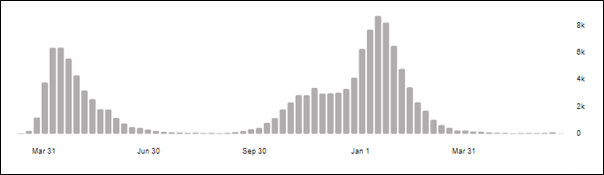
The weekly death rates from March 2020 to June 2021 for the UK are shown in figure 1 below from the WHO web site. The curves for all the other countries considered are broadly similar, but the precise shapes and timings of the curves depend crucially upon the lockdown measures that were imposed by different countries, upon the spread of the new variants through the countries (in particular the so-called Kent or alpha variant) and the effectiveness and rapidity of the vaccination programmes.

Figure 1 United Kingdom weekly death rates throughout waves 1 and 2

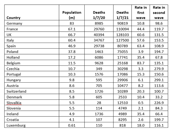
In the analysis we use WHO data for deaths and data from Wikipedia for country populations. The cumulative death figures at 30th June 2020 and 30th June 2021 are used and are shown in Table 1. The first wave of the pandemic was over by the first date, and the second wave well on the way to being over by the second, at least in terms of deaths. The death rates up to June 30th 2020 and between July 1st 2020 and June 30th 2021 have been calculated from the data and are expressed in what has become the conventional statistic of deaths per 100,000 population.

Table 1 Death rates per 100,000 for first and second waves

(At the time of writing – June 30th 2021- the delta variant continues to increase case rates in the UK, in effect a third wave, but deaths remain at a very low level. It is likely that this wave will spread across Europe in the next few months, but hopefully because of the vaccination efforts, serious illnesses and deaths in those countries too will remain at a low level.)

The first wave

The distinction between the first and second waves of the pandemic is important. For the first wave up to 30th June 2020, it can be seen from Table 1 that some countries were affected significantly whilst others hardly at all. The death rate per 100,000 in the UK of 60.6 was amongst the highest in the countries studied. The reasons for this variation are complex, and can be expected to include the degree of initial seeding of the countries from areas where Covid-19 was already endemic, the age profile of the population etc. The February half term skiing trips by many on the UK seem to have been a significant source of the spread, together with international travel from affected areas. There also seems to have been a pronounced west / east gradient, with the easternmost countries in the sample suffering very few deaths in this phase. Germany seems to have straddled this boundary. To unravel these effects would take a much more sophisticated analysis than I can carry out, and it must be left to those better able to do it, . This is not to say that what happened in this wave is unimportant, and the UK death rates were very high. Indeed, it is likely that the UK government will ultimately have to answer serious questions on their level of preparedness, PPE supplies, and in particular the decisions that were made to send untested elderly hospital patients back into care homes. The government estimate for the excess deaths in care homes up to mid-June 2020 was 19,394. If this figure is excluded from the totals the UK death rate in the first wave falls to 31.5 – close to the average of the death rates in the other countries.  That being said, the level of the analysis I am able to undertake does not enable me to draw any further conclusions concerning the relative performance of the different nations in the first wave of the pandemic.

The second wave

In the UK the rise in September and October 2020 was brought under control through a fairly severe lockdown from November 5th 2020 to 2nd December 2020 although by the end of the lockdown it had not fallen to pre-lockdown values. There was much criticism if the government at the lateness of the imposition of the lockdown. The rate began to rise again in early December, due to the emergence of the Kent or alpha variant, peaking in mid-January before being brought down by another lockdown which started on January 6th and was relaxed in stages from March 8th. Again, there was a widespread feeling that the government were late these restrictions and should not have allowed social mixing over Christmas. Vaccinations begin in late December 2020, and this also played a significant role in the lockdown. In the other countries under consideration, the peak in early 2021 due to the Kent variant usually began a month or two later, and the vaccination programmes were also a month or two behind those in the UK, so in general the curves were shifted along the time axis by a month or so. But by the end of June 2021 death rates were very low in all countries.

The international comparison shown in Table 1 indicates that in the second wave, the deaths per hundred thousand of all 18 countries varied widely between 33 in Denmark and 299 in Hungary. The population weighted average was 133. The average of the seven most populous countries was 129. The value for the UK was 132 – very close to the average for both the complete data set of all countries and for the restricted number of countries. Many of the death rates are similar with half the countries having rates between 75 and 150. The data offers little encouragement for those who would either praise or denigrate the performance of the UK – it was boringly average. No doubt it’s mistakes in not locking down quickly enough have been compensated by the rapid vaccination roll out, but the same sort of trade offs can be found in all countries. Perhaps the most important questions to ask are how Denmark, Ireland and Holland achieved the lowest death rates of less than half the average. There are almost certainly important lessons to be learnt from these countries.