Professor Julian Hunt FRS, Baron Hunt of Chesterton (1941-2026)

Author’s note

This post contains the text of a tribute to Julian Hunt that I delivered (through a recording) to the Wind Engineering community gathered at London Ontario for the Conference Dinner of the Computational Wind Engineering Conference in June 2026. I cannot claim to have known Julian well – he would have regarded me as a simple acquaintance – and much of the material below is derived from other public sources. However it does contain some personal memories, that are of particular relevance to those in the wind engineering discipline and I hope it will be of some interest to readers in that community. Note that the tribute as delivered was somewhat shorter than that contained below because of the restrictions of time.

Other obituaries

Other obituaries can be found via the following links.

The tribute

Julian Charles Ronald Hunt was born in Madras in British India in 1941, where his father was a civil servant and diplomat, but spent most of his childhood in England with relatives. He attended Westminster School and Trinity College Cambridge, where he read Mechanical Sciences and graduated with a 1st Class BA in 1963, before carrying out postgraduate research in the field of  magnetohydrodynamics, for which he was awarded a PhD in 1967. He had been elected a Fellow of Trinity College in 1966 and in 1967 he undertook post-doctoral research as a Fulbright Scholar at Cornell. From 1968 to 1970, he was a research officer with the Central Electricity Generating Board where, amongst other things, he studied the collapse of the Ferrybridge Cooling Towers. On his return to Cambridge in 1970  he was made a university lecturer in applied mathematics and engineering, and was later appointed Reader and  Professor of Fluid Dynamics in 1990. He held numerous visiting professorships, and was also a visiting scholar at the United States EPA in 1977 and the National Center for Atmospheric Research in 1983. He  was  a founding director of Cambridge Environmental Research Consultants in 1985, which developed his academic work into practical applications, and remained as Chairman of the company until 2022.In 1989 he was elected as a Fellow of the Royal Society and in 1992, became Director General of the Meteorological Office. In 1997 he became Professor of Climate Modelling at University College London, from where he retired in 2008.

Julian Hunt married Marylla Shephard in 1965 and they had three children: novelist Jemima; medical doctor Matilda; and historian and former Member of Parliament, Tristram. He was politically active and joined the British Labour Party in the 1960s, and was served as a Councillor on Cambridge City Council from 1971 to 1974, being leader of the Labour Group in 1972.  He was created a life peer as Baron Hunt of Chesterton (a suburb to the north of Cambridge) in 2000. He died on April 20th 2026.

I first came across Julian as a final year undergraduate at Cambridge in the early 1970s when he lectured to me – a short course on vorticity and a longer course on pollutant dispersal based on Gaussian plume modelling, which emphasised the importance of the Richardson number, named after the noted mathematician and meteorologist Lweis Fry Richardson. It was some years later that I realised that he was Julian’s great uncle.  Julian’s lectures were always entertaining, but more than a little chaotic and taking any sort of coherent notes was far from easy. Nonetheless mucgh of the narerial he covered was to inform my research and scholarship for many years afterwards. I undertook my Bachelor’s project in the Hydraulic Laboratory of the Department of Engineering, where there was a prominently displayed photograph of Julian Hunt as a research student from a few years previously, with a suitably 1960s flowing hair style, collecting signatures for an anti-Vietnam war petition. 

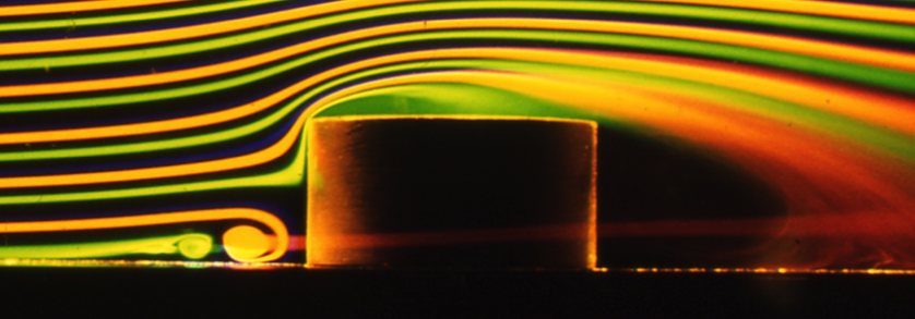
I saw rather more of him as a PhD student, where his work on flow topology helped me in the interpretation of oil flow visualization of horseshoe vortices. He gave a seminar on this topic in the Department of Applied Mathematics on this work, and it was there that I observed one of the few occasions when he appeared unsure of himself, wondering what the audience of very able mathematicians would make of his essentially observational topological work.

On another memorable occasion, as I was walking through Cambridge to do some shopping, he cycled towards me, braked heavily on seeing me, took out a notebook and paper and, whilst still astride his bicycle, sketched out how my smoke flow visualization of horseshoe vortices could be used to check his theory of flow between two buildings. This brief encounter was to result in a short paper in one of the early editions of the Journal of Wind Engineering and Industrial Aerodynamics.

Throughout the following decades, Julian was an ever present in the Fluid Mechanics and Wind Engineering Community, at conferences and seminars, and was very supportive in the early days of the UK Wind Engineering Society.  His talks were always stimulating even if the style remained a little chaotic and always delivered with confidence. On one occasion I remember him walking into a meeting of the Hazards forum a little late and finding his name down to give a presentation, that he had clearly forgotten about. For the next 20 minutes he sat at the back of the room and wrote one out (it was the days of OHP acetates, not PowerPoint) and then proceeded to give a coherent presentation that gave no clue as to its recent genesis.

Whilst perhaps best known to the wider world for his work on meteorology, climatology and hazard prediction Julian Hunt’s contribution to the development of wind engineering has of course been significant, laying the basis for the study of wind effects on pedestrians, wind flow over hills, wind forces on and flows around buildings and the dispersion of pollutants, all based on his fundamental work on the nature of atmospheric turbulence. Much of his work on pollutant dispersion has been incorporated in the ADMS modelling suite which is used worldwide as a powerful design tool.

But, as well as these very real achievements, I would suggest Julian’s greatest gift was his ability to analyse a problem, identify the most significant parameters, and develop simple theoretical approaches that could be both practically useful and offer considerable and generisable insights. With our current abilities to generate very large experimental and computational datasets that can so easily cloud our basic understanding of the phenomena we study, cultivating such an approach is perhaps more important than ever, to underpin the huge advances in technology that we are experiencing.

Ladies and Gentlemen, as I am recording this well before you all sat down to eat this evening, I have no idea what will be the state of the meal you are enjoying, but if you still have something left in the glass before you, I would ask you to raise it in a toast, to the memory of Professor Lord Julian Hunt FRS, Baron Hunt of Chesterton.

The simulation of local tornado wind conditions

Preamble

At the recent Bluff Body Aerodynamics Conference in Brimingham at the end of July / start of August 2024, there was considerable discussion concerning the simulation of tornado and downburst flow for the purposes of measuring structural loads. The current experimental methodology uses large scale tornado / downburst generators that have to be physically very large to have reasonable model scales, with either the whole downflow mechanism being moved across a model, or a model being moved beneath the generator. Such tests are complex and time consuming, the more so because to obtain reliable load statistics multiple tuns are required for each case considered with various tornado or downburst characteristics, building position and orientation relative to the core flow etc.

In the discussions of the various presentations, there was some talk of modelling local flow characteristics around building models, rather than modelling the complete flow field. After mulling over some possibilities for this, in this blog post I set out my preliminary thoughts on how such local simulations might be achieved. I have no access to labs or funding, so these ideas will be for someone else to take forward if they are thought to have merit.

The proposal

The basic idea is as follows.

  • The local wind field around a building should be simulated in a duct, where rapid changes in wind speed such as those found beneath tornadoes and downbursts can be simulated using active control of fans / screens etc. This has been attempted in the past and the technique is clearly possible. The near ground local shear and turbulence could be generated using spires and roughness in the usual way.
  • The rapid horizontal direction changes seen by a building as the flow structures pass over it should be simulated by rotating the model at the required speed.
  • Vertical direction changes (which it will be seen below are usually small) could be simulated in one of two ways – either by tilting the building model vertically (which would result in some ground plane distortion) or perhaps by rapid changes in duct roof profile to produce the appropriate upward or downward vertical velocity component.

In principle there seems to be no reason why it should not be possible to simulate the necessary velocity and direction changes, but there are two issues that need to be investigated. Firstly, what exactly are the local wind velocity and direction changes at a particular point when a tornado or downburst passes over them, and secondly how rapid are these changes – are they possible to achieve at reasonable model scales. We address these issues in what follows.

Specification of wind conditions

There are a number of ways in which wind conditions experienced by buildings as tornados or downbursts pass over them can be specified.

  • Through the use of full-scale data, although this is somewhat sparse, particularly close to the ground.
  • Through large scale LES simulations, a number of which are available, but are usually for certain specific situations and not easily generalized.
  • Through the use of simple analytical models which capture the main features of the flow, and by their nature can be generalized quite easily.

Here we use the latter method (which will come as no surprise to those who know me!). Specifically we use the methods of Baker and Sterling (2017) and Sterling et al (2023).  These give the equations for the three components of velocity, relative to the tornado / downburst centre, shown in Box 1. It is then assumed that the building is stationary as the storm passes over it and the overall horizontal velocity and horizontal and vertical flow directions calculated from assuming a vector sum of a steady wind velocity in the storm direction of travel and the velocity induced by the tornado / downburst (figure 1).

Box 1 Tornado and downburst equations

Figure 1. Co-ordinate system

Clearly the model requires a number of parameters to be specified. These have been taken from the data collation of Baker and Sterling (2019) (which was compiled to assess the adequacy of tornado vortex generators) and four conditions specified – for small, medium and large tornados and for a downburst of similar size to a medium tornado. The parameters for these cases are shown in Table 1. I make no claim as to the overall adequacy or otherwise of this method – as it stands it is simply a convenient tool with which to investigate the broad parameters of the problem, and other methodologies could be used to determine the wind conditions relative to a building.

Table 1. Tornado and downburst parameters used in calculation

Wind speed and direction relative to a stationary building

Clearly the wind speed and wind direction changes experienced by a stationary building as a storm passes over them will depend upon the position of the building relative to the storm track. If the building is directly on the track, then some very rapid changes in speed and direction can be expected. This is shown in figures 2a to 2c for the large tornado case. The x axis is the time at full scale equivalent values as the storm passes over the building. The origin is at the point when the centre of the storm is directly over the building. As might be expected there is a very rapid change in the speed and horizontal direction as the vortex core passes over, and a very large change in vertical direction. Two points can be made, Firstly, in this region the model is at its least realistic as the sharp changes will be smoothed in reality by vortex wandering and viscous effects. However secondly, there will undoubtedly be large vertical flow direction changes as the core passes over, although perhaps not as high or as rapid as shown in figure 2, and the type of model simulation proposed here would be unable to simulate such changes and such simulations are probably not adequate close to the core. In what follows we thus confine our attention to two model positions, at one core radius either side of the vortex direction of travel where one would expect the simulation to be adequate..

(a)

Figure 2. Wind conditions experienced by building directly on the storm track as large tornado passes over

The results of this analysis are shown in figures 3a to 3d for the small, medium and large tornados and figures 4a to 4c for the downburst. The following points can be made.

  • The velocity magnitude variations are the same for both building positions, and all show a rapid rise then a fall as would be expected.
  • The vertical direction change is characterized by a sharp peak. For the tornado cases, this variation is always less than 1 degree, but for the downburst case it is considerably greater.
  • For the downburst, the horizontal direction variation differs in sign between the two positions but are otherwise identical.  However, for the tornado cases the horizontal direction variation is different for the two building positions due to the asymmetry introduced by the rotation of the storm. For the case with the building to the top of the storm track in figure 1, there is a steady, if rapid, change of direction around the building and back to the starting point. For the bottom case, the flow directions move through 130 degrees and then back to the original position.
(a)
(b)
(c)
(d)

Figure 3. Wind conditions experienced by building one core radius away from the storm track as large, medium and small tornados passes over

(a)
(b)
(c)

Figure 4. Wind conditions experienced by building one core radius away from the storm track as downburst passes over

Can the velocity and direction variations be modelled?

The question then arises as to whether these predicted velocity and direction variations can be achieved in practice. As noted above the x axis on figures 3 and 4 is the full-scale time in seconds. If, say, a building model scale of 1:25 is adopted, which is broadly in line with current practice, and a velocity scale of 2:1 is used (ie the simulation velocities are half full-scale velocities, which seems practical), then the model time scale is 1:12.5 i.e. the model changes have to take place 12.5 times faster than the full-scale cases. If we take the modelling above as broadly correct in regard to the time scales of velocity and direction variations, then the horizontal  direction and velocity variations for the large, medium and small tornados and the downburst takes place over periods of around 50, 30 and 10 seconds respectively, resulting in model times of 4, 2.5 and 0.8 seconds. For the direction changes, these time scales seem reasonable and should be achievable by a suitable mechanical system. However, for the velocity changes, that rely on moving air masses with significant inertia, the time scale required for the small tornado would represent a challenge. The vertical direction variations are over much smaller time scales in each case but could probably be achieved with a mechanical system to tilt the model, but probably not with a system that tries to deflect the moving air downwards or upwards.

Concluding remarks

Based on what has been set out above, it would appear that the type of local simulation described in this post has some potential. The use of such a simulation would be restricted however to medium and large storms, as the velocity changes for small storms would be difficult to achieve at model scale. Similarly, the conditions very close to the storm track, in particular the vertical velocity changes, are unlikely to be able to be adequately modelled.

However, I am now retired, with no access to either lab facilities or funding, so if such a simulation is to be further investigated, someone else will need to do it!

References

C J Baker, M Sterling (2017) Modelling wind fields and debris flight in tornadoes, Journal of Wind Engineering and Industrial Aerodynamics 168, 312-321 http://dx.doi.org/10.1016/j.jweia.2017.06.017  

C Baker, M Sterling (2019) Are Tornado Vortex Generators fit for purpose? Journal of Wind Engineering and Industrial Aerodynamics 190, 287-292, https://doi.org/10.1016/j.jweia.2019.05.011

M Sterling, S Huo, C Baker (2023) “Using crop fall patterns to provide an insight into thunderstorm downbursts”, Journal of Wind engineering and Industrial Aerodynamics. 238, July 2023, https://doi.org/10.1016/j.jweia.2023 .105431

Measurements of Carbon Dioxide concentrations in a church

The measurements reported in this post were made by colleagues of the School of Engineering at the University of Birmingham – Dr David Soper and Dr Mike Jesson – whose help is gratefully acknowledged.

Introduction

Over the course of the Covid-19 pandemic, there has understandably been increased concern over ventilation within buildings and on buses and trains etc. This has been reflected in church circles where church ventilation has also been much discussed. Whilst more modern churches will have been specifically designed with ventilation in mind, with proper ventilation paths between windows and doors, the same cannot be said about older churches. For many such churches the only ventilation is offered by the opening of doors, and by leakage through windows and roofs. Because of the large vertical size of such buildings, this lack of ventilation is ameliorated by the ability of any pollutants of pathogens to diffuse throughout the large church space.

One such church is St. Michael on Greenhill in Lichfield (figure 1 below), which is essentially two large, connected boxes – a nave, and a chancel, with a main door in the north wall of the nave and a smaller door into the choir vestry on the south side, and internal doors between the vestry area, the nave and the chancel (figure 2). A though ventilation path is rarely established however as the external and internal doors are seldom open at the same time. There are plans to build new parish rooms to the south of the church, on the grassed area of the figure below.

Figure 2. Plan of church (the measurement positions are indicated by red circles)

This brief post outlines a short series of measurements to measure carbon dioxide (CO2) levels in St. Michael’s. CO2 is produced naturally by people during breathing and CO2 concentration levels are often taken to be an indication of pathogen levels when the population is infected. These measurements were made on Sunday May 15th 2022, when the service pattern was somewhat different from normal, with the normal 8.00 and 10.00 Holy Communion services supplemented by the Annual Parochial Church Meeting (APCM) at 11.15 and a 4.00 service at which a new Rector was Instituted by the Bishop and Archdeacon. As such it gave the opportunity to look at the effects of different congregation numbers (10 in the chancel for the 8.00 service, 50 for the 10.00 service and the APCM, and 150 for the Institution). A screen shot of a video of the Induction service is shown in figure 3 to give some idea of the density of the congregation.

Figure 3. The congregation during the 4.00 service

The measurements

Carbon Dioxide measurements were made with small transducers and data loggers at different points around the church. These were attached to pillars of left on suitable window ledges. These sampled automatically every minute and the results were transmitted wirelessly to a Raspberry Pi computer and from there to a University of Birmingham web site from where the data could be accessed in real time. These measurements were supplemented by measurements of temperature and pressure using further transducers with built in data loggers.

For the sake of simplicity only the results from two of the CO2 sensors will be shown, as the results from them all were very similar. The location of these are shown on the plan of Figure 2 – one on a pillar in the nave, and one on a window ledge in the chancel. The photographs of the instruments shown in figure 4 indicate that they are quite small and discrete and indeed were barely noticed by the congregation. The results will be presented from midnight on Saturday May 14th to midnight on Sunday May 15th.

The results of the trials

The weather on May 15th was quite pleasant with early morning temperatures of 10°C rising to around 20°C in the late afternoon and evening. The external humidity varied from 20% to 100% throughout the day. Inside the church however there was far less variation with temperatures between 16 and 21°C and humidity between 55 and 70%. The was a light southerly wind in the morning, with a somewhat stronger easterly wind from mid-afternoon onwards.

The results of the CO2 measurements are shown on the graph of figure 5. These are shown in terms of parts per million (ppm) of carbon dioxide in the atmosphere by volume and are relative to a general background level of around 400 ppm.

Figure 5. The carbon dioxide concentration measurements

The church was opened at around 7.30 am for the 8.00 Holy Communion service held in the chancel, which went on until till around 8.45. Around 10 people attended. There can be seen to be a small increase in CO2 levels in the chancel over the course of the service (A). Later in the morning there was a 10.00 Holy communion service in the nave with around 50 in the congregation, with a small choir of 4 or 5 in the chancel. This was followed immediately by the APCM from 11.15 to 11.45 in the nave with about the same number attending. During this period there can be seen to be a steady increase in CO2 levels both in the nave and the chancel (B). At 12.00 the church emptied and the doors were closed. This led to a steady decrease in concentrations (C) till about 2.00 when people started to arrive at the church to set up for the major service of the day – the Institution of the new Rector by the Bishop of Lichfield. At this point both the main door and the choir vestry door were opened (as Gazebos were being set up to the south of the church for refreshments after the service), and a ventilation path was opened through the church, with major CO2 concentration reductions (D). Around 3.00 the congregation for the 4.00 Induction service began to arrive and the church rapidly filled with around 150 attending, including a choir of around 20 in the chancel. There were significant increases in CO2 concentrations during the course off the service through till around 5.30 (E). When the service was over, both the main door and the choir vestry door were again opened, and there was a rapid drop in concentration levels till around 7.00 when the choir vestry door was closed (F). After some clearing up, the church emptied by around 8.00 and there was a gradual fall off in concentration levels (G).

Two main points emerge from these measurements. Firstly, and quite obviously, the levels of CO2 increase with the number of people in church and with the time they spend there – B and E on the above figure. Secondly it is clear that there are two different types of ventilation – the slow diffusion of CO2 throughout the building and leakage through the building envelope – roof, doors, windows etc. (C and G); and the rapid lowering of concentration levels when there is a direct ventilation path through the building between the two doors (D and F).

Now from the slope of the graph for the times when concentrations are falling, it is possible to get estimates of the time it takes for the concentrations to fall by 50%. For C and G these times are around 2.5 hours, whilst for D and F these times are between 10 and 30 minutes. Thus the through ventilation reduces the carbon dioxide levels much more quickly than simple diffusion and leakage.

Implications

The results show firstly that the method that was used is a simple and viable way of assessing the main ventilation parameters in a church. Colleagues from the University of Birmingham recognise that there is still work to on improving the frequency response of the sensors but overall the method has much promise. Secondly there are some implications for St. Michael’s itself – that large congregations in the church for lengthy periods of time can result in significant CO2 concentrations (and thus pathogens in times of infection), and that through ventilation is much more effective in reducing these concentrations than simply relying on diffusion and leakage. In the Parish Rooms developments that are under consideration for the area adjoining the choir vestry, it may be worth investigating if it is possible to design through ventilation paths through the church and the new development.

Pollutants, pathogens and public transport – ventilation, dispersion and dose

Preamble

The ventilation of buses and trains has come to be of some significance to the travelling public in recent years for a number of reasons. On the one hand, such vehicles can travel through highly polluted environments, such as urban highways or railway tunnels, with high levels of the oxides of nitrogen, carbon monoxide, hydrocarbons and particulate matter that can be drawn into the passenger compartments with potentially both short- and long-term health effects on passengers. On the other, the covid-19 pandemic has raised very significant concerns about the aerosol spread of pathogens within the enclosed spaces of trains and buses. There is a basic dichotomy here – to minimise the intake of external pollutants into vehicles, the intake of external air needs to be kept low, whilst to keep pathogen risk low, then high levels of air exchange between the outside environment and the internal space are desirable. This post addresses this issue by developing a common analytical framework for pollutant and pathogen dispersion in public transport vehicles, and then utilises this framework to investigate specific scenarios, with a range of different ventilation strategies.

The full methodology is given in the pdf that can be accessed via the button opposite. This contains all the technical details and a full bibliography. Here we give an outline of the methodology and the results that have been obtained.

Analysis

The basic method of analysis is to use the principle conservation of mass of pollutant or pathogen into and out of the cabin space. In words this can be written as follows.

Rate of change of mass of species inside the vehicle = inlet mass flow rate of species + mass generation rate of species within the vehicle – outlet mass flow rate of species– mass flow rate of species removed through cleaning, deposition on surfaces or decay.

This results in the equation shown in Box 1 below, which relates the concentration in the cabin to the external concentrations, the characteristics of the ventilation system and the characteristics of the pollutant or pathogen. The basic assumption that is made is of full mixing of the pollutant or pathogen in the cabin. The pdf gives full details of the derivation of this equation, and of analytical solutions for certain simple cases. It is sufficient to note here however that this is a very simple first order differential equation that can be easily solved for any time variation of external concentrations of pollutant generation by simple time stepping methods. For gaseous pollutants, the rate of deposition and the decay rate are both zero which leads to a degree of simplification.

Box 1. The concentration equation

The pdf also goes on to consider the pollutant or pathogen dose that passengers would be subjected to – essentially the integration of concentration of time history – and then uses this in a simple model of pathogen infection. This results in the infection equation shown in Box 2. Essentially it can be seen that the infection risk is proportional to the average concentration in the cabin and to journey length.

Box 2. Infection equation

The main issue with this infection model is that it assumes complete mixing of the pathogen throughout the cabin space and does not take account of the elevated concentrations around an infected individual. A possible way to deal with this is set out in the pdf. Further work is required in this area.

Ventilation types

The concentration and infection equations in Boxes 1 and 2 do not differentiate between the nature of the ventilation system on public transport vehicles. Essentially there are five types of ventilation.

  • Mechanical ventilation by HVAC systems
  • Ventilation through open windows
  • Ventilation through open doors
  • Ventilation by a through flow from leakage at the front and back of the vehicle (for buses only)
  • Ventilation due to internal and external pressure difference across the envelope.

Simple formulae for the air exchange rates per hour have been derived and are shown in Box 3 below. By substituting typical parameter values the air exchange rates are of the order of 5 to 10 air changes per hour for the first four ventilation types, but only 0.1 for the last. Thus ventilation due to envelope leakage will not be considered further here, although it is of importance when considering pressure transients experienced by passengers in trains.

Box 3. Ventilation types

Scenario modelling

In what follows, we present the results of a simple scenario analysis that investigates the application of the above analysis for different types of vehicle with a range different ventilation systems, running through different transport environments. We consider the following vehicle and ventilation types.

  • An air-conditioned diesel train, with controllable HVAC systems.
  • A window and door ventilated diesel train.
  • A bus ventilated by windows, doors, and externally pressure generated leakage.

Two journey environments are considered.

  • For the trains, a one-hour commuter journey as shown in figure 1, beginning in an inner-city enclosed station, running through an urban area with two stations and two tunnels, and then through a rural area with three stations (figure 1).
  • For buses, a one-hour commuter journey, with regular stops, through city centre, suburban and rural environments (figure 2).

Results are presented for the following scenarios.

  • Scenario 1. Air-conditioned train on the rail route, with HVACs operating at full capacity throughout.
  • Scenario 2. As scenario 1, but with the HVACs turned to low flow rates in tunnels and enclosed stations, where there are high levels of pollutants.
  • Scenario 3. Window ventilated train on rail route with windows open throughout and doors opened at stations.
  • Scenario 4. As scenario 3, but with windows closed.
  • Scenario 5. Window, door and leakage ventilated bus on bus route with windows open throughout and doors opened at bus stops.
  • Scenario 6. As scenario 5, but with windows closed.

Details of the different environments and scenarios are given in tables 1 and 2.  Realistic, if somewhat arbitrary levels of environmental and exhaust pollutants are specified for the different environments – high concentrations in cities and enclosed railway and bus stations and lower concentrations in rural areas. The air exchange rates from different mechanisms are also specified, with the values calculated from the equations in Box 3. Note that, in any development of this methodology, more detailed models of the exhaust emissions could be used that relate concentrations at the HVAC systems and window openings to concentrations at the stack, which would allow more complex speed profiles to be investigated, with acceleration and deceleration phases.

Figure 1. The rail route

Figure 2. The bus route

Table 1. The rail scenarios

Table 2. The bus scenarios

The results of the analysis are shown in figures 3 and 4 below for the train and bus scenarios respectively. Both figures show time histories of concentrations for NO2, PM2.5, CO2 and Covid-19, together with the external concentrations of the pollutants.

For Scenario 1, with constant air conditioning, all species tend to an equilibrium value that is the external value in the case of NO2 and PM2.5, slightly higher than the external value for CO2 due to the internal generation and a value fixed by the emission rate for Covid 19.

For Scenario 2, with low levels of ventilation in the enclosed station and in the tunnels, NO2 and PM2.5 values are lower than scenario 1 at the start of the journey where the lower ventilation rates are used, but CO2 and Covd-19 concentrations are considerably elevated. When the ventilation rates are increased in the second half of the journey all concentrations approach those of Scenario 1.

The concentration values for scenario 3, with open windows, match those of Scenario 1 quite closely as the specified ventilation rates are similar. However, for Scenario 4, with windows shut and only door ventilation at stations, such as might be the case in inclement weather, the situation is very different, with steadily falling levels of NO2 and PM2.5, but significantly higher values of CO2 and Covid-19. The latter clearly show the effect of door openings at stations.

Figure 3. The train scenario results

Now consider the bus scenarios in figure 4. For both Scenario 5 with open windows and doors, and Scenario 6 with closed windows and open doors, the NO2 and PM2.5 values tend towards the ambient concentrations and thus fall throughout the journey as the air becomes cleaner in rural areas. The internally generated CO2 and Covid-19 concentrations for CO2 and Covid-19 are however very much higher for Scenario 6 than for Scenario 5.

Figure 5. The bus scenarios

The average values of concentration for all the scenarios is given in Table 3. The dose and, for Covid-19, the infection probability, are proportional to these concentrations. For NO2 and PM10 the average concentrations reflect the average external concentrations, and, with the exception of Scenario 4, where there is low air exchange with the external environment for part of the journey. The average concentrations for CO2 and Covid-19 for the less ventilated Scenarios 4 and 6 are significantly higher than the other. For Covid-19, the effect of closing windows on window ventilated trains and buses raises the concentrations, and thus the infection probabilities, by 60% and 76% respectively.

Table 3. Average concentrations

Closing comments

The major strength of the methodology described above is its ability, in a simple and straightforward way, to model pollutant and pathogen concentrations for complete journeys, and to investigate the efficacy of various operational and design changes on these concentrations. It could thus be used, for example, to develop HVAC operational strategies for a range of different journey types. That being said, there is much more that needs to be done – for example linking the methodology with calculations of exhaust dispersion around vehicles, with models of particulate resuspension or with models of wind speed and direction variability. It has also been pointed out above that the main limitation of the infection model is the assumption of complete mixing. The full paper sets out a possible way forward that might overcome this. Nonetheless the model has the potential to be of some utility to public transport operators in their consideration of pollutant and pathogen concentrations and dispersion within their vehicles.

The calculation of Covid-19 infection rates in churches

Preamble

In a recent post, I looked at the risk of Covid infection on GB trains, based on the spreadsheet calculation methodology of Professor Jimenez and his team at the University of Colorado – Boulder. This method is based solely on aerosol transmission, which is now regarded as being of much more significance than transmission by surface contamination, and the risk of the latter can be easily reduced by normal hygiene precautions. In this post, I apply the same methodology specifically to the case of churches and include a downloadable EXCEL spreadsheet that might be of use to others. There is a level of self-interest of course, as I am a minister at an Anglican church which will shortly be faced with decisions concerning the nature of worship as the Covid restrictions are removed.  Essentially the spreadsheet gives a numerical value for the risk of Covid infection with specified amelioration methods in place (social distancing, masks, no singing etc.) and allows a rational assessment of safety to be made.

At the outset, it needs to be made clear that there are very many assumptions in the methodology of Jimenez, with some of the parameters not well specified, and the base values of risk that the model gives must be regarded as indicative only and it is best used in a comparative sense. In what follows, I first describe the input and output parameters of the spreadsheet, and then look at how it might be used to compare risk levels for different situations.

Screenshot of spreadsheet

Download the spreadsheet from here

The spreadsheet

The spreadsheet is quite simple and straightforward, and requires no specific expertise to use. A screenshot is given above. The brown cells are input parameters, and the blue cells the output parameters The former are as follows.

  • Length, width and height of worship area. The model effectively assumes that the worship area is a three-dimensional box. This is clearly not usually the case, and some degree of judgement will be required in assigning the length, width and height. All dimensions are in metres.
  • Duration of worship is specified in hours.
  • The ventilation with outside air is specified in air changes per hour. For most old churches that have been well maintained, this will be small and a value of 1.0 can be assumed. For particularly drafty churches, this could be rather higher (at say 3.0). For air-conditioned worship areas a value of 10.0 is appropriate.
  • For the decay rate of the virus and the deposition to surfaces standard parameters are assumed. Normally the value for additional control measures will be zero unless there is filtering of recirculated air.
  • The number in the choir and congregation are self-explanatory. Ministers should be included in the latter. Because of lack of reliable data on breathing rates and virus emission rates in children, no breakdown by age is required. This is probably a conservative assumption.
  • The fractions of time that the choir sings and the fraction of time that the congregation sings are both values between 0 and 1.0. The choir fraction is when they are singing alone – it is assumed they will join with the congregation when the latter sing.
  • The fraction of population that is immune is taken to be the proportion of the population that have received a full course of vaccinations, multiplied by 0.9 to allow for virus escape. At the time of writing in the UK, this parameter has a value of around 0.5.
  • The parameter that allows for virus transmission enhancement due to variants has a base value of 1.0, a value of 1.5 for the alpha variant, and a value of 2.0 for the delta variant.
  • A choice of values for masks efficiency for both breathing in and out are given.
  • The fraction of the congregation with masks is a number between 0 and 1.0.
  • The probability of being infective is taken from regional ONS data. For example, if the ONS figure of those infected is 1 in 500, then the probability will be 1/500 = 0.002.
  • The hospitalization and death rates of those infected can also be taken from ONS data and have small values just above 0.0. At the time of writing the hospitalization rate is around 0.02 (2%) and the death rate is almost negligible and is taken as 0.001 (0.1%).

The next set of parameters in the spreadsheet are those that emerge from the calculation process and are not of direct interest to users. These lead on to the output parameters, which are as follows.

  • The probabilities of covid infection, hospitalisation and death of a person attending the service of worship.
  • These probabilities expressed as risk – for example a risk of 1 in 1000 of infection.
  • The number of covid cases, hospitalisations and deaths arising from attending the service.

Comparing risk

The absolute values of probability and risk must only be regarded as approximate. Indeed, Jimenez emphasises that there is a great deal of uncertainty around many of the assumed parameter and urges caution in the interpretation of the results. At best, the results will be accurate to within an order of magnitude. The main utility of the model would seem to be to assess changes in risk – for example, any particular congregation may be comfortable with a certain set of Covid amelioration methods (no singing, masks etc.) and the method can be used to see how this risk might change as these measures are relaxed.

As an example of this, let us consider a church (which is not dissimilar to the one where I am a minister), where the congregation is currently capped at 60, there is 100% marks wearing, and only the choir of 6 sings. For the current infection rate of 1 in 150, this gives a risk of infection of 1 in 18100 for a one-hour service. This level of risk would seem to be acceptable to the congregation. Indeed, for one person attending similar services each week for one year, the risk of covid infection is close to the UK risk of injury in a vehicle accident in a year.

Firstly, suppose that a capacity of 100 is allowed (i.e. social distancing regulations are abolished). This increases the risk of infection to 1 in 11800. Now suppose that in addition masks are no longer required. This leads to a risk of infection of 1 in 4100. Allowing congregational singing raises the risk further to 1 in 1600. As all these figures are dependent upon regional infection rate, they also allow for the congregation to decide at what infection level restrictions can be removed. Should the infection level fall to 1 in 1000, then the overall risk with no amelioration measures decreases from 1 in 1600 to 1 in 11300. Whilst these figures are themselves only approximate, they nonetheless give any congregation the information to make a rational choice of how to proceed as restrictions are eased.

Closing comment

In order to make the spreadsheet as easy to use as possible, I have deliberately kept it simple and have not included too many options. However, if anyone has any suggestions for improvements / useful additions, then please contact me on bakercj54@gmail.com.

The calculation of Covid-19 infection rates on GB trains

Preamble

In a recent post I looked at the ventilation rate of trains without air conditioning and compared them with the ventilation rate of airconditioned trains. The context was the discussion of the safety of trains in terms of Covid-19 infection. For air conditioned trains, the industry accepted number of air changes per hour is around 8 to 10. For non-air conditioned trains with windows fully open and doors opening regularly at stations, I calculated very approximate values of air changes per hour of around twice this value, but for non-air conditioned trains with windows shut and thus only ventilated by door openings, I calculated approximate values of a of 2.0. On the basis of these calculations, I speculated that the non-air conditioned trains with windows shut probably represented the critical case for Covid-19 transmission. In that post however I was unable to be precise about the level of risk of actually becoming infected and how this related to ventilation rate.

The work of Jimenez

I have recently come across the spreadsheet tool produced by Prof. Jose Jimenez and his group at the University of Colorado-Boulder that attempts to model airborne infection rates of Covid-19 for a whole range of different physical geometries, using the best available information on pathogen transport modelling, virus production rates, critical doses etc. They base their  analysis on the assumption that aerosol dispersion is the major mode of virus transport, which now seems to be widely accepted (and as anyone who has been following my blogs and tweets will know that I have been going on about for many months). I have thus modified the downloadable spreadsheet to make it applicable to the case of a standard GB railway passenger car compartment.  A screen shot of the input / output to the spreadsheet is shown in figure 1 below.

Figure 1 Screen shot of spreadsheet input / output parameters

The inputs are the geometry of the passenger compartment; the duration and number of occurrences of the journey, the air conditioning ventilation rate; the number of passengers carried; the proportion of the population who may be considered to be immune; the fraction of passengers wearing masks; and the overall population probability of an individual being infected. In addition, there are a number of specified input parameters that describe the transmission of the virus, which the authors admit are best guess values based on the available evidence, but about which there is much uncertainty. The outputs are either the probabilities of infection, hospitalization and death for an individual on a specific journey or for multiple journeys; or the number of passengers who will be infected, hospitalized or die for a specific journey or for multiple journeys.

The spreadsheet is a potentially powerful tool in two ways – firstly to investigate the effect of different input parameters on Covid-19 infection risk, and secondly to develop a rational risk abatement process. We will consider these in turn below.

Parametric investigation

In this section we define a base case scenario for a set of input variables and then change the input variables one by one to investigate their significance. The base case is that shown in the screen shot of figure 1 – for a journey of 30 minutes repeated 10 times (i.e. commuting for a week);  80 unmasked passengers in the carriage; a ventilation rate of 8 air changes per hour; a population immunity of 50%; and a population infection rate of 0.2% (one in 500). The latter two figures broadly match the UK situation at the time of writing. For this case we have a probability of one passenger being infected on one journey of 0.096% or 1 in 1042. The arbitrariness of this figure should again be emphasized – it depends upon assumed values of a number of uncertain parameters. We base the following parametric investigation on this value. Nonetheless it seems a reasonable value in the light of current experience. The results of the investigation are given in Table 1 below.

Table 1 Parametric Investigation

The table shows the risk of infection for each parametric change around the base case and this risk relative to the base case. There is of course significant arbitrariness in the specification of parameter ranges.  Red shading indicates those changes for which the infection risk is more than twice the value for the base case and green shading for those changes for which the infection risk is less than half the value for the base case. The following points are apparent.

  • The risk of infection varies linearly with changes in journey time, population infection rate and population immunity. This seems quite sensible, but is effectively built into the algorithm that is used. 
  • Changes in ventilation rate cause significant changes in infection risk. In particular the low value of 2ach, which is typical on non-airconditioned vehicles with closed windows, increases the infection risk by a value of 3.5.
  • The effect of decreasing passenger number (and thus increasing social distancing) is very significant and seems to be the most effective way of reducing infection risk, with a 50% loading resulting in an infection risk of 28% of the base case, and a 20% loading a risk of 6% of the base case.
  • The effect of 100% mask wearing reduces the infection risk to 35% of the base case.
  • 100% mask wearing and a 50% loading (not shown in the table) results in a reduction of infection risk to 10% of the base case.

From the above, regardless of the absolute value of risk for the base case, the efficacy of reducing passenger numbers and mask wearing to reduce risk is very clear.

An operational strategy to reduce risk.

The modelling methodology can also be used to develop a risk mitigation strategy. Let us suppose, again arbitrarily, that the maximum allowable risk of being infected per passenger on the base case journey is 0.1% (i.e. 1 in a thousand). Figure 2 shows the calculated infection risk for a wide range of national infection rate of between 0.01% (1 in 10,000) to 2% (1 in 50). Values are shown for no mask and full capacity; 100% mask wearing and full capacity; and 100% mask wearing and 50 % capacity. It can be seen that the no mask / full capacity curve crosses the 0.1% line at a national infection rate of 0.2% and the 100% mask / full capacity line crosses this boundary at 0.6%.

Figure 2 Effect of national infection rate on infection risk, with and without mask wearing and reduction in loading

Consideration of the results of figure 2 suggest a possible operational strategy of taking no mitigation risks below an infection rate of 0.2%, imposing a mask mandate between 0.2% and 0.6% and adding a significant capacity reduction above that. This is illustrated in figure 3 below.

Figure 3. Mitigation of risk to acceptable level through mask wearing and reduced capacity.

As has been noted above the absolute risk values are uncertain, but such a methodology could be derived for a variety of journey and train types, based to some extent on what is perceived to be safe by the travelling public. Regional infection rates could be used for shorter journeys. Essentially it gives a reasonably easily applied set of restrictions that could be rationally imposed and eased as infection rate varies, maximizing passenger capacity as far as is possible. If explained properly to the public, it could go some way to improving passenger confidence in travel.

Covid-19 and train ventilation

Recently the Rail Delivery Group has issued a short video animation of which the above is a screenshot. This addresses, for the first time, the need for good ventilation to decrease the risk of Covid infection on trains. Aerosol transmission is now regarded as the primary mode of pathogen transmission and infection is much more likely via this route than from surface transmission, despite the emphasis that has been given to the latter. So this little video is to be welcomed. But in telling us that train ventilation systems change the air every 6 to 9 minutes, giving the number of air changes per hour (ACH) of between 7 and 10, it rather begs the question as to what actually is an adequate ventilation rate to minimize infection risk. In a blog of November 2020, I addressed this issue in a rather simplistic way and came up with the expression shown below. This simple formula says that the time for a critical pathogen dose increases with increases in the value of the critical dose and in the number of air changes per hour, but decreases with increases in the respiration rate of infected individuals and the initial concentration of the pathogen. This all seems very reasonable, but precise values depend crucially on the values of critical dose, respiration rate and initial concentration. I would guess such values are available (or at least arrange of them) but I don’t have easy access to them.

But let us assume for the sake of argument that the current air exchange rates on trains are adequate to keep the risk of infection low (but note that they are significantly less than in aircraft, where 25 to 30 ACH seem to be common). This only applies of course to trains with air conditioning systems, but there are trains that rely on window opening for ventilation – not least the Class 323s on the Cross City line in Birmingham – the trains that I travel on most frequently. How does the ventilation of these trains compare with that for air-conditioned trains.?

British Rail Class 323 - Wikiwand

For such trains the ventilation mechanism will be what can be referred to as shear layer ventilation – the flow in and out of the train windows and doors due to the relative air movement when the train is moving, or due to wind effects when the train is stationary. In some work from about 20 years ago, a research student and myself derived the simple expression shown below for shear layer ventilation for wind passing across an opening in a large box structure.

The application of this method to train ventilation is a bit of a stretch, and one would not expect any great accuracy. For the Class 323, we the assume the following: 22 windows/carriage, area of window opening window of 0.02m2, giving a total opening area of 0.44m2; 2 open doors per carriage with an opening area of 4m2 giving a total opening area of 8m2; a carriage volume of 80m3.  We also assume that for both doors and windows, the coefficient k=0.05. The train speed when moving is taken as 20m/s, and the wind speed when the train is stationary is taken as 1m/s. In operation we assume that the train is moving for 90% of the time and stationary for 10% of the time. Based on these figures we can calculate the number of air changes per hour for when the train is moving and when it is stationary. For the former we get an ACH of 3600(20*0.44*0.05*0.9) /80= 17.8, and for the latter an ACH of  3600(1*8*0.05*0.1) /80= 1.8.

The simplicity of this method needs to be emphasised and the results should only be regarded as approximations. Nonetheless they are of interest. Firstly the figures suggest that with all windows open, the ventilation of the Class 323 is twice as high as on a typical air  conditioned system. This ties in with my personal experience – when the windows are open to this extent in the summer, there is a strong (and if the weather is hot, pleasant) draft through the carriage. If only half the windows are open, the overall ventilation is equivalent to an air conditioned system. Secondly, the amount of ventilation due to doors opening in stations is small in comparison to the maximum window ventilation. This leads to the third point – if all the windows are shut (as would be the case in the winter) the overall ventilation is well below the air-conditioned case. It is perhaps for such vehicles in such conditions that we should look for the critical case of pathogen transmission on trains.

Giovanni Solari 1953-2020

See the source image

On April 19th 2021 an online memorial event was held to celebrate the life of Prof Giovanni Solari of the University of Genoa who died five months previously. His career is well described in a memorial article in the Journal of Wind Engineering that can be found here. I was one of over 20 friends and colleagues who spoke at the event. My short contribution is given below.

Giovanni Solari has left us a very considerable legacy, and I would like to briefly consider three aspects of this. The first is his legacy to the wind engineering community. He was the first President of the International Association of Wind Engineering and held that role from 2003 to 2007. But that role involved much more than a ceremonial aspect. He was instrumental in turning the IAWE from a very loose association that met for an extended supper every four years at the major conferences to a legally organised society with a properly formulated constitution, member organisations and a functioning secretariat. This involved much work with lawyers (an unenviable task) and much travelling and discussion. In a real way the existence of an international wind engineering community is one of Giovanni’s major legacies.

The second aspect I want to mention is his intellectual legacy. Giovanni had the gift of being able to take a complex physical or engineering problem, often in the field of structural dynamics, and to express this problem mathematically in such a way that he could obtain closed form solutions for the engineering parameters of interest. These were often complex but allowed a proper appreciation of the role of different material and loading properties to be understood and generalised. Giovanni was the master of the closed form solution. In these days, when it is so easy simply to throw computer power at a difficult problem through complex CFD of FE analysis, the need for such closed form solution becomes all the greater to inform calculations and to actually understand the issues in depth. Giovanni’s intellectual legacy, of doing the hard thinking and analysis before resorting to numerical calculation, is a very important one to keep hold of.

The third of the legacies I want to mention is a personal one. I believe I first met Giovanni at the first European Conference on Wind Engineering in the early 1990s. Certainly we began to correspond after that (and remember those were the days before the instant gratification of emails) and I paid a memorable visit to Genoa around that time where the highlight for me was the ability to spend some hours in the library, which was much better resourced in wind engineering terms than that of my own institution. I was received with courtesy and kindness and Giovanni spent time showing me around the city that he clearly loved. Over the years that same courtesy and kindness has been shown by Giovanni to numerous people – from research students at the very start of their careers to the more senior of us. And that is how many of us, myself included, who remember him – for his personal legacy as much as for his undoubted scholarship, organisational and intellectual legacies, as the kindest and most courteous of friends and colleagues. He will be very much missed by many in the community.

Giovanni – Requiescat in pace

International Wind Engineering seminars 2020/21 – some reflections

A Japanese version of this post can be found here

Between October 2020 and March 2021, I organised a series of six International Wind Engineering Seminars, through the University of Birmingham, my employer before I retired. These were sponsored by the International Association of Wind Engineering (IAWE) and delivered via Zoom. On the web page for this seminar series, I give the justification for organising it as follows.

“Because of the Covid19 pandemic, opportunities for the international wind engineering community to meet physically have been very much restricted and are likely to remain so for at least the next year. To enable the community to continue to interact with each other, at least in a virtual way, the University of Birmingham is organizing a series of six seminars via Zoom from October 2020 to March 2021.”

In this post, I want to reflect on how these seminars were delivered and received, what lessons might be learnt, and ask some questions concerning the future.

Each seminar consisted of a main speaker, followed by either a panel discussion or between two and four shorter presentations. The dates and topics are given in table 1. As these seminars were set up in some haste in August / September 2020, I mainly called upon my circle of contacts to be the main speakers at the events, and they suggested other speakers or panel members. I am indebted to all the speakers for taking part and spending considerable time in preparation. The nature of the delivery and follow up evolved over the course of the series. After the first seminar it became clear that I could not both chair the sessions and organise the questions in Chat to put to the speakers. Thus, from seminars 2 to 6, I was assisted by Grace Yan from Missouri who collated all the questions that were put on Chat and forwarded them to me to put to the speakers. Her help was hugely appreciated. For seminars 3, 4 and 6 the presenters and panelists were also asked to provide written answers to questions, and these were posted on the web pages that were for each of the seminars. All the presentations (and for seminars 5 and 6 the questions and answers) were recorded using the Zoom Record function and these recordings were place on my YouTube site and linked to the appropriate page. These pages also included talk abstracts and speaker biographies. After the third seminar I realised that YouTube could not be accessed from all parts of the world, so a link to the Zoom cloud versions was also given. From seminar 4 onwards, these could also be downloaded as required. The time chosen for the seminars (after the first) was 12.00 UK time, this being the best compromise for most time zones, with the exception of the west coast of the America and Australasia. I tried to institute a separate Q and A session for these time zones a day or so after the seminar, but there was insufficient take up to make it worthwhile. Thus the whole process was a considerable learning experience for me.

Table 1 Seminar dates, titles and speakers

It must be mentioned at this point that the third seminar occurred shortly after the death of Prof Giovanni Solari, who was instrumental in the setting up of the IAWE, and the speaker, Prof Kareem, paid tribute to him in his talk.

UniGe Giovanni Solari
Prof. Giovanni Solari

Table 2 shows the bare statistics for the seminars. The size of the distribution list for publicity grew through the series from the original 688 of the mailing list for the abortive BBAA conference to 1525 for seminar 6.  By seminar 3 the size of the list became so large that my e mail account was temporarily stopped as it was thought it had been hacked and was sending out spam. Thereafter I sent the information around in smaller batches. The number of registrants varied between 279 and 616, although only around 50 to 70% of these actually connected. The number of video views was also encouraging although again one must interpret these numbers cautiously as only around 20 to 30% of the views were for more than a few minutes. Note that these statistics are up to March 14th 2021 only, and as the views continued for several months after each seminar, the number of video views for the 2021 seminars will not be the final values.

Table 2 Seminar statistics (up to March 14th 2021)

Table 3 shows a breakdown of the views of the seminar web pages by month (which includes links to the videos). As expected these peak just before and just after the seminar, but all the seminars attract a significant number of views for a number of months after the event, which suggest that the subject matter is of ongoing interest. Again, note that this date only extends to the middle of March 2021,and a significant number of views could be expected for the later seminars after this date.

Table 3 Views of seminar web pages (up to March 15th 2021)

Table 4 shows the location of those who registered, as far as could be judged from email addresses. The generic .com address contains registrants from a wide variety of countries, and this rather skews the results. Nonetheless, it can be seen that whilst those countries where wind engineering is well established are well represented, a very wide range of countries was represented overall.

Table 4 Locations of registrants

Thus the numbers suggest that there was a significant number of wind engineers around the world who appreciated the seminar series and found them useful, and indeed that is what has been suggested by the informal feedback I have received. Again, caution is required to avoid over interpretation – the level of engagement with online seminars is likely to be much less than with in person presentations – I for one tend to do things such as checking my e mail / cricket scores when attending such virtual events – but not when I am chairing of course! But broadly the seminar series seems to have met a need. But there are needs it hasn’t addressed, for example the inclusion of a social aspect for informal discussion and the inclusion of young researchers in a meaningful way etc. To address this sort of issue, other formats can be envisaged – for example I can think of the following.

  • Specific discussion topics could be set, and potential attendees asked to submit short abstracts of a two minute, two slide talk, from which a balanced group of young and established researchers could be selected for a series of short presentations and a more relaxed discussion. These could be recorded and put on-line for all to see.
  • Interviews (by me or others) of a range of wind engineers, talking about their careers, their successes and failures etc., which could again be recorded and put on-line.
  • The use of a platform such as Gather Town, which seems to allow for multiple individual conversations within a group structure and could be used for, say, virtual poster sessions (but note I have never used this, although on the face of things it seems potentially useful.)

And there are no doubt other possibilities. The question then arises as to what should happen next. I don’t intend to organise any more such seminars till September at least – amongst other things I wish to watch a number of cricket matches rather than just checking the scores, and to re-acquaint myself with a number of heritage railways in Wales. So, I put the following questions to the wind engineering community.

  • Should something similar be organised for next winter as I suspect international travel won’t resume in any real sense until Summer 2022 at best? Note that I am not necessarily implying that should something felt to be necessary, then I would be the one to organise it!
  • If so, what should the format be – just one speaker, or more than one speaker, or something completely different?
  • Are there any suggestions for topics and speakers?
  • Are there any other suggestions for possible related activities, such as I mention above.

There is also a larger question of course about the future of the four year cycle of Wind Engineering conferences and whether such a cycle is still sustainable – see for example the initiative of Glasgow University which is urging academics to reduce overseas travel as part of the greening of its activities. But that is a discussion for others to have within the IAWE committee.

Please make any comments in the comment box attached to this post, or, if you wish, email me directly on bakercj54@gmail.com. Thanks in advance.

Some thoughts on ventilation and pathogen concentration build up

Modeling airflow scenarios in classrooms
Covid spread from CFD studies

Introduction

Up till recently most attention had been focused on the spread of Covid-19 by near field transmission – being in close proximity to an infected person for a certain amount of time, and rather ad hoc social distancing rules have been imposed to attempt to reduce transmission. However, there is another aspect of transmission – the gradual build up of pathogen concentrations in the far field in enclosed spaces due to inadequate ventilation. The importance of this mode of transmission is beginning to be recognised – see for example a recent seminar hosted by the University of Birmingham. The main tool that seems to have been used for both near and far field dispersion is Computational Fluid Dynamics (CFD) – see the graphic above from the University of Minnesota for example. Now whilst such methods are powerful and can produce detailed information, they are very much situation specific and not always easy to generalise. This post therefore develops a simple (one could even say simplistic) method for looking at the far field build up of pathogens in an enclosed space, in a very general way, to try to obtain a basic understanding of the issues involved and arrive at very general conclusions.

The model

We begin with equation (1) below. This is a simple differential equation that relates the rate of change of concentration of pathogen in an enclosed volume to the pathogen emitted from one or more individuals via respiration and the pathogen removed by a ventilation system. This assumes that the pathogen is well mixed in the volume and is a simple statement of conservation of volume.

From the point of view of an individual, the important parameter is the pathogen dose. This is given by equation (2) and is the volume of pathogen ingested over time through respiration. The respiration rate here is assumed to be the same as that of the infected individual.

Equations (1) and (2) can be expressed in the normalised form of equations (3) and (4) and simply solved to give equations (5) and (6).

Equations (5) and (6) are plotted in figures 1 and 2. Note that an increment of 1.0 in the normalised time in this figure corresponds to one complete air change in the enclosed volume. It can be seen that after around three complete air changes the concentration of pathogen reaches an equilibrium value and the dose increases linearly, whatever the starting concentration. To the level of approximation that we are considering here we can write the relationship between normalised dose and time in the form of equation (7), which results in the non-normalised form of equation (8).

Assuming that there is a critical dose, the critical time after which this occurs is then given by equation (9).

Equation (9), although almost trivial, is of some interest. It indicates that the time required for an individual to receive acritical dose of pathogen is proportional to the volume of the enclosure and the ventilation rate. This is very reasonable – the bigger the enclosure and the higher the ventilation, the longer the time required. The critical time is inversely proportional to the concentration of the emission, which is again reasonable, but inversely proportional to the square of the respiration rate. This is quite significant and a twofold increase in respiration rate (say when taking exercise or dancing) results in the time for a critical dose being reduced by a factor of 4, or alternatively the need for ventilation rate to increase by a factor of 4 to keep the critical time constant. Similarly if there are two rather than one infected individuals in the space, then the respiration rate will double, with a reduction in the critical time by a factor of four.

Discussion

Now consider the implications of this equation for two specific circumstances that are of concern to me – travelling on public transport (and particularly trains) and attending church services. With regard to the former, perhaps the first thing to observe is that there is little evidence of Covid-19 transmission on trains, and calculated risks are low. In terms of the far field exposure considered here, respiration rates are likely to be low as passengers will in general be relaxed and sitting. This will increase the time to for a critical dose. On modern trains there will be an adequate ventilation system, and the time to reach a critical dose will be proportional to its performance. Nonetheless the likelihood of reaching the critical level increases with journey time – thus there is a prima facie need for better ventilation systems on trains that undergo longer journeys than those that are used for short journeys only. For trains without ventilation systems (such as for example the elderly Class 323 stock I use regularly on the Cross City line) has window ventilation only, and in the winter these are often shut. Thus ventilation rates will be low and the time to achieve a critical dose will be small.

See the source image
Class 323 at Birmingham New Street

Now consider the case of churches. Many church buildings are large and thus from equation (9) the critical times will be high. However most church buildings do not possess a ventilation system of any kind, and ventilation is via general leakage. Whilst for many churches this leakage this can be considerable (….the church was draughty to day vicar….), some are reasonable well sealed – this will thus, from equation (9) tend to reduce the critical time. In this case too the respiration rate is important. As noted above the critical time is proportional to the respiration rate squared. As the rate increases significantly when singing, this gives a justification for the singing bans that have been imposed.

File:Thornbury.church.interior.arp.750pix.jpg - Wikimedia Commons
Church interior – Wikipedia Commons

The above analysis is a broad brush approach indeed, and in some ways merely states the obvious. However it does give something of a handle on how pathogen dose is dependent on a number of factors, that may help in the making of relevant decisions. To become really useful a critical dose and initial pathogen concentration need to be specified together with site specific values of enclosed volume, ventilation rate and expected respiration rates. This would give at least approximate values of the time taken to reach a critical dose in any specific circumstance.