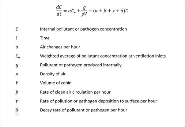
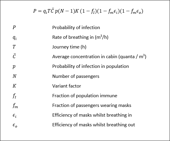
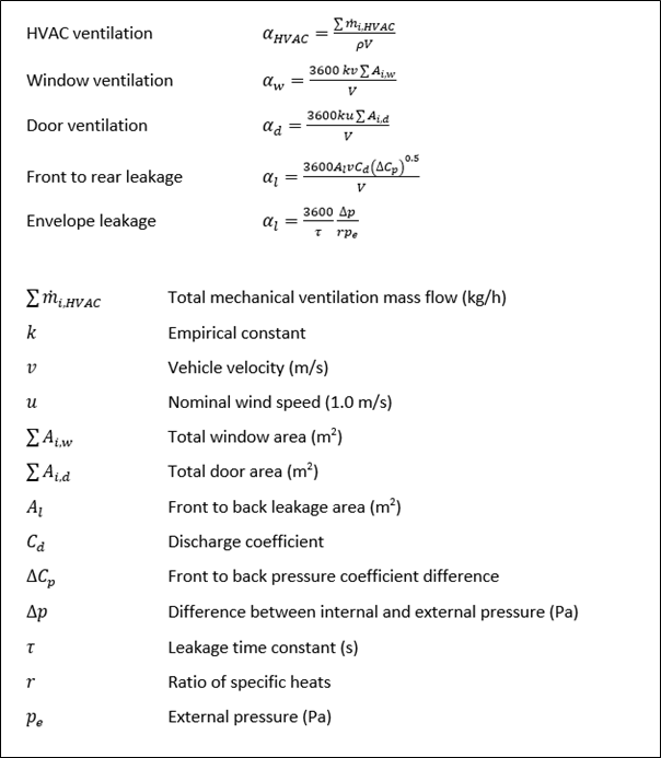
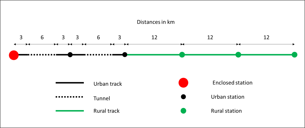
Preamble
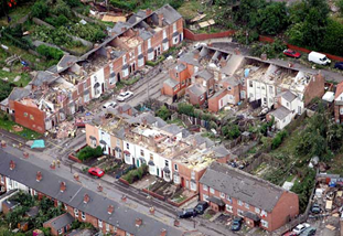
At the recent Bluff Body Aerodynamics Conference in Brimingham at the end of July / start of August 2024, there was considerable discussion concerning the simulation of tornado and downburst flow for the purposes of measuring structural loads. The current experimental methodology uses large scale tornado / downburst generators that have to be physically very large to have reasonable model scales, with either the whole downflow mechanism being moved across a model, or a model being moved beneath the generator. Such tests are complex and time consuming, the more so because to obtain reliable load statistics multiple tuns are required for each case considered with various tornado or downburst characteristics, building position and orientation relative to the core flow etc.
In the discussions of the various presentations, there was some talk of modelling local flow characteristics around building models, rather than modelling the complete flow field. After mulling over some possibilities for this, in this blog post I set out my preliminary thoughts on how such local simulations might be achieved. I have no access to labs or funding, so these ideas will be for someone else to take forward if they are thought to have merit.
The proposal
The basic idea is as follows.
- The local wind field around a building should be simulated in a duct, where rapid changes in wind speed such as those found beneath tornadoes and downbursts can be simulated using active control of fans / screens etc. This has been attempted in the past and the technique is clearly possible. The near ground local shear and turbulence could be generated using spires and roughness in the usual way.
- The rapid horizontal direction changes seen by a building as the flow structures pass over it should be simulated by rotating the model at the required speed.
- Vertical direction changes (which it will be seen below are usually small) could be simulated in one of two ways – either by tilting the building model vertically (which would result in some ground plane distortion) or perhaps by rapid changes in duct roof profile to produce the appropriate upward or downward vertical velocity component.
In principle there seems to be no reason why it should not be possible to simulate the necessary velocity and direction changes, but there are two issues that need to be investigated. Firstly, what exactly are the local wind velocity and direction changes at a particular point when a tornado or downburst passes over them, and secondly how rapid are these changes – are they possible to achieve at reasonable model scales. We address these issues in what follows.
Specification of wind conditions
There are a number of ways in which wind conditions experienced by buildings as tornados or downbursts pass over them can be specified.
- Through the use of full-scale data, although this is somewhat sparse, particularly close to the ground.
- Through large scale LES simulations, a number of which are available, but are usually for certain specific situations and not easily generalized.
- Through the use of simple analytical models which capture the main features of the flow, and by their nature can be generalized quite easily.
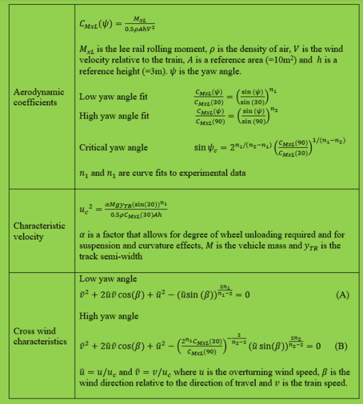
Here we use the latter method (which will come as no surprise to those who know me!). Specifically we use the methods of Baker and Sterling (2017) and Sterling et al (2023). These give the equations for the three components of velocity, relative to the tornado / downburst centre, shown in Box 1. It is then assumed that the building is stationary as the storm passes over it and the overall horizontal velocity and horizontal and vertical flow directions calculated from assuming a vector sum of a steady wind velocity in the storm direction of travel and the velocity induced by the tornado / downburst (figure 1).
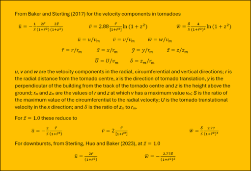
Box 1 Tornado and downburst equations

Figure 1. Co-ordinate system
Clearly the model requires a number of parameters to be specified. These have been taken from the data collation of Baker and Sterling (2019) (which was compiled to assess the adequacy of tornado vortex generators) and four conditions specified – for small, medium and large tornados and for a downburst of similar size to a medium tornado. The parameters for these cases are shown in Table 1. I make no claim as to the overall adequacy or otherwise of this method – as it stands it is simply a convenient tool with which to investigate the broad parameters of the problem, and other methodologies could be used to determine the wind conditions relative to a building.
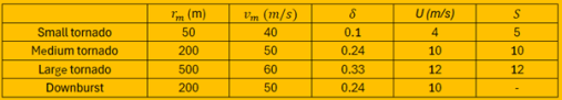
Table 1. Tornado and downburst parameters used in calculation
Wind speed and direction relative to a stationary building
Clearly the wind speed and wind direction changes experienced by a stationary building as a storm passes over them will depend upon the position of the building relative to the storm track. If the building is directly on the track, then some very rapid changes in speed and direction can be expected. This is shown in figures 2a to 2c for the large tornado case. The x axis is the time at full scale equivalent values as the storm passes over the building. The origin is at the point when the centre of the storm is directly over the building. As might be expected there is a very rapid change in the speed and horizontal direction as the vortex core passes over, and a very large change in vertical direction. Two points can be made, Firstly, in this region the model is at its least realistic as the sharp changes will be smoothed in reality by vortex wandering and viscous effects. However secondly, there will undoubtedly be large vertical flow direction changes as the core passes over, although perhaps not as high or as rapid as shown in figure 2, and the type of model simulation proposed here would be unable to simulate such changes and such simulations are probably not adequate close to the core. In what follows we thus confine our attention to two model positions, at one core radius either side of the vortex direction of travel where one would expect the simulation to be adequate..

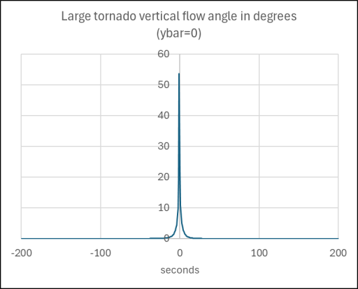

Figure 2. Wind conditions experienced by building directly on the storm track as large tornado passes over
The results of this analysis are shown in figures 3a to 3d for the small, medium and large tornados and figures 4a to 4c for the downburst. The following points can be made.
- The velocity magnitude variations are the same for both building positions, and all show a rapid rise then a fall as would be expected.
- The vertical direction change is characterized by a sharp peak. For the tornado cases, this variation is always less than 1 degree, but for the downburst case it is considerably greater.
- For the downburst, the horizontal direction variation differs in sign between the two positions but are otherwise identical. However, for the tornado cases the horizontal direction variation is different for the two building positions due to the asymmetry introduced by the rotation of the storm. For the case with the building to the top of the storm track in figure 1, there is a steady, if rapid, change of direction around the building and back to the starting point. For the bottom case, the flow directions move through 130 degrees and then back to the original position.


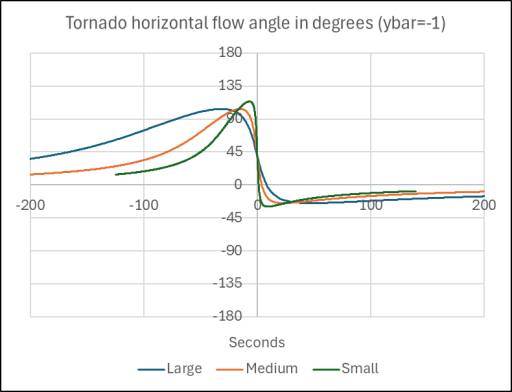
Figure 3. Wind conditions experienced by building one core radius away from the storm track as large, medium and small tornados passes over
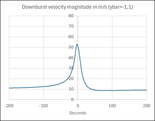

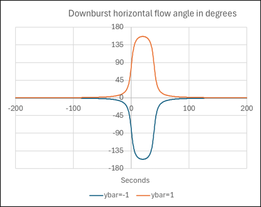
Figure 4. Wind conditions experienced by building one core radius away from the storm track as downburst passes over
Can the velocity and direction variations be modelled?
The question then arises as to whether these predicted velocity and direction variations can be achieved in practice. As noted above the x axis on figures 3 and 4 is the full-scale time in seconds. If, say, a building model scale of 1:25 is adopted, which is broadly in line with current practice, and a velocity scale of 2:1 is used (ie the simulation velocities are half full-scale velocities, which seems practical), then the model time scale is 1:12.5 i.e. the model changes have to take place 12.5 times faster than the full-scale cases. If we take the modelling above as broadly correct in regard to the time scales of velocity and direction variations, then the horizontal direction and velocity variations for the large, medium and small tornados and the downburst takes place over periods of around 50, 30 and 10 seconds respectively, resulting in model times of 4, 2.5 and 0.8 seconds. For the direction changes, these time scales seem reasonable and should be achievable by a suitable mechanical system. However, for the velocity changes, that rely on moving air masses with significant inertia, the time scale required for the small tornado would represent a challenge. The vertical direction variations are over much smaller time scales in each case but could probably be achieved with a mechanical system to tilt the model, but probably not with a system that tries to deflect the moving air downwards or upwards.
Concluding remarks
Based on what has been set out above, it would appear that the type of local simulation described in this post has some potential. The use of such a simulation would be restricted however to medium and large storms, as the velocity changes for small storms would be difficult to achieve at model scale. Similarly, the conditions very close to the storm track, in particular the vertical velocity changes, are unlikely to be able to be adequately modelled.
However, I am now retired, with no access to either lab facilities or funding, so if such a simulation is to be further investigated, someone else will need to do it!
References
C J Baker, M Sterling (2017) Modelling wind fields and debris flight in tornadoes, Journal of Wind Engineering and Industrial Aerodynamics 168, 312-321 http://dx.doi.org/10.1016/j.jweia.2017.06.017
C Baker, M Sterling (2019) Are Tornado Vortex Generators fit for purpose? Journal of Wind Engineering and Industrial Aerodynamics 190, 287-292, https://doi.org/10.1016/j.jweia.2019.05.011
M Sterling, S Huo, C Baker (2023) “Using crop fall patterns to provide an insight into thunderstorm downbursts”, Journal of Wind engineering and Industrial Aerodynamics. 238, July 2023, https://doi.org/10.1016/j.jweia.2023 .105431